
A cumulative distribution function shows, for every possible value on the x-axis, what proportion of the data falls at or below it. Where a histogram bins data into groups and can look different depending on bin width, a CDF (technically an empirical CDF, or ECDF, when built from real data) plots every observation exactly once, with no binning decisions to make. It's a genuinely underused chart: reading a median or a percentile off a CDF is just finding where the curve crosses a horizontal line, and comparing two groups' full distributions is a single glance instead of squinting at overlapping histograms.
Matplotlib: Quick Example
There's no built-in cdf() function in Matplotlib, but the ECDF itself is only two lines: sort the data, and plot it against evenly spaced cumulative proportions.
import numpy as np
import matplotlib.pyplot as plt

sorted_vals = np.sort(standard)
y = np.arange(1, len(sorted_vals) + 1) / len(sorted_vals)

fig, ax = plt.subplots(figsize=(8, 5.2))
ax.plot(sorted_vals, y, linewidth=2, label="Standard")
ax.set_xlabel("Delivery Time (minutes)")
ax.set_ylabel("Cumulative Proportion")
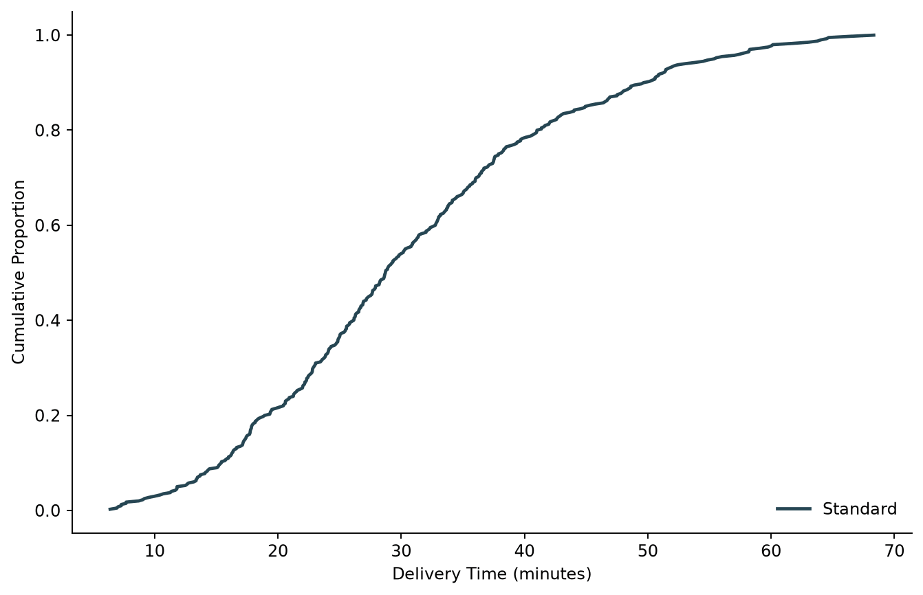
np.sort() orders every observation from smallest to largest, and np.arange(1, n + 1) / n gives each one its cumulative proportion: the first (smallest) point sits at 1/n, the last (largest) point sits at 1.0. Plotting one against the other is the entire ECDF; there's no statistics library or binning logic involved.
Comparing two groups, and reading off the median
A CDF's real strength shows up once there's more than one group on the same axes. Add a second sorted line, and horizontal or vertical reference lines turn the chart into something you can read exact values off of.
def ecdf(data):
    sorted_vals = np.sort(data)
    y = np.arange(1, len(sorted_vals) + 1) / len(sorted_vals)
    return sorted_vals, y

fig, ax = plt.subplots(figsize=(8, 5.2))
for name, data in [("Standard", standard), ("Express", express)]:
    x, y = ecdf(data)
    ax.plot(x, y, linewidth=2, label=name)
    ax.axvline(np.median(data), linestyle=":", linewidth=1.2, alpha=0.7)

ax.axhline(0.5, color="#999999", linestyle=":", linewidth=1)
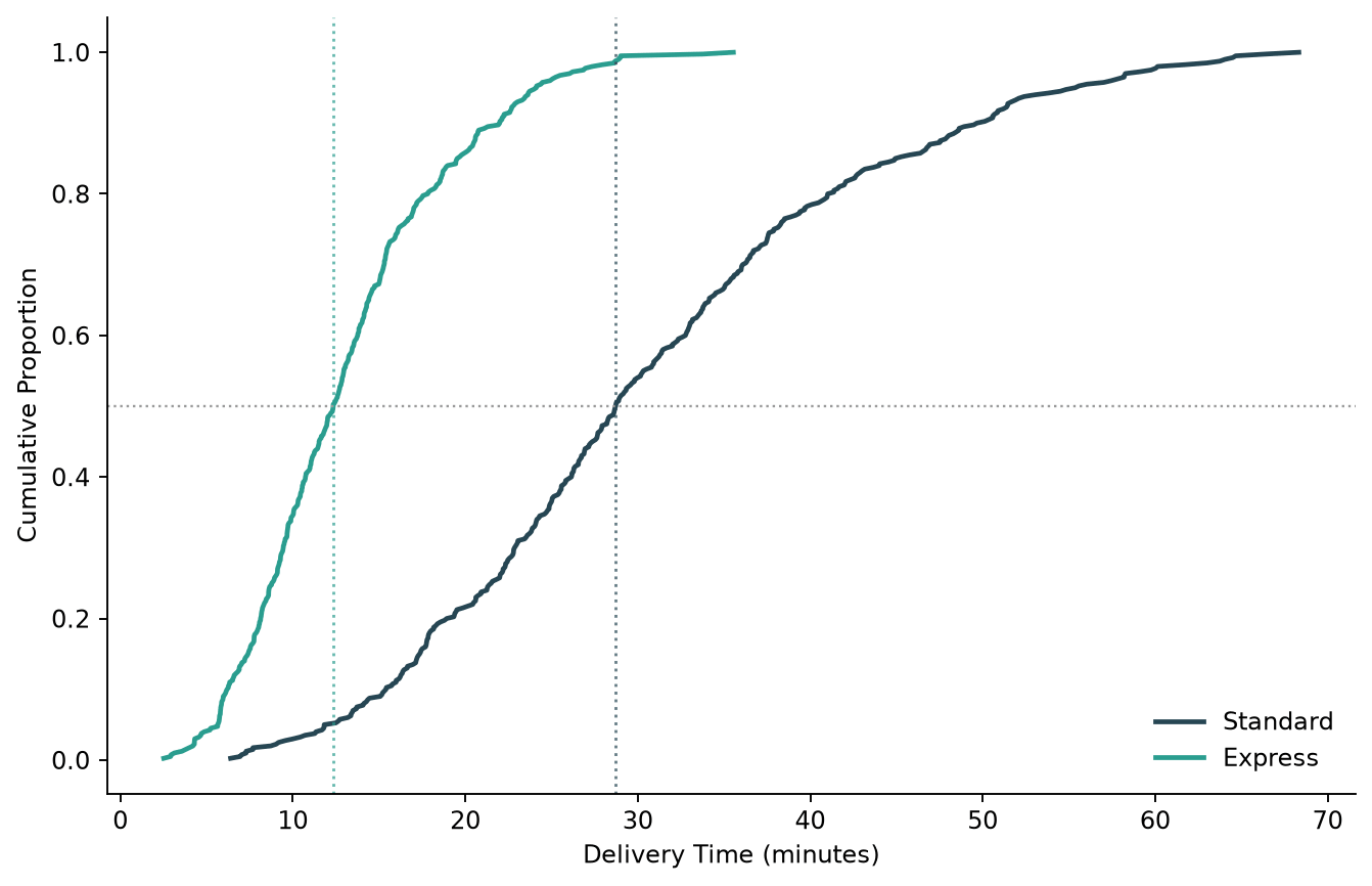
Where each curve crosses the horizontal 0.5 line is that group's median, marked here with a matching vertical line. This is the comparison a CDF makes easy that a pair of histograms makes hard: Express isn't just "generally faster," the chart shows its entire distribution sits to the left of Standard's, and by how much, at every percentile, not only the median.
Seaborn: the same chart in one call
Seaborn's ecdfplot() builds the identical curve directly from a long-format DataFrame, handling the per-group sorting and coloring that the Matplotlib version does by hand.
import seaborn as sns

fig, ax = plt.subplots(figsize=(8, 5.2))
sns.ecdfplot(data=df, x="minutes", hue="service", linewidth=2, ax=ax)
ax.set_xlabel("Delivery Time (minutes)")
ax.set_ylabel("Cumulative Proportion")
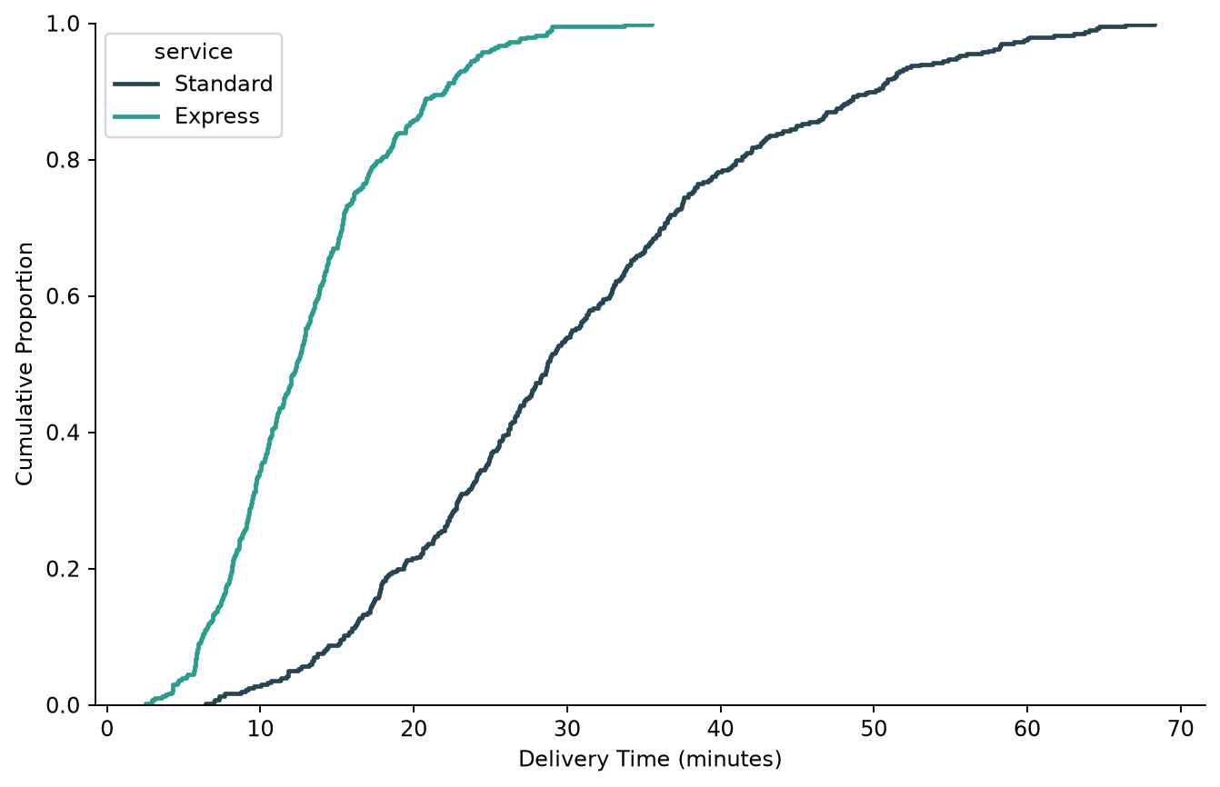
The curves are pixel-for-pixel the same shape as the manual version above; ecdfplot() is computing the exact same sort-and-divide ECDF, just wired up to hue so a single call handles both groups, the legend, and consistent coloring. This is the more convenient version once the data is already in a tidy DataFrame with a grouping column, which is the more common starting point in practice.
Counts instead of proportions
ecdfplot() has one option the manual version doesn't get for free: switching the y-axis from a 0-to-1 proportion to a running count with stat="count".
sns.ecdfplot(data=df, x="minutes", hue="service", stat="count", ax=ax)
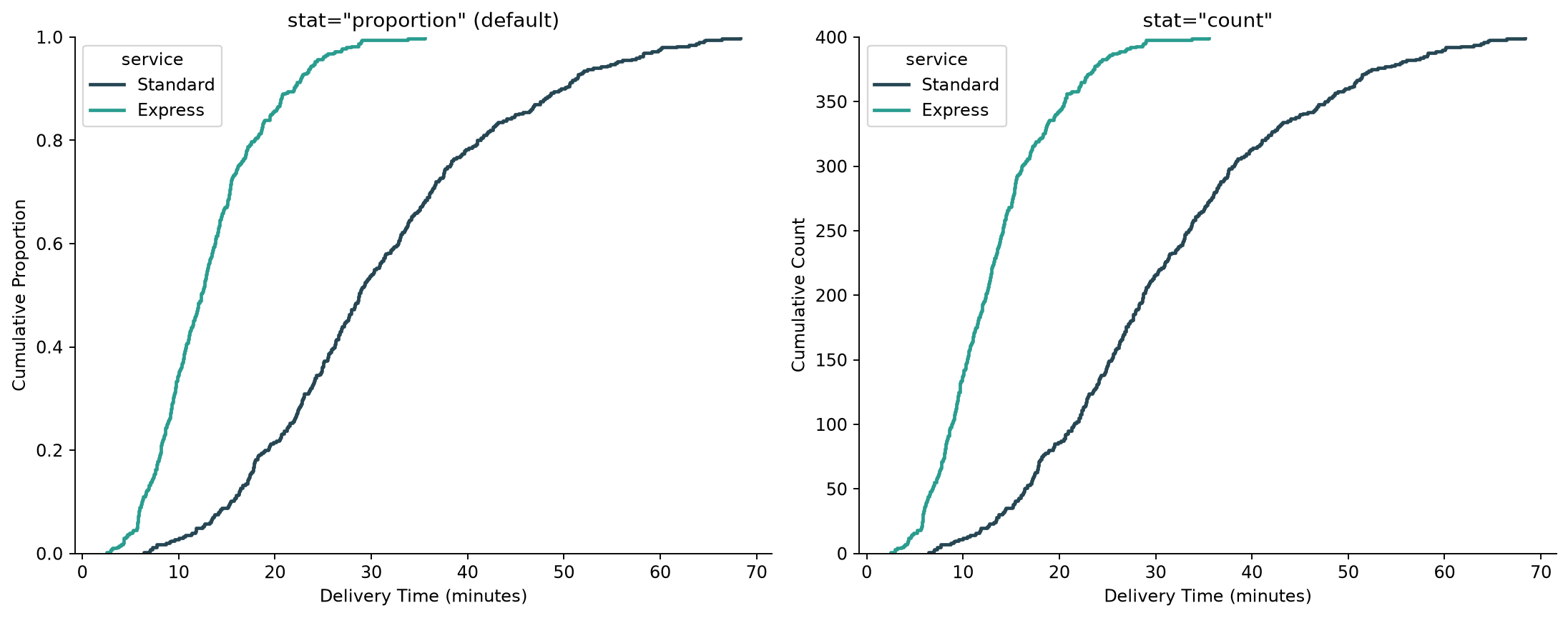
The curve shapes are identical; only the y-axis scale changes. stat="count" is worth reaching for when the group sizes themselves are part of the story, since stat="proportion" (the default) always ends every curve at exactly 1.0 regardless of how many observations went into it, which can hide a large difference in sample size between groups.
Practical Tips
- A CDF needs no bin width decision, unlike a histogram; every observation gets its own step, so the shape is a direct, unambiguous property of the data.
- Reading a median or percentile off a CDF is just finding where the curve crosses a horizontal reference line (
ax.axhline(0.5)for the median,0.9for the 90th percentile, and so on). - Reach for the manual Matplotlib version (
np.sort()plus a cumulative proportion) when full control over styling matters, or when avoiding a Seaborn dependency matters more than convenience. - Reach for
sns.ecdfplot()once the data is already a tidy DataFrame with a grouping column;huehandles multiple groups, coloring, and the legend in one call. - Use
stat="count"instead of the defaultstat="proportion"when the underlying sample sizes differ enough that the comparison should show absolute counts, not just relative shape.