
Altair builds on Vega-Lite, so axis titles and value formats are set declaratively through alt.X, alt.Y, and alt.Axis. You never mutate a chart after drawing; you describe the axis and let Altair render it.
Quick Example
Pass title to the alt.X and alt.Y encodings to set the axis labels.
import altair as alt

alt.Chart(df).mark_bar().encode(
    x=alt.X("month", title="Month"),
    y=alt.Y("revenue", title="Revenue (USD)"),
)
The alt.X() and alt.Y() wrappers accept all the axis options, including the title text shown on each axis.
Set the axis titles
Give each encoding a title and Altair puts that text at the end of the axis.
chart = (
    alt.Chart(df)
    .mark_bar()
    .encode(
        x=alt.X("month", title="Month"),
        y=alt.Y("revenue", title="Revenue (USD)"),
    )
    .properties(title="Monthly revenue")
)
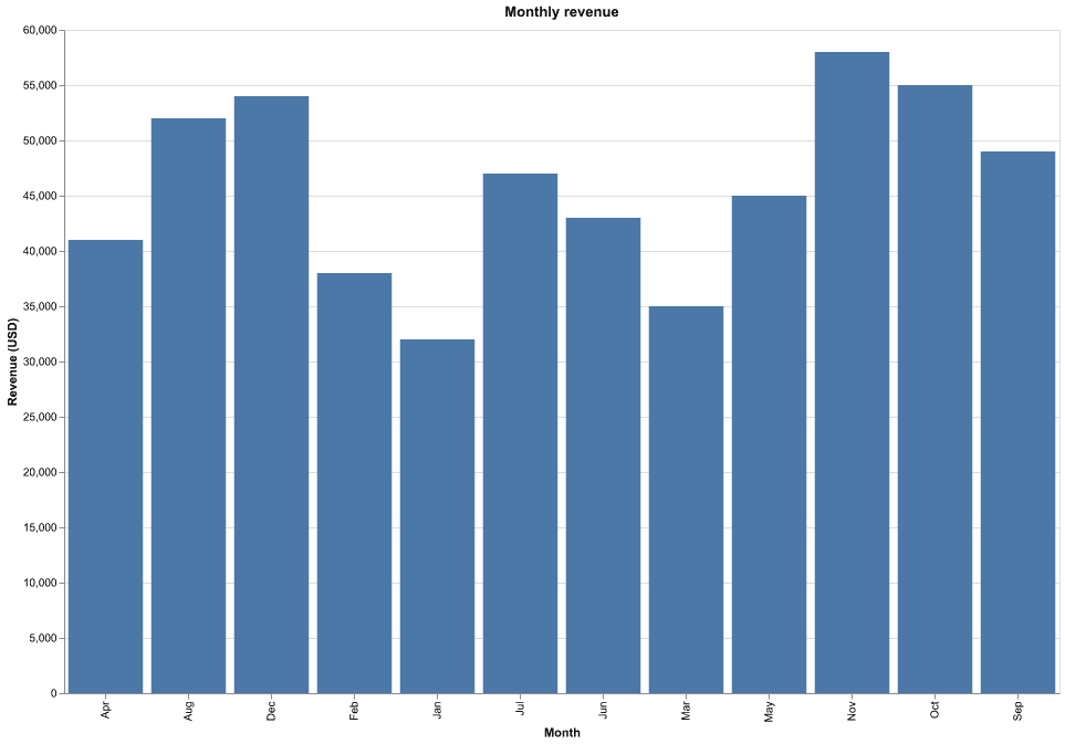
The .properties(title=...) call adds a chart title on top, separate from the axis titles. It is an easy way to make a chart self-describing.
Format the values on an axis
Number formatting goes through axis=alt.Axis(format=...). The format follows the d3-format spec, and $,.0f turns raw numbers into currency with thousands separators.
alt.Chart(df).mark_line(point=True).encode(
    x=alt.X("month", title="Month"),
    y=alt.Y("revenue", title="Revenue (USD)",
            axis=alt.Axis(format="$,.0f")),
)
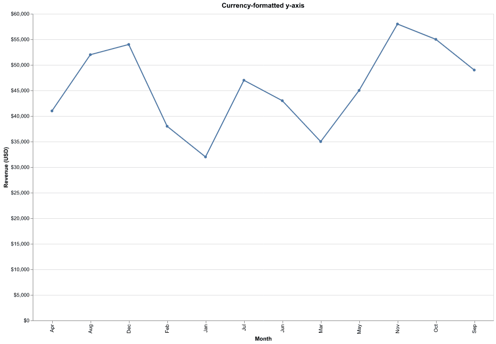
The y-axis now reads $30K, $40K, and so on, instead of 30000, 40000.
Format as a percentage
For values stored as fractions, .0% multiplies by 100 and adds a percent sign, with no decimal places.
y=alt.Y("conversion", title="Conversion rate",
        axis=alt.Axis(format=".0%"))
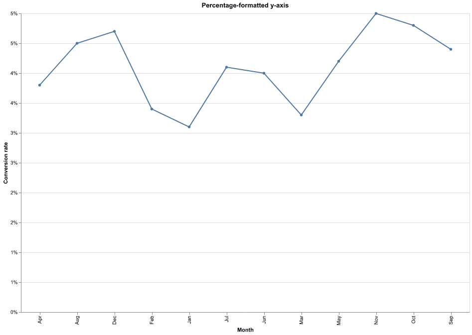
Storing 0.03 and formatting with .0% prints 3%, which is far more readable than the raw decimal.
Adjust ticks and label rotation
alt.Axis also controls the tick count and the label rotation so the axis stays legible.
y=alt.Y("revenue", title="Revenue (USD)",
        axis=alt.Axis(format="$,.0f", tickCount=6))

chart.configure_axis(labelAngle=0)
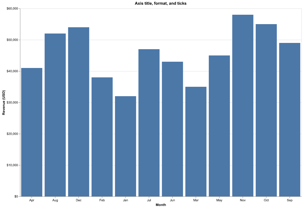
tickCount controls how many tick labels to draw, and configure_axis(labelAngle=0) keeps the x labels flat instead of angled when there are many categories.
Practical Tips
- Set the axis label with
titleonalt.X/alt.Y. - Use the d3-format strings in
alt.Axis(format=...):$,.0ffor currency,.0%for percentages,.2ffor decimals. - Add a chart title with
.properties(title=...). - Control how busy the axis is with
tickCount. - Rotate labels with
configure_axis(labelAngle=0)when categories crowd the bottom.