
Faceting is one of the easiest ways to show more structure in a plot without cluttering the view. Instead of creating a dozen separate charts by hand, Plotnine lets you split one chart into panels based on a variable.
This is especially helpful when you want to compare groups, trends, or distributions side by side. In Plotnine, the two main tools are facet_wrap() and facet_grid().
Quick Example
from plotnine import ggplot, aes, geom_point, labs, facet_wrap
from plotnine.data import mtcars

(
    ggplot(mtcars, aes('wt', 'mpg'))
    + geom_point(size=2.5, alpha=0.8)
    + facet_wrap('~ cyl', ncol=3)
    + labs(
        title='Miles per gallon by weight',
        x='Weight',
        y='MPG',
    )
)
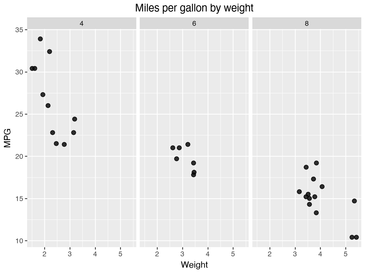
This creates a small-multiple plot where each panel shows one cylinder group. It is a clean way to compare the relationship between weight and MPG without forcing all groups into one crowded layer.
Using facet_wrap()
facet_wrap() is the simpler option when you want to split a plot by one variable. It arranges the panels in a grid and automatically wraps them to fit the available space.
from plotnine import ggplot, aes, geom_point, labs, facet_wrap
from plotnine.data import mtcars

(
    ggplot(mtcars, aes('wt', 'mpg', color='factor(cyl)'))
    + geom_point(size=2.5, alpha=0.8)
    + facet_wrap('~ cyl', ncol=2)
    + labs(
        title='MPG vs weight by cylinder count',
        x='Weight',
        y='MPG',
        color='Cylinders',
    )
)
A few useful arguments to know:
ncol=sets the number of columns in the wrap layout.nrow=sets the number of rows.scales='free'lets each panel use its own axis range when the groups are on different scales.
(
    ggplot(mtcars, aes('wt', 'mpg'))
    + geom_point(size=2.5)
    + facet_wrap('~ cyl', ncol=3, scales='free')
)
This is often the most readable choice when you are faceting by a single categorical variable.
Using facet_grid()
facet_grid() is more structured. It creates a matrix of panels based on one variable in the rows and another in the columns. This is useful when you want to compare across two grouping variables at the same time.
from plotnine import ggplot, aes, geom_point, labs, facet_grid
from plotnine.data import mtcars

(
    ggplot(mtcars, aes('wt', 'mpg'))
    + geom_point(size=2.5, alpha=0.8)
    + facet_grid('gear ~ cyl')
    + labs(
        title='MPG vs weight by cylinder and gear count',
        x='Weight',
        y='MPG',
    )
)
With facet_grid(), the formula syntax matters:
facet_grid('row_var ~ col_var')creates rows byrow_varand columns bycol_var.facet_grid('. ~ col_var')gives you a single row of panels.facet_grid('row_var ~ .')gives you a single column of panels.
(
    ggplot(mtcars, aes('wt', 'mpg'))
    + geom_point(size=2.5)
    + facet_grid('. ~ cyl')
)
That is a good option when you want a simple layout and one variable is the main organizing factor.
Shared scales vs free scales
One of the biggest decisions is whether all panels should share the same axis range.
facet_wrap('~ cyl')defaults to shared scales.facet_wrap('~ cyl', scales='free')gives each panel its own range.
This matters when one group has a much wider spread than the others. Free scales can make the panel easier to read, but shared scales are better when you want to compare values directly across groups.
(
    ggplot(mtcars, aes('wt', 'mpg'))
    + geom_point(size=2.5)
    + facet_wrap('~ cyl', scales='free')
)
In most practical cases, I start with shared scales and only switch to free if the groups are visually compressed.
Faceting with a line or trend plot
Faceting is not just for scatter plots. It works just as well with lines and smooths.
from plotnine import ggplot, aes, geom_line, stat_smooth, facet_wrap, labs

(
    ggplot(mtcars, aes('wt', 'mpg'))
    + geom_point(size=2.5)
    + stat_smooth(method='lm', se=False)
    + facet_wrap('~ cyl', ncol=3)
    + labs(
        title='Weight and MPG by cylinder count',
        x='Weight',
        y='MPG',
    )
)
That pattern is useful when you want to show the same model or relationship across groups without stacking all of the lines together.
Practical tips
- Use
facet_wrap()for one grouping variable and a simple layout. - Use
facet_grid()when you want a more deliberate row/column organization. - Prefer shared scales unless the groups are very different.
- Keep the panel counts reasonable. Too many small panels make the chart harder to read.