
Plotly's default renderers draw with SVG, which is crisp but bogs down as the number of marks grows. Switching to a WebGL trace hands the drawing to the GPU and keeps pan, zoom, and hover smooth on big datasets.
Quick Example
Turn on the WebGL renderer for a scatter with render_mode="webgl".
import plotly.express as px

fig = px.scatter(df, x="x", y="y", color="class", render_mode="webgl")
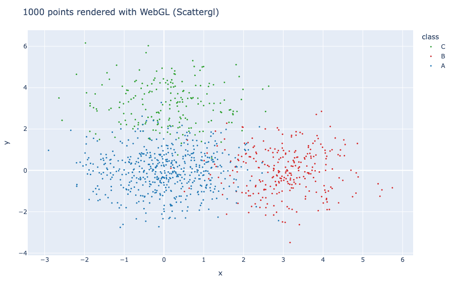
The trace type becomes scattergl, which renders through WebGL. With thousands of points it stays responsive instead of freezing up like an SVG plot.
Why WebGL helps
SVG keeps every mark as a DOM element, so a plot with tens of thousands of points can slow the page and the interactions. WebGL pushes the drawing to the graphics card and renders the whole scene in one pass, which scales to far more points. The tradeoff is that WebGL output is rasterized, so it is less useful as a crisp print vector but ideal for exploring big data in a browser.
Use render_mode in Plotly Express
Express exposes the renderer through render_mode. This is the easiest path when you already build charts with px.
fig = px.scatter(
    df, x="x", y="y", color="class",
    render_mode="webgl",
    size_max=20,
)
Under the hood this produces a scattergl trace instead of scatter, so you keep the usual Express API but get GPU rendering.
Use go.Scattergl directly
When you work with plotly.graph_objects, pick the WebGL variant of the trace. go.Scattergl is the WebGL counterpart of go.Scatter and takes the same arguments.
import plotly.graph_objects as go

fig = go.Figure(
    go.Scattergl(x=x, y=y, mode="markers", marker=dict(size=5))
)
Use go.Scattergl when you need fine control or when the data arrives as plain arrays rather than a DataFrame.
A WebGL scatter in action
The chart below is a scattergl trace. Hover a point and drag the axes; the interaction stays fluid even as you zoom into the clusters.
Other WebGL-capable traces
scattergl is the common one, but several other traces render through WebGL for the same reason:
scatterglis the common one, but several other traces also render through WebGL, e.g.densitymapboxfor dense points on map tiles,mesh3dfor 3D surfaces, andparcoords/splomfor heavy multi-dimensional plots.
For most scatter, line, and point work, switching to scattergl is the biggest win. You can also pass the same idea through go-style traces (go.Scattergl, go.Mesh3d) or Express render_mode where it is available.
Trim the data first
The best performance fix is fewer points. WebGL handles thousands smoothly, but it is still faster to plot what you need.
- Sample or aggregate a very large dataset before plotting.
- Drop points you cannot see anyway, such as outside the visible axis range.
- Use
splomor histograms for dense data instead of a raw scatter.
Plotly does not draw invisible marks for free, and raw SVG/WebGL still pays for what you render.
Disable hover on huge data
Hovering one point among tens of thousands is hard to hit and adds overhead. Turning it off can noticeably speed up interactions.
fig.update_traces(hovertemplate=None, hoverinfo="skip")
Keep hover on when readers actually need to inspect individual points; leave it off for a broad overview where the shapes matter more than single values.
Practical Tips
- Prefer
scattergl/render_mode="webgl"for large scatter and line data. - Keep WebGL output for on-screen interaction; use SVG when you need crisp vector exports.
- Sample or aggregate data before plotting to reduce the point count.
- Turn off hover on very large traces to speed up pan and zoom.
- Combine WebGL traces with the usual
fig.update_layoutfor titles, axes, and margins.