
Altair lets you compose small charts into bigger ones with three operators: + layers charts on shared axes, | places them side by side, and & stacks them vertically. Each is a clean way to build a figure from parts.
Quick Example
Use the operators directly on chart objects.
import altair as alt

layered = chart1 + chart2      # same axes, one plot
row = chart1 | chart2          # horizontal concatenation
column = chart1 & chart2       # vertical concatenation
The + operator is layering, and | / & are concatenation. The same operations exist as alt.layer(), alt.hconcat(), and alt.vconcat().
Layer two charts
+ draws both charts on the same axes. It is the way to overlay a line on top of bars, or to add a threshold to a plot.
bar = alt.Chart(df).mark_bar().encode(
    x=alt.X("month:O", title="Month"),
    y=alt.Y("revenue", title="Revenue (USD)"),
)
target = alt.Chart(df).mark_line(color="#e45756").encode(
    x=alt.X("month:O", title="Month"),
    y=alt.Y("target", title="Revenue (USD)"),
)

(bar + target).properties(title="Layered bar and line")
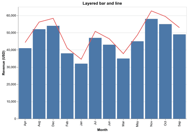
Because the two layers share the axes, both encodings must use compatible fields. Here the bar shows actual revenue and the line shows the target, so you can see at a glance how far off the bars are.
Layer a line and its points
A line and its points are a natural pair to layer, often to mark individual values on top of the trend.
line = alt.Chart(df).mark_line(color="#f58518").encode(
    x=alt.X("month:O", title="Month"),
    y=alt.Y("conversion", title="Conversion rate", axis=alt.Axis(format=".0%")),
)
points = alt.Chart(df).mark_point(color="#f58518", size=80).encode(
    x=alt.X("month:O", title="Month"),
    y=alt.Y("conversion", title="Conversion rate", axis=alt.Axis(format=".0%")),
)

(line + points).properties(title="Layered line and points")
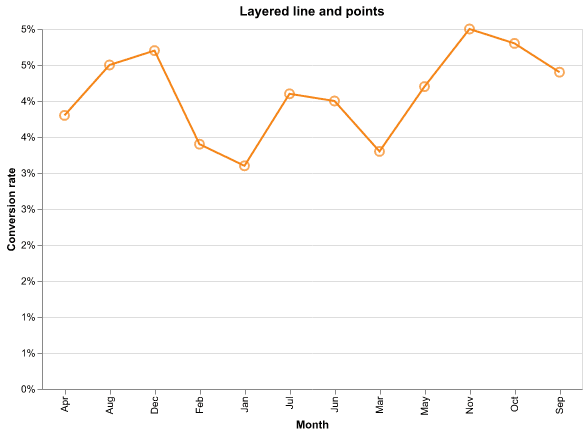
Because both layers use the same conversion encoding, the shared axis scales once and the points sit exactly on the line.
Concatenate side by side
| places charts horizontally. It is useful for a small row of related charts that share the same data.
bar = alt.Chart(df).mark_bar().encode(
    x=alt.X("month:O", title=None), y=alt.Y("revenue", title="Revenue"))
line = alt.Chart(df).mark_line(point=True).encode(
    x=alt.X("month:O", title=None), y=alt.Y("revenue", title="Revenue"))

(bar | line).properties(title="Bar and line")
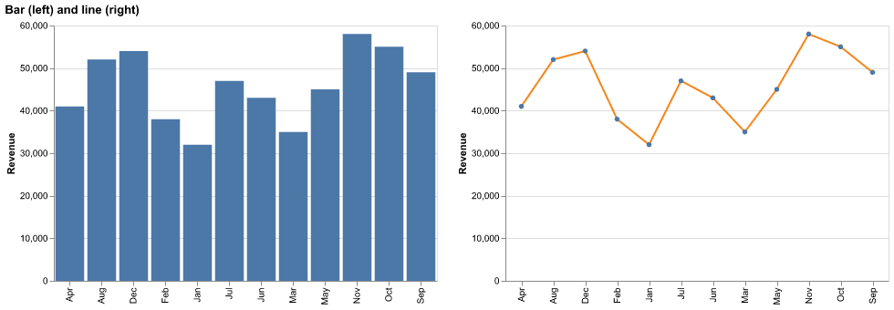
Each child keeps its own axes, and the two sit side by side in the output. Give both a matching width and height so the row lines up.
Stack them vertically
Use & to stack charts one above the other. This is a clean way to show two series that do not share a scale, like revenue and conversion rate.
conv = alt.Chart(df).mark_bar(color="#54a24b").encode(
    x=alt.X("month:O", title=None),
    y=alt.Y("conversion", title="Conversion", axis=alt.Axis(format=".0%")),
)

(bar & conv).properties(title="Revenue and conversion")
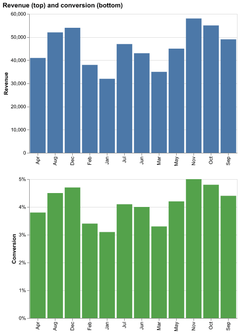
Vertical concatenation is the clean answer when two series have very different magnitudes and would squash each other on a shared axis.
Practical Tips
- Use
+(layer) to overlay chart marks that belong on the same axes. - Use
|and&for side-by-side and stacked views when the scales do not mix. - Pass matching
width/heightto child charts so concatenations align. - Use
alt.layer(),alt.hconcat(),alt.vconcat()named functions if the operators read oddly for you. - Remember layers share axes, while concatenations give each child its own.