
A polar scatter plot places each point by angle and distance from the center instead of by x and y. It is a natural fit for directional data like wind, bearings, and around-the-clock measurements, and both Matplotlib and Plotly support it.
Quick Example
Matplotlib needs a polar projection; Plotly has a dedicated scatterpolar trace.
# Matplotlib
import matplotlib.pyplot as plt
import numpy as np

fig = plt.figure()
ax = fig.add_subplot(projection="polar")
ax.scatter(theta_rad, r)

# Plotly
import plotly.graph_objects as go

fig = go.Figure(go.Scatterpolar(theta=theta_deg, r=r, mode="markers"))
fig.show()
Both take an angle and a distance from the center. This post builds the same wind-by-direction dataset in each.
Matplotlib polar scatter
Matplotlib draws polar plots through a projection. Create a polar axes and call scatter() as usual, but with the angle in radians.
import matplotlib.pyplot as plt
import numpy as np

angles_deg = np.arange(0, 360, 15)
a = np.deg2rad(angles_deg)

fig = plt.figure()
ax = fig.add_subplot(projection="polar")
ax.scatter(a, speed, s=70, c=speed, cmap="viridis",
           edgecolor="white", linewidth=0.8)
The plot defaults to zero pointing east and angles increasing counterclockwise. Real compass data is better served with North at the top and a clockwise sweep, so flip it and label the ticks with compass points.
compass = ["N", "NE", "E", "SE", "S", "SW", "W", "NW"]

ax.set_theta_zero_location("N")
ax.set_theta_direction(-1)
ax.set_xticks(np.deg2rad(np.arange(0, 360, 45)))
ax.set_xticklabels(compass)
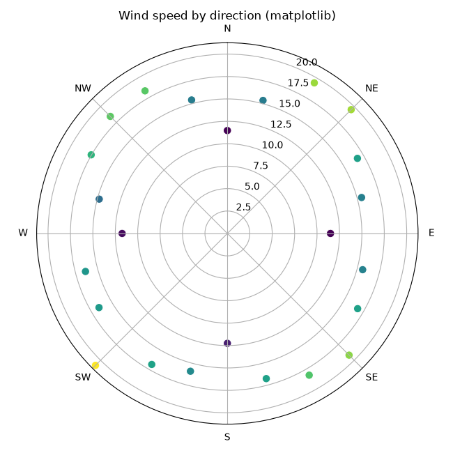
Each point is placed by angle and radius, and the points are colored by speed through matplotlib's scatter c and cmap arguments.
Plotly polar scatter
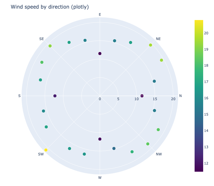
Plotly's scatterpolar trace takes theta in degrees and r for the radius, so no conversion is needed.
import plotly.graph_objects as go

fig = go.Figure(
    go.Scatterpolar(
        r=speed,
        theta=angles_deg,
        mode="markers",
        marker=dict(size=12, color=speed, colorscale="Viridis",
                    showscale=True),
    )
)
fig.update_layout(
    polar=dict(
        angularaxis=dict(
            tickmode="array",
            tickvals=list(range(0, 360, 45)),
            ticktext=["N", "NE", "E", "SE", "S", "SW", "W", "NW"],
        )
    )
)
fig.show()
The result is interactive: hover a point to read its bearing and speed, and use the mode bar to zoom and pan. The chart below is embedded directly.
When to use a polar scatter
Reach for a polar scatter when the two coordinates really are an angle and a distance: wind direction and strength, sensor readings around a hub, or timestamps mapped to an angular view. If the axes are just two numbers, a plain x-y scatter is usually simpler and easier to interpret.
Tweak the angular axis
Both libraries default to non-compass conventions, so set the reference and direction to match your data.
Matplotlib:
ax.set_theta_zero_location("N")  # where 0 points
ax.set_theta_direction(-1)       # clockwise
ax.set_xticks(np.deg2rad(np.arange(0, 360, 45)))
Plotly:
fig.update_layout(
    polar=dict(
        angularaxis=dict(
            tickmode="array",
            tickvals=list(range(0, 360, 45)),
            ticktext=["N", "NE", "E", "SE", "S", "SW", "W", "NW"],
        )
    )
)
Using compass labels instead of raw degrees makes a wind or bearing chart readable at a glance.
Practical Tips
- Convert angles to radians for Matplotlib; Plotly's
thetauses degrees. - Color the markers with a third dimension (speed, magnitude) to add signal without a second plot.
- Orient the zero point and direction to match what the data means, whether that is North or something else.
- Use
mode="markers"or"markers+lines"in Plotly depending on whether you want the angular path drawn. - Use Matplotlib for a static print-ready figure and Plotly when readers should explore or zoom.