
A donut chart is a pie chart with the center removed, which leaves room for a total or a headline number. This post makes one in Matplotlib and puts the total in the middle.
Quick Example
Draw the pie with a width in wedgeprops to punch the hole, then add text at the origin.
import matplotlib.pyplot as plt

fig, ax = plt.subplots()
ax.pie(
    values,
    labels=labels,
    autopct="%1.1f%%",
    wedgeprops=dict(width=0.4),
)
ax.text(0, 0, "Total\n$2,400", ha="center", va="center", fontweight="bold")
ax.set_aspect("equal")
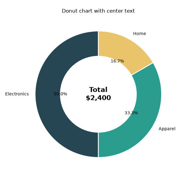
The ax.text(0, 0, ...) call is the center-text trick: the origin of the axes falls right in the middle of the hole.
Punch the hole
A Matplotlib pie() is a solid disk by default. Giving each wedge a width (0 to 1) turns it into a ring, where width=1 is a full pie and a smaller value leaves a hole in the middle.
ax.pie(
    values,
    labels=labels,
    autopct="%1.1f%%",
    colors=["#264653", "#2a9d8f", "#e9c46a"],
    startangle=90,
    wedgeprops=dict(width=0.4, edgecolor="white", linewidth=2),
)
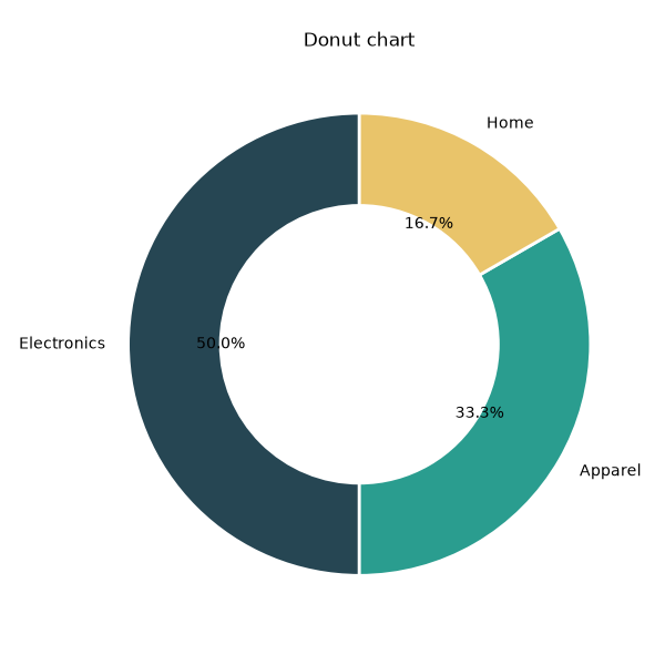
width=0.4 leaves a wide enough hole for text, and the white edge keeps the slices separated.
Add text in the center
ax.text(x, y, s, ...) draws a string at data coordinates. The center of the chart is (0, 0), and ha/va center the text horizontally and vertically.
ax.text(
    0, 0, "Total\n$2,400",
    ha="center",   # horizontal alignment
    va="center",   # vertical alignment
    fontsize=16,
    fontweight="bold",
)
A \n in the string creates a two-line label, which is the common way to show a value plus a caption under it.
Format the center text
Compute the value you show so it stays accurate when the data changes.
total = sum(values)
ax.text(
    0, 0,
    f"Total\n${total:,}",
    ha="center", va="center",
    fontsize=16, fontweight="bold",
)
Putting a real metric in the center makes the donut read as a headline summary rather than just a colored ring.
Practical Tips
- Use
wedgeprops=dict(width=0.4)(or smaller) to create the hole. - Add the center text after drawing the pie so it sits on top.
- Use
ax.text(0, 0, ...)withha="center", va="center"to center it in the hole. - Keep
ax.set_aspect("equal")so the donut is a true circle, not an oval. - Format the center number from the data (e.g.,
sum(values)) so it never goes stale.