
TL;DR
Use ax.annotate() to add text labels at specific coordinates. You can offset the text from the data point using xytext and specify label coordinates in points or pixels using textcoords.
import matplotlib.pyplot as plt

fig, ax = plt.subplots(figsize=(7, 4.5))
x = [1, 2, 3]
y = [12, 19, 15]
labels = ['Point A', 'Point B', 'Point C']

ax.plot(x, y, marker='o')

# Annotate points with a small offset
for i, txt in enumerate(labels):
    ax.annotate(txt, xy=(x[i], y[i]), xytext=(5, 5), textcoords='offset points')

plt.show()
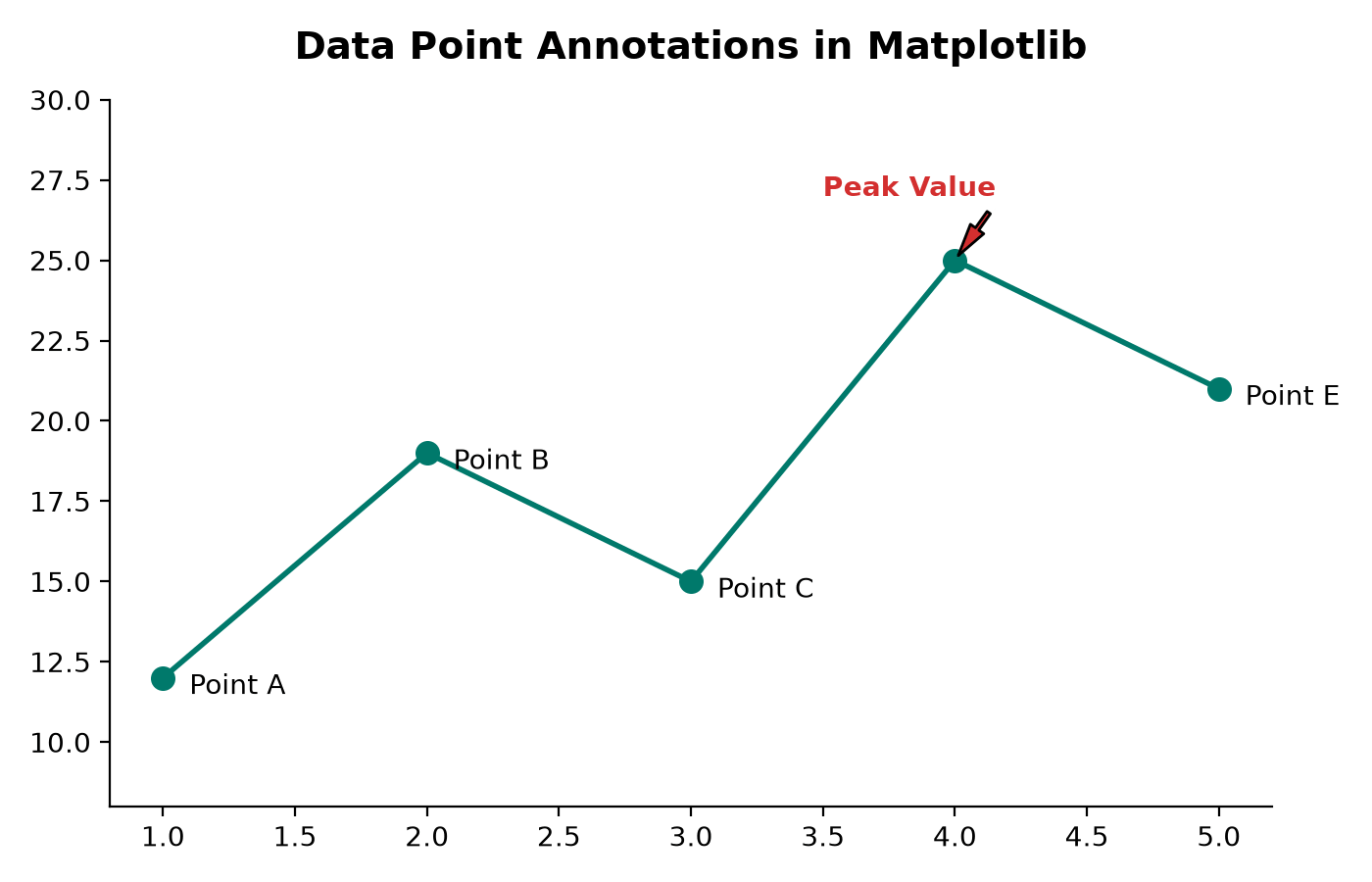
Basic Text Labeling with ax.text()
For simple labels, use ax.text(x, y, "label"). This places text directly at the specified coordinate values:
# Places text 'Label' at x=2, y=15
ax.text(2, 15, 'Label', fontsize=12, color='blue', ha='center', va='bottom')
Key parameters for alignment:
- ha (horizontal alignment): 'center', 'left', or 'right'.
- va (vertical alignment): 'center', 'top', or 'bottom'.
Advanced Labeling with ax.annotate()
The ax.annotate() function is more powerful because it separates the position of the label text from the position of the data point, and can connect the two with a line or arrow.
1. Offsetting Text Safely
If you place text exactly on (x, y), the label will overlap with your data point marker. Use the xytext and textcoords parameters to add safety margins:
ax.annotate(
    'Label Text',
    xy=(x_coord, y_coord),                  # The data point coordinate
    xytext=(10, -5),                       # Offset values
    textcoords='offset points'              # Offset in printer points (relative to xy)
)
Using 'offset points' or 'offset pixels' ensures that your label offsets remain consistent regardless of changes to your axis limits or figure aspect ratio.
2. Adding Callout Arrows
When highlighting an important data point (like a peak or anomaly), add a callout arrow using the arrowprops dictionary parameter:
ax.annotate(
    'Peak Value',
    xy=(x[3], y[3]),                        # Arrow points here
    xytext=(x[3] - 0.5, y[3] + 2),          # Text placed here
    arrowprops=dict(
        facecolor='red',                    # Arrow color
        shrink=0.08,                        # Gap between arrow tip and label/data point
        width=1.5,                          # Arrow stem width
        headwidth=6                         # Arrow head width
    ),
    fontweight='bold',
    color='red'
)