Basic Pie Chart in Matplotlib
Pie charts don't have the best reputation in the visualization community, but there are times when you want one anyway.
Pie charts can be useful when utilized in the right context with the right data. So we'll go over how to code them up in Matplotlib, which happens to be pretty straighforward.
The axes Matplotlib object has a baked in pie method,
as does the higher level pyplot library. We'll use the former in our
examples but any of these could be coded up as the latter instead.
The pie method takes an x parameter as its first argument, which is
the values that will make up the wedges of the pie. They can be given
as decimals (percentages of total) or raw values, it doesn't really
matter; Matplotlib will convert them to percentages regardless. The one
caveat here is that if the sum(x) < 1, the wedges won't automatically
fill in the full pie. We'll give an example of this below.
The labels argument should be an iterable of the same length and order
of x that gives labels for each pie wedge.
For our example, let's say we want to show which sports are most popular at a given school by looking at the number of kids that play each.
import matplotlib.pyplot as plt
x = [10, 50, 30, 20]
labels = ['Surfing', 'Soccer', 'Baseball', 'Lacrosse']

fig, ax = plt.subplots()
ax.pie(x, labels=labels)
ax.set_title('Sport Popularity')
plt.tight_layout()
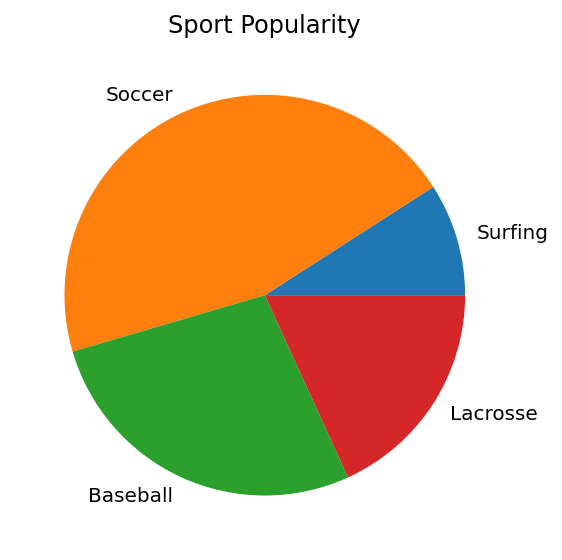
Matplotlib uses the default color cycler to color each wedge and automatically orders the wedges and plots them counter-clockwise.
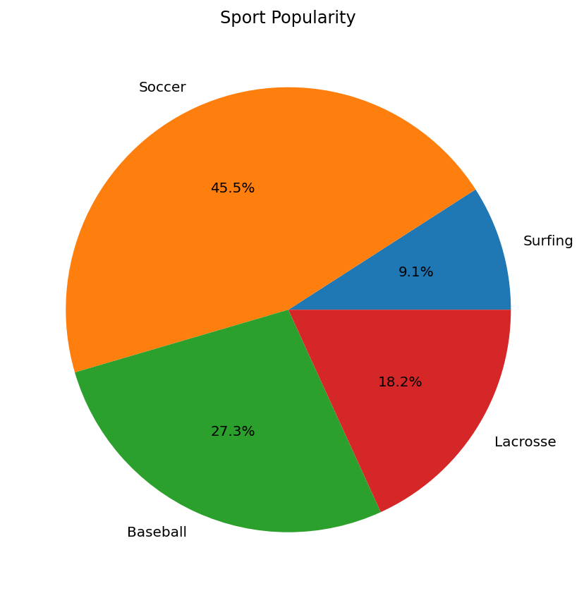
Let's make the pie a bit bigger just by increasing figsize and also
use the autopct argument to show the percent value inside each piece
of the pie. The autopct arg takes either a string format or a function
that can transform each value.
fig, ax = plt.subplots(figsize=(6, 6))
ax.pie(x, labels=labels, autopct='%.1f%%')
ax.set_title('Sport Popularity')
plt.tight_layout()
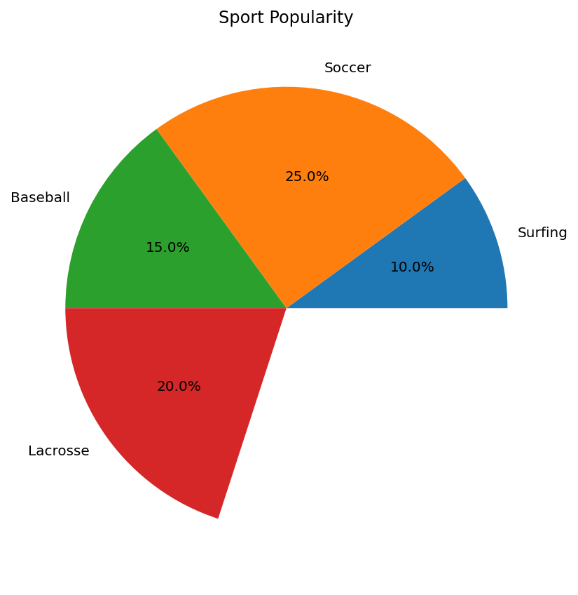
As explained above, if we switch the values to be decimals and their sum doesn't equal one, the pie will have a gap or blank wedge.
fig, ax = plt.subplots(figsize=(6, 6))

x = [0.1, 0.25, 0.15, 0.2]

ax.pie(x, labels=labels, autopct='%.1f%%')
ax.set_title('Sport Popularity')
plt.tight_layout()
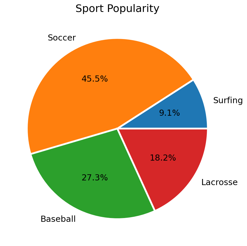
Styling the Pie Chart
You can use the wedgeprops and textprops arguments to style the
wedges and texts, respectively.
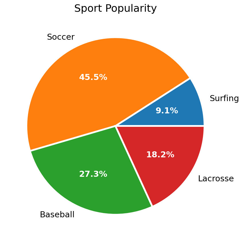
Here, we add a wider border around each wedge and color it white; we also increase the text size to be more readable.
fig, ax = plt.subplots(figsize=(6, 6))

x = [10, 50, 30, 20]

ax.pie(x, labels=labels, autopct='%.1f%%',
       wedgeprops={'linewidth': 3.0, 'edgecolor': 'white'},
       textprops={'size': 'x-large'})
ax.set_title('Sport Popularity', fontsize=18)
plt.tight_layout()
But what if you only want to style, say, the labels? If you only want
to style some of the text, you'll have to use the return values from
pie. There are three return values:
- The wedge patches
- The label texts
- The value / percentage texts
fig, ax = plt.subplots(figsize=(6, 6))

# Capture each of the return elements.
patches, texts, pcts = ax.pie(
    x, labels=labels, autopct='%.1f%%',
    wedgeprops={'linewidth': 3.0, 'edgecolor': 'white'},
    textprops={'size': 'x-large'})
# Style just the percent values.
plt.setp(pcts, color='white', fontweight='bold')
ax.set_title('Sport Popularity', fontsize=18)
plt.tight_layout()
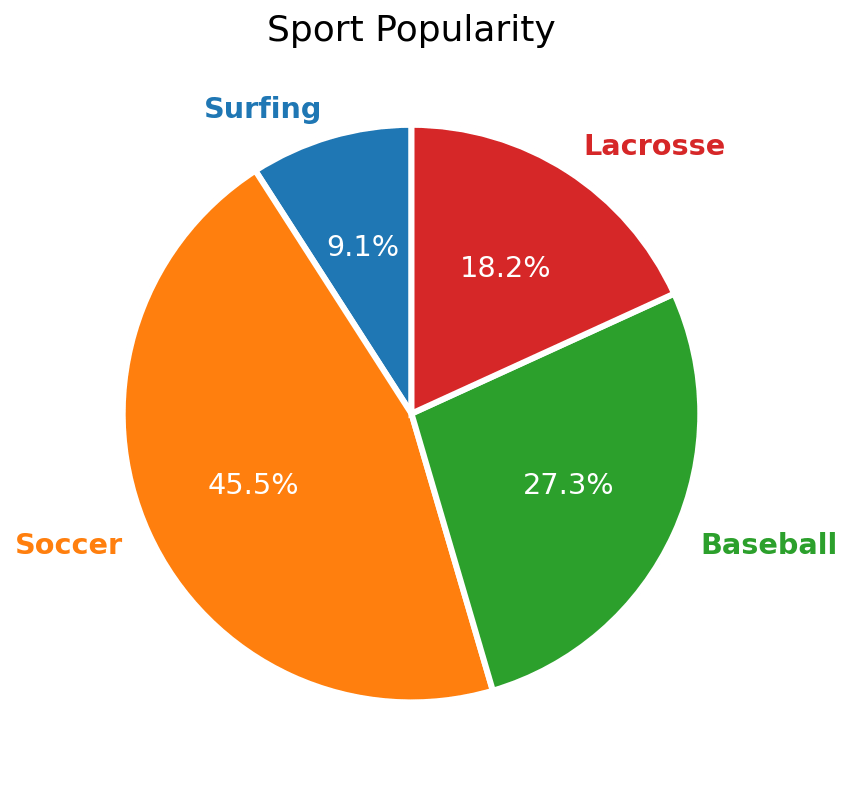
Now that we know this, we can do cool things like have the text labels match the color of the wedge they correspond to.
fig, ax = plt.subplots(figsize=(6, 6))

patches, texts, pcts = ax.pie(
    x, labels=labels, autopct='%.1f%%',
    wedgeprops={'linewidth': 3.0, 'edgecolor': 'white'},
    textprops={'size': 'x-large'},
    startangle=90)
# For each wedge, set the corresponding text label color to the wedge's
# face color.
for i, patch in enumerate(patches):
  texts[i].set_color(patch.get_facecolor())
plt.setp(pcts, color='white')
plt.setp(texts, fontweight=600)
ax.set_title('Sport Popularity', fontsize=18)
plt.tight_layout()
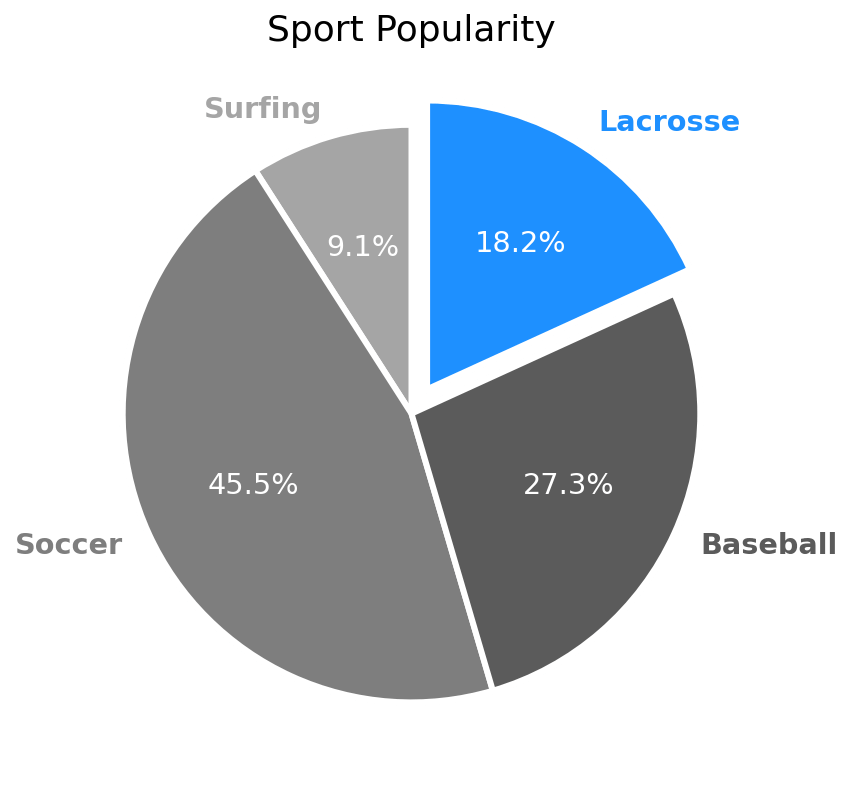
Lastly, let's change the colors of the pie wedges, highlighting one
wedge in particular with a brighter color. Let's also use the explode
parameter to shift the Lacrosse wedge out a bit to highlight it from the
rest.
import numpy as np

fig, ax = plt.subplots(figsize=(6, 6))

# Get four different grey colors.
cmap = plt.get_cmap('Greys')
colors = list(cmap(np.linspace(0.45, 0.85, len(x))))
# Swap in a bright blue for the Lacrosse color.
colors[3] = 'dodgerblue'

# You could also just manually assign colors very easily.
# colors = ['purple', 'black', 'pink', 'aqua']

patches, texts, pcts = ax.pie(
    x, labels=labels, autopct='%.1f%%',
    wedgeprops={'linewidth': 3.0, 'edgecolor': 'white'},
    textprops={'size': 'x-large'},
    startangle=90,
    colors=colors,
    # "Explode" the Lacrosse wedge to highlight it.
    explode=(0, 0, 0, 0.1))

for i, patch in enumerate(patches):
  # You could also do something like this if you want to assign colors
  # by some rule or by value.
  # if texts[i].get_text() == 'Lacrosse':
  #   patch.set_facecolor('dodgerblue')
  texts[i].set_color(patch.get_facecolor())
plt.setp(pcts, color='white')
plt.setp(texts, fontweight=600)
ax.set_title('Sport Popularity', fontsize=18)
plt.tight_layout()
Hopefully that helps get you started creating pie charts in Matplotlib. There are many other cool things you can do with pie (and donut) charts in Matplotlib, but we'll get to those in a follow-up post.