
Pandas
Plot Multiple Columns on the Same Line Chart in Pandas
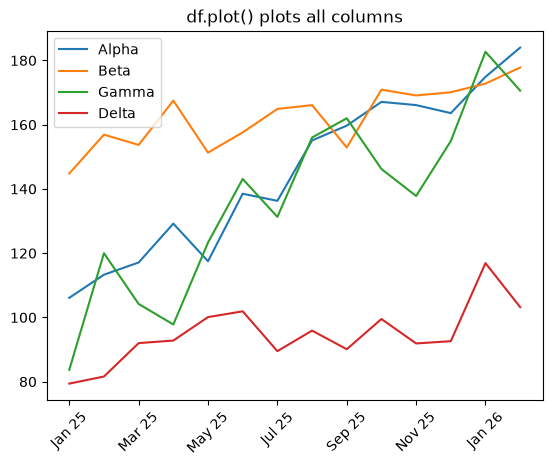
Plot multiple DataFrame columns on one line chart in Pandas with df.plot and per-column colors and styles.
Plot multiple DataFrame columns on one line chart in Pandas with df.plot and per-column colors and styles.
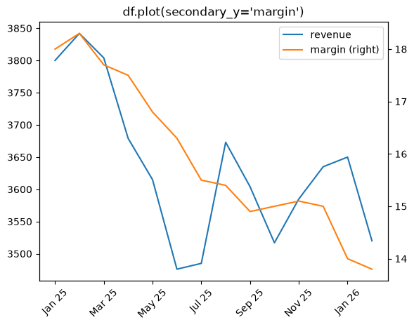
Plot a secondary y-axis in Pandas with df.plot(secondary_y=...) or ax.twinx().
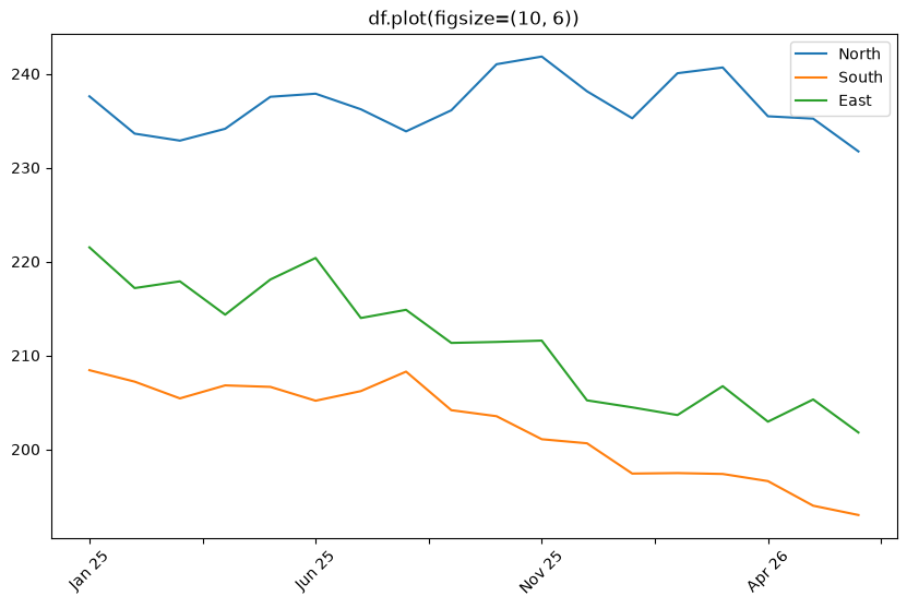
Change the figure size for Pandas df.plot() charts with figsize, plt.subplots, and rcParams.
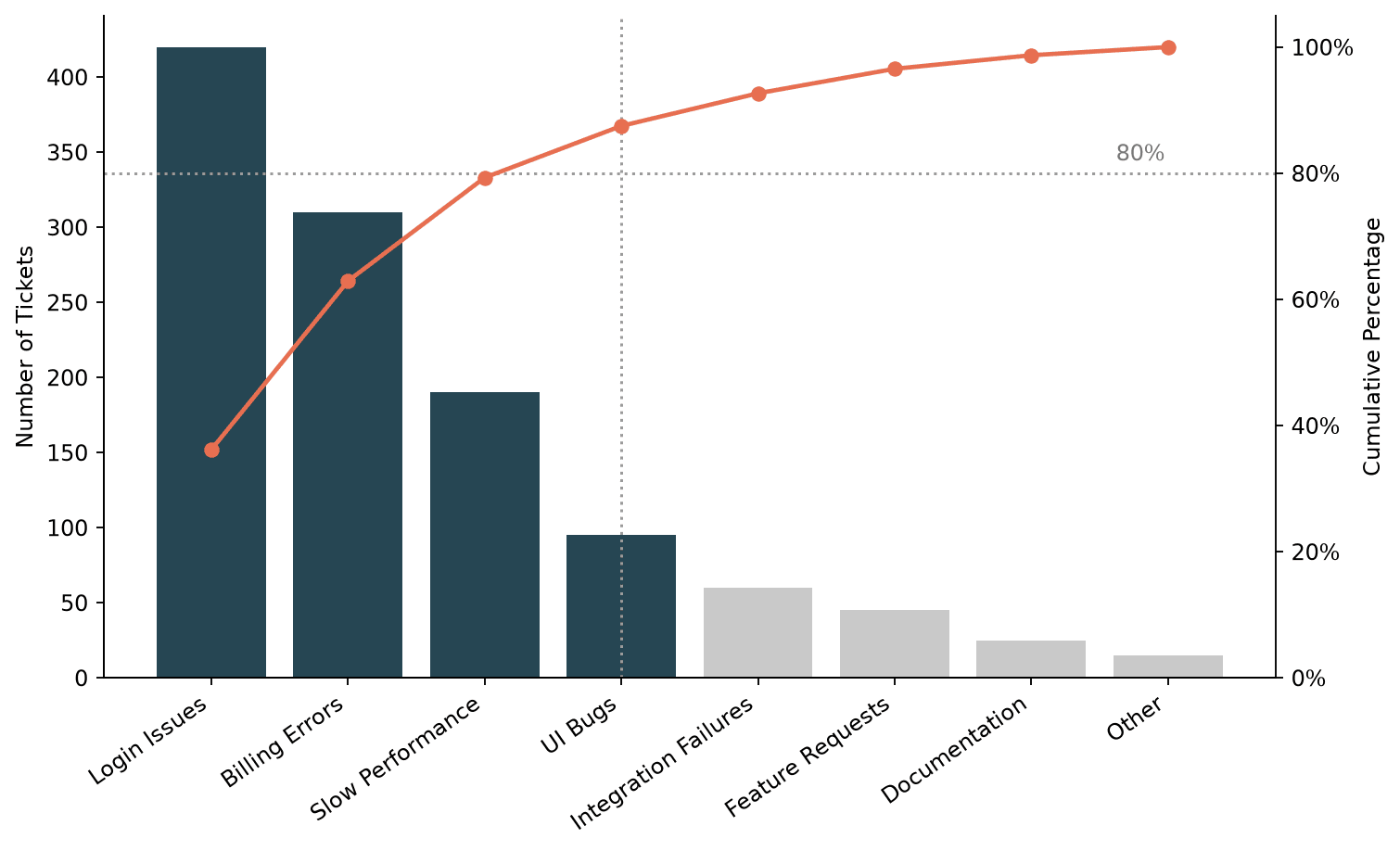
Build a Pareto chart in Matplotlib, combining a sorted bar chart with a cumulative percentage line to visualize the 80/20 rule.
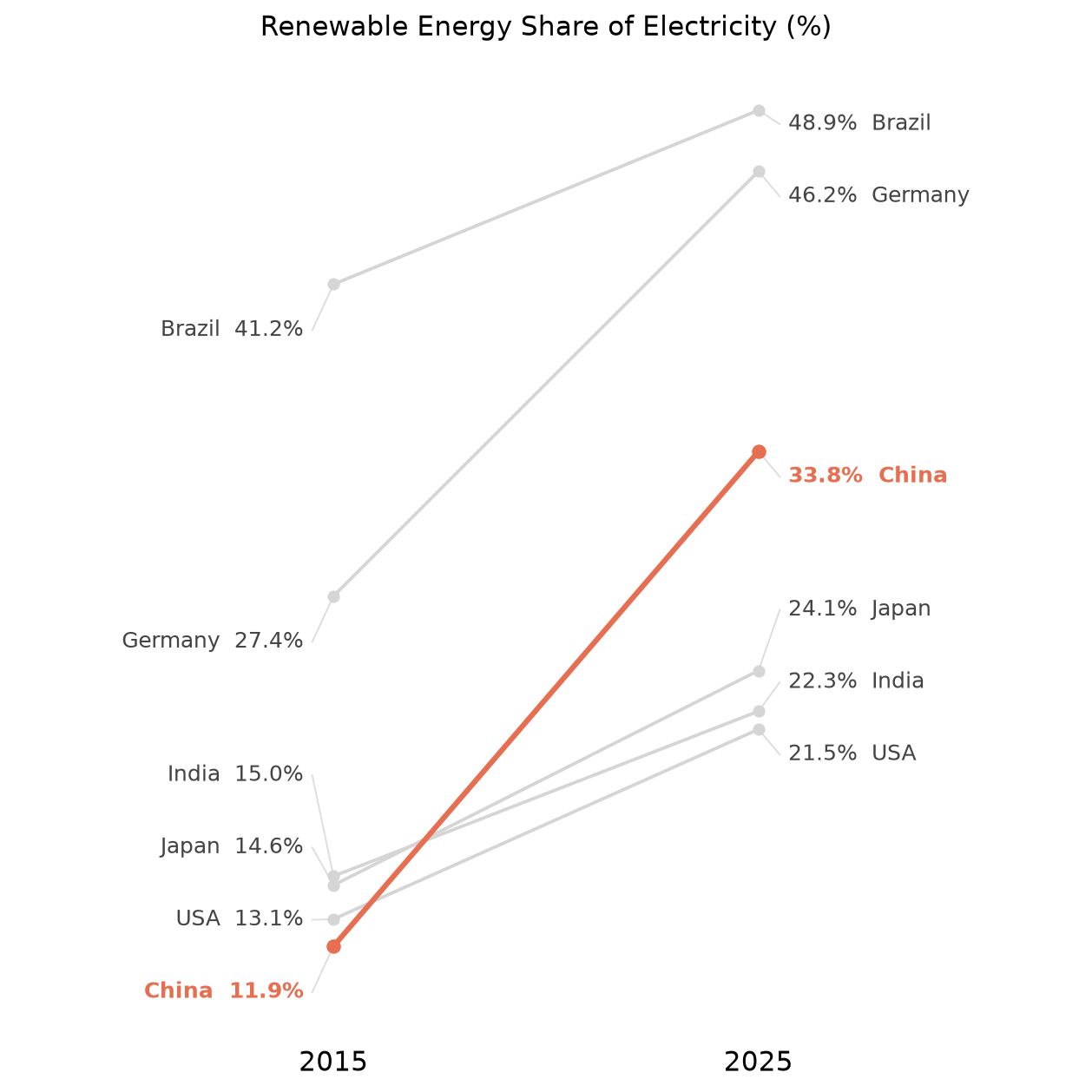
Build a slope chart in Matplotlib for comparing a value across two time points, including label decluttering and highlighting a category.
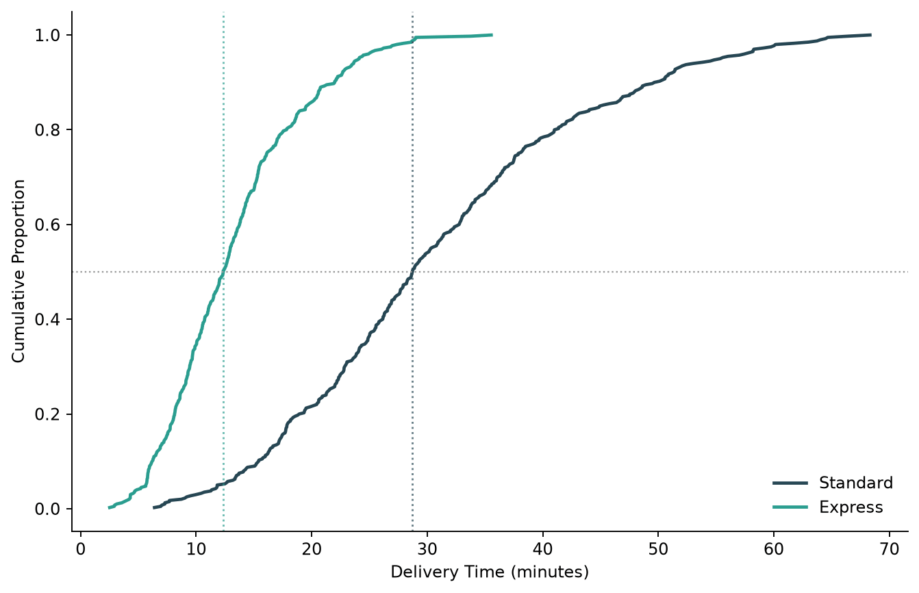
Plot an empirical cumulative distribution function (CDF) in Python, comparing a manual Matplotlib version with Seaborn's ecdfplot.
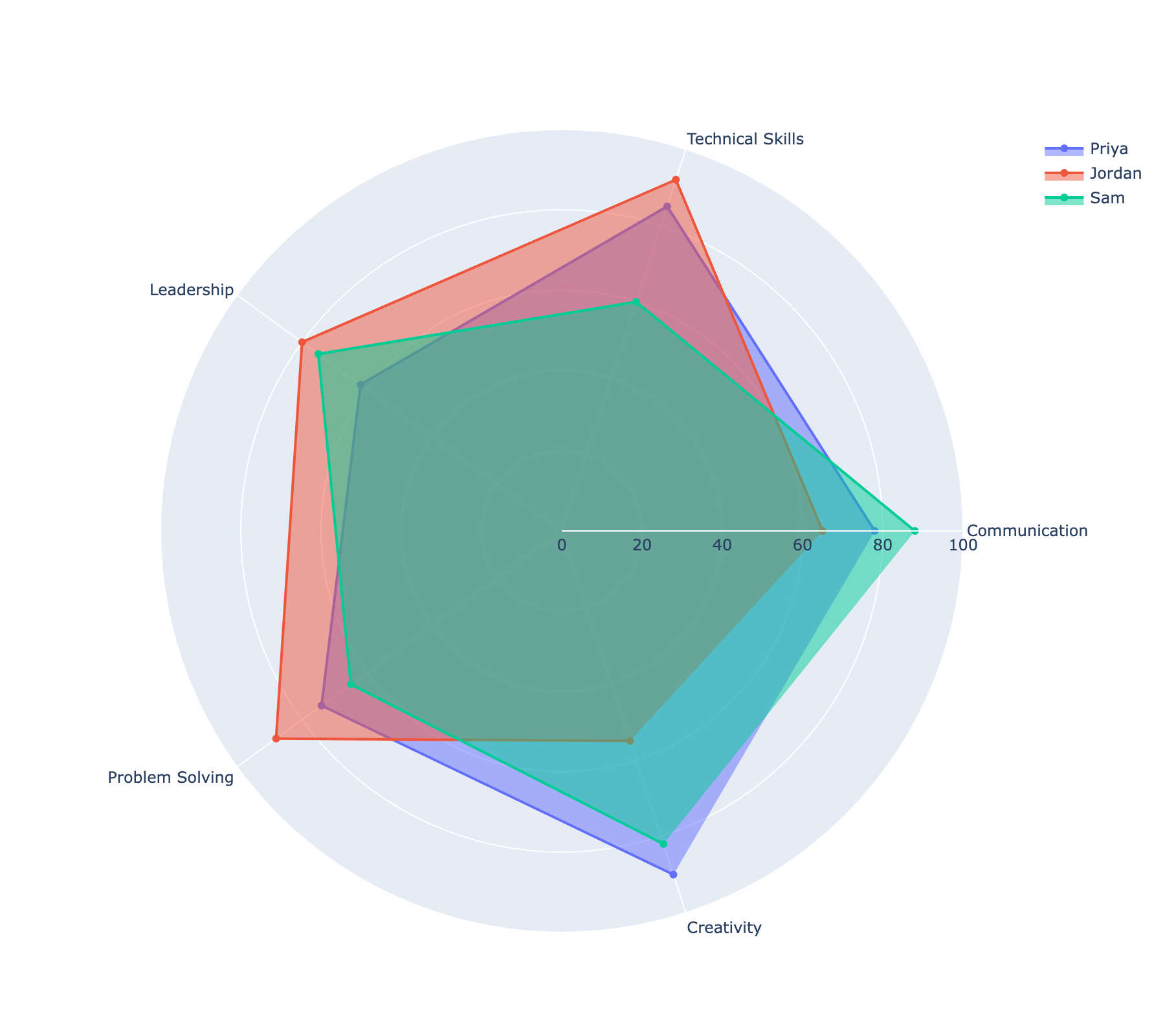
Build interactive radar (spider) charts in Plotly using go.Scatterpolar, including comparing multiple entities and customizing the radial axis.
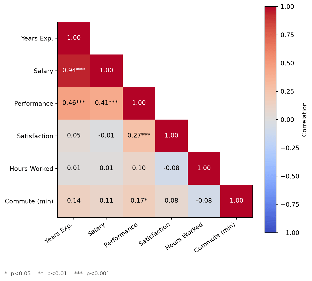
Build a correlation matrix heatmap in Matplotlib with rich annotations, including significance stars and a properly zero-centered color scale.
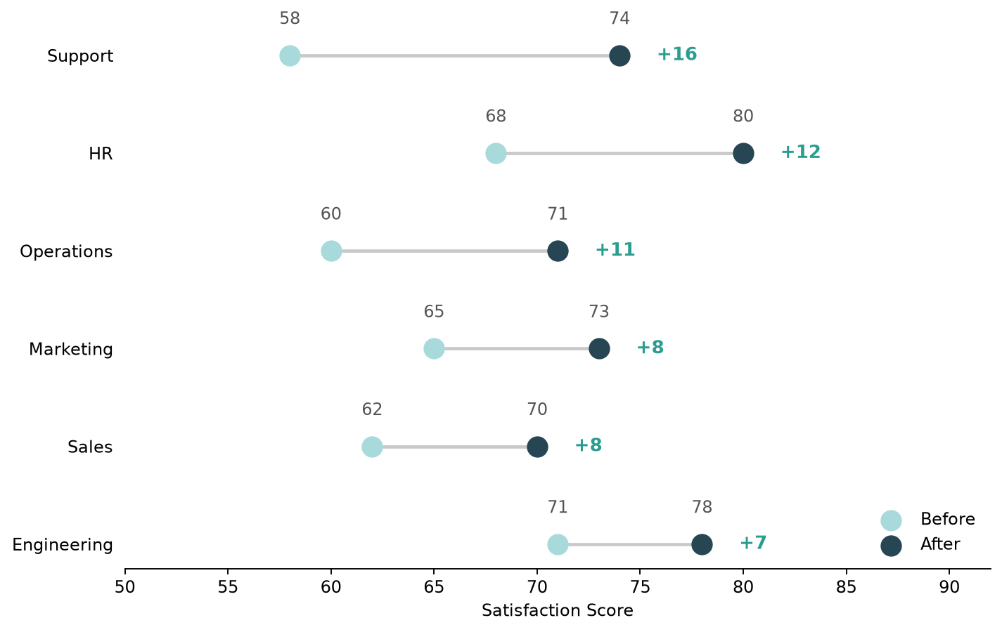
Build a dumbbell plot (dot-and-line chart) in Python with both Matplotlib and Plotly, and compare the two approaches.
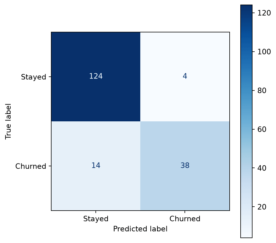
Plot a confusion matrix in Python using scikit-learn's ConfusionMatrixDisplay or a manually styled Seaborn heatmap.
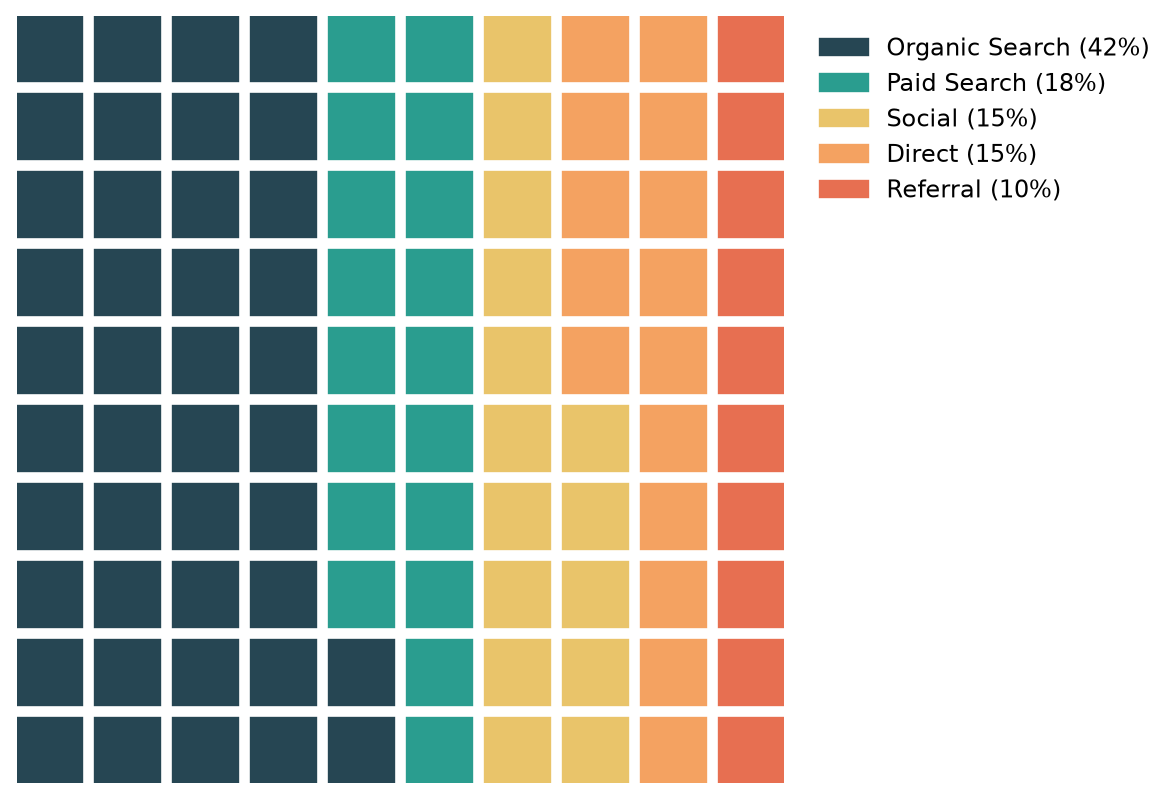
Build waffle charts (square pie charts) in Python with the PyWaffle library, including icons and custom layouts.
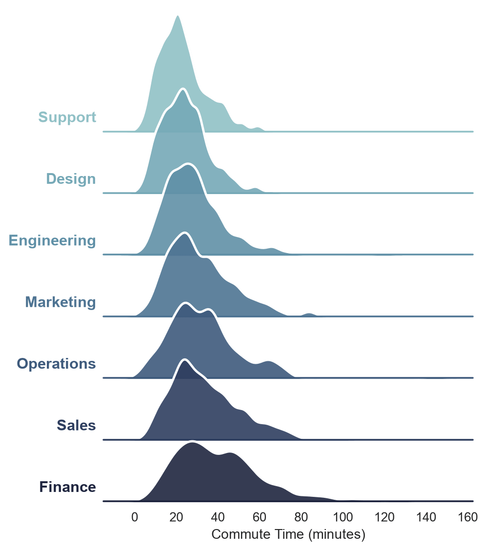
Build a ridge plot (joyplot) in Seaborn using a FacetGrid of overlapping KDE curves.
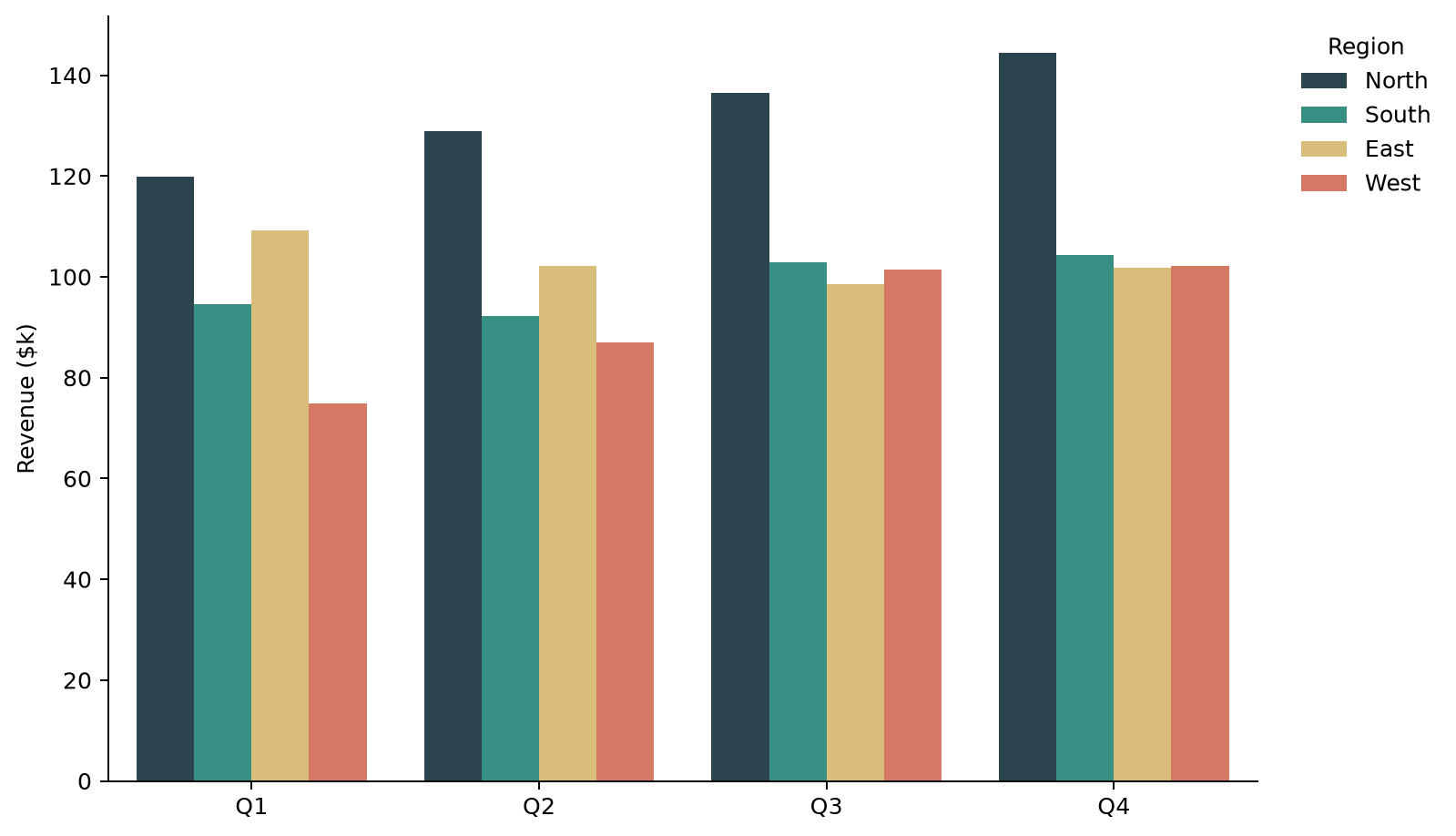
Plot grouped bar charts in Seaborn using hue, control group order, spacing, and orientation.
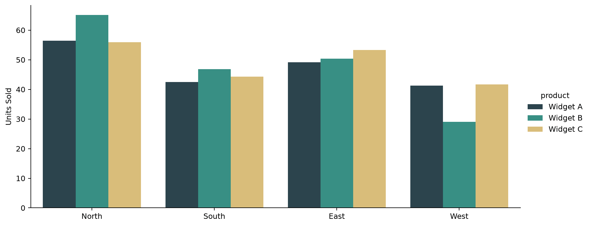
Control the size and shape of a Seaborn catplot using its height and aspect arguments instead of figsize.
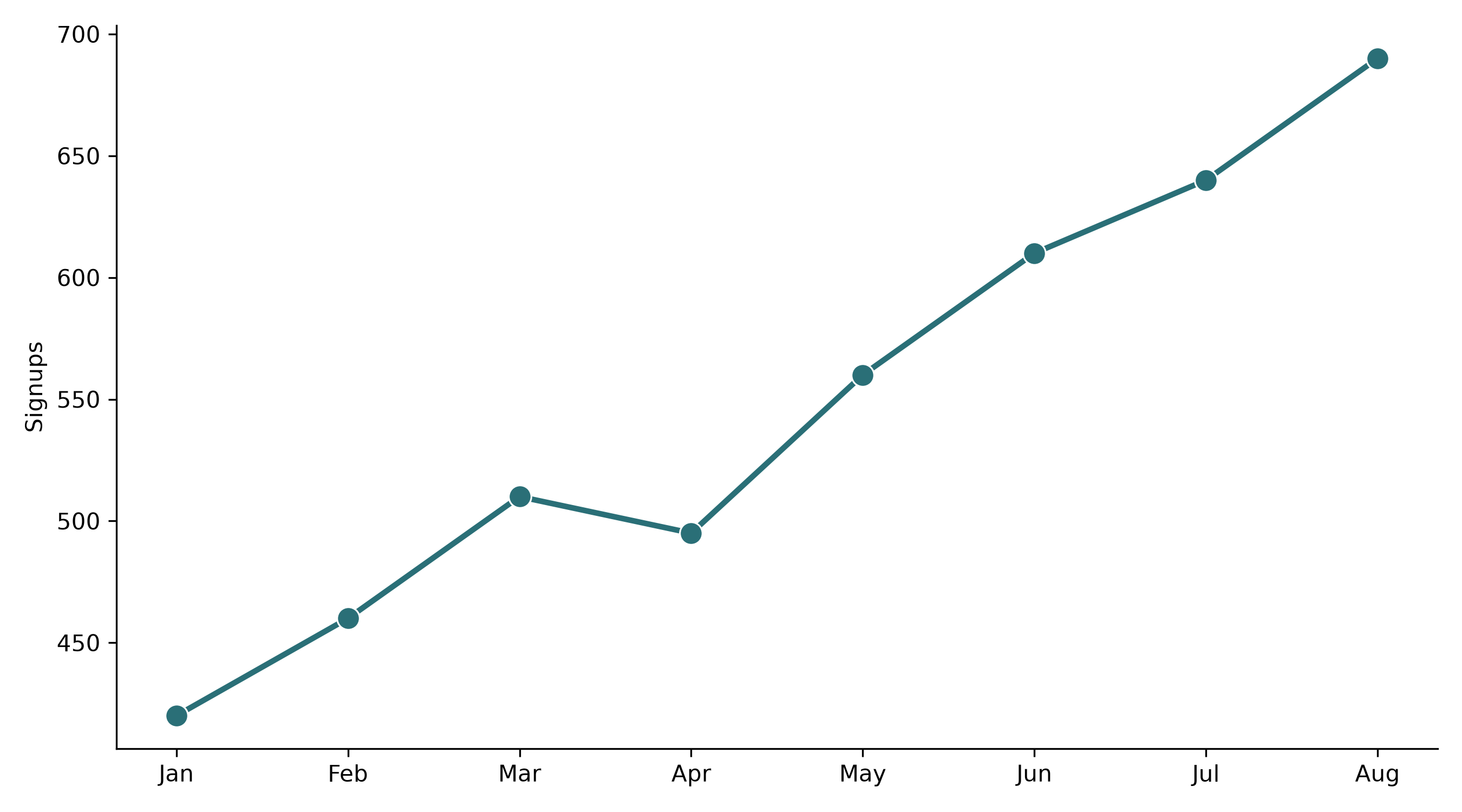
Save Seaborn plots at print- or presentation-quality resolution using dpi, bbox_inches, and vector formats.
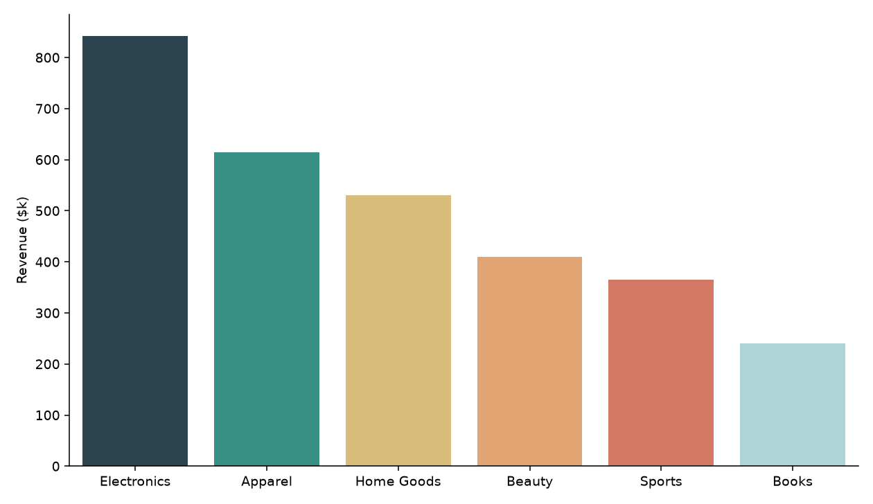
Set custom color palettes in Seaborn using hex lists, named palettes, category-to-color dictionaries, and diverging palettes.
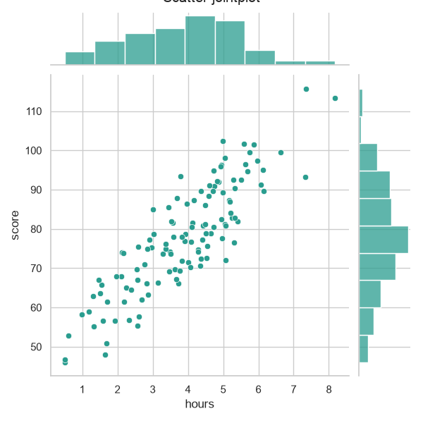
Plot bivariate distributions in Seaborn with jointplot, choosing from scatter, hex, and kde kinds.
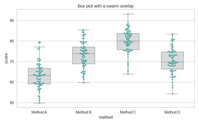
Overlay a swarm (scatter) plot on a Seaborn box plot to show every point alongside the summary.
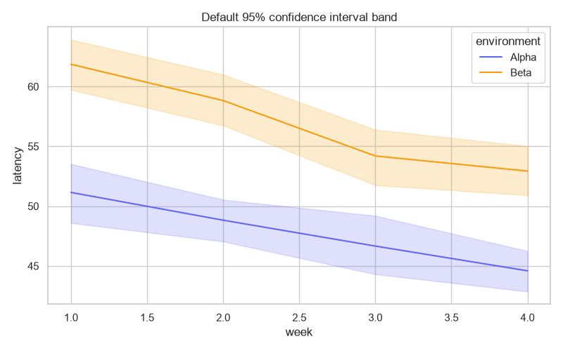
Create, modify, and remove confidence interval bands in Seaborn with the errorbar parameter.
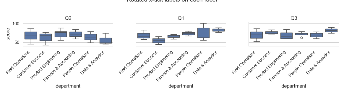
Rotate tick labels on Seaborn FacetGrid and pairplot figures with set_xticklabels and a small loop.