
A radar chart (also called a spider chart or star chart) plots several variables on axes that radiate from a shared center, so one entity's shape across all of them is visible at a glance. It's a natural fit for comparing something across a fixed set of dimensions, like skill ratings, product specs, or survey scores. Plotly builds one from go.Scatterpolar, and gets hover tooltips and zooming for free in the process, which a static radar chart can't offer.
Quick Example
go.Scatterpolar takes r (the values) and theta (the category labels) the same way a bar chart takes y and x; fill="toself" closes the shape and fills it in.
import plotly.graph_objects as go

categories = ["Communication", "Technical Skills", "Leadership", "Problem Solving", "Creativity"]
values = [78, 85, 62, 74, 90]

fig = go.Figure(go.Scatterpolar(
    r=values, theta=categories, fill="toself", name="Priya",
))

fig.update_layout(
    polar=dict(radialaxis=dict(visible=True, range=[0, 100])),
    showlegend=False,
)
fig.show()
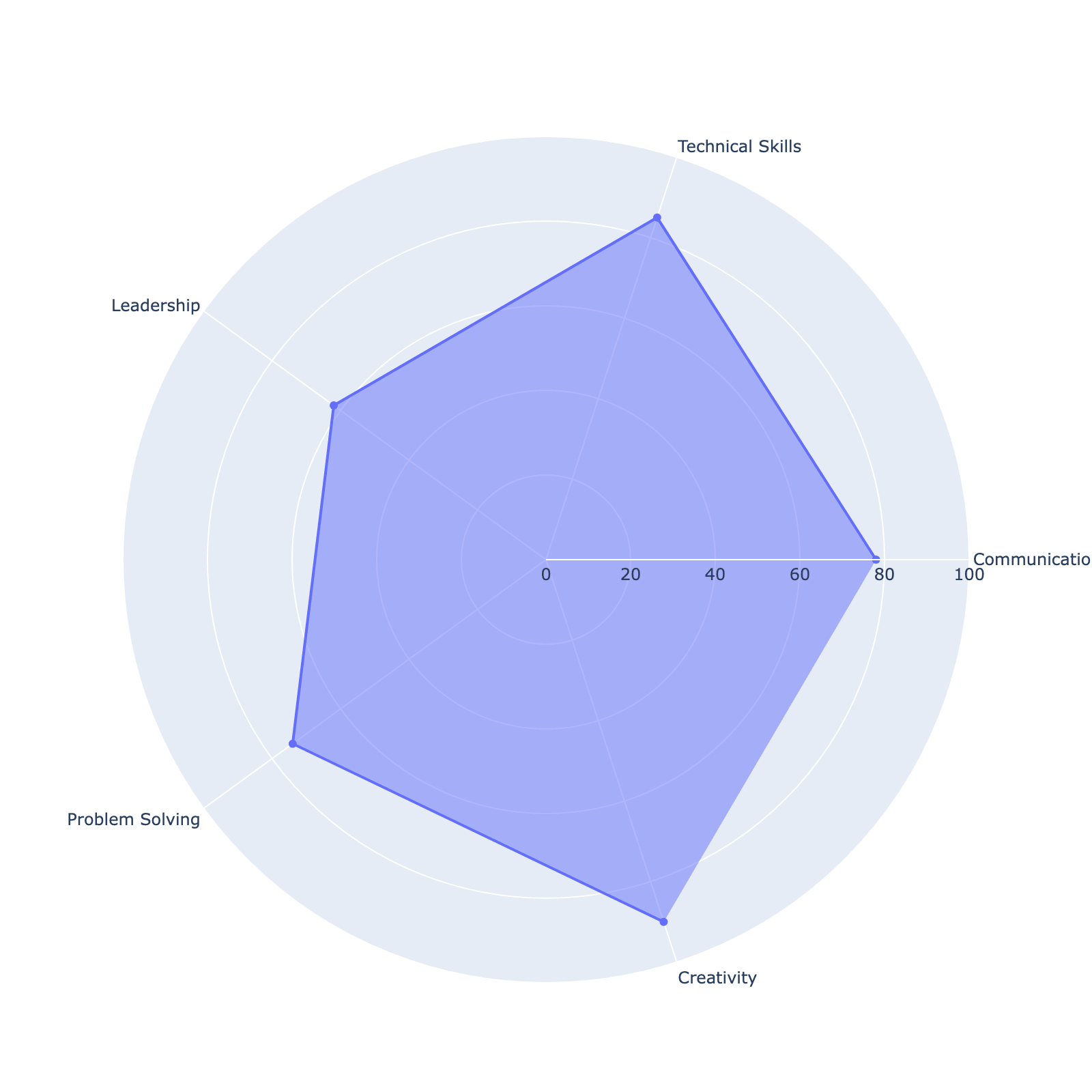
Unlike Matplotlib's polar axes, go.Scatterpolar closes the shape on its own once fill="toself" is set; there's no need to manually repeat the first category at the end of the list the way a Matplotlib radar chart requires. Setting range=[0, 100] on the radialaxis matters here, since the axis otherwise scales to the data's own min and max, which makes it harder to compare this chart against another one built the same way.
Comparing multiple entities
Add one go.Scatterpolar trace per entity to a single figure to overlay several shapes for direct comparison, which is usually where a radar chart earns its keep over a table of the same numbers.
employees = {
    "Priya": [78, 85, 62, 74, 90],
    "Jordan": [65, 92, 80, 88, 55],
    "Sam": [88, 60, 75, 65, 82],
}

fig = go.Figure()
for name, values in employees.items():
    fig.add_trace(go.Scatterpolar(
        r=values, theta=categories, fill="toself", name=name,
    ))

fig.update_layout(
    polar=dict(radialaxis=dict(visible=True, range=[0, 100])),
    showlegend=True,
)
fig.show()
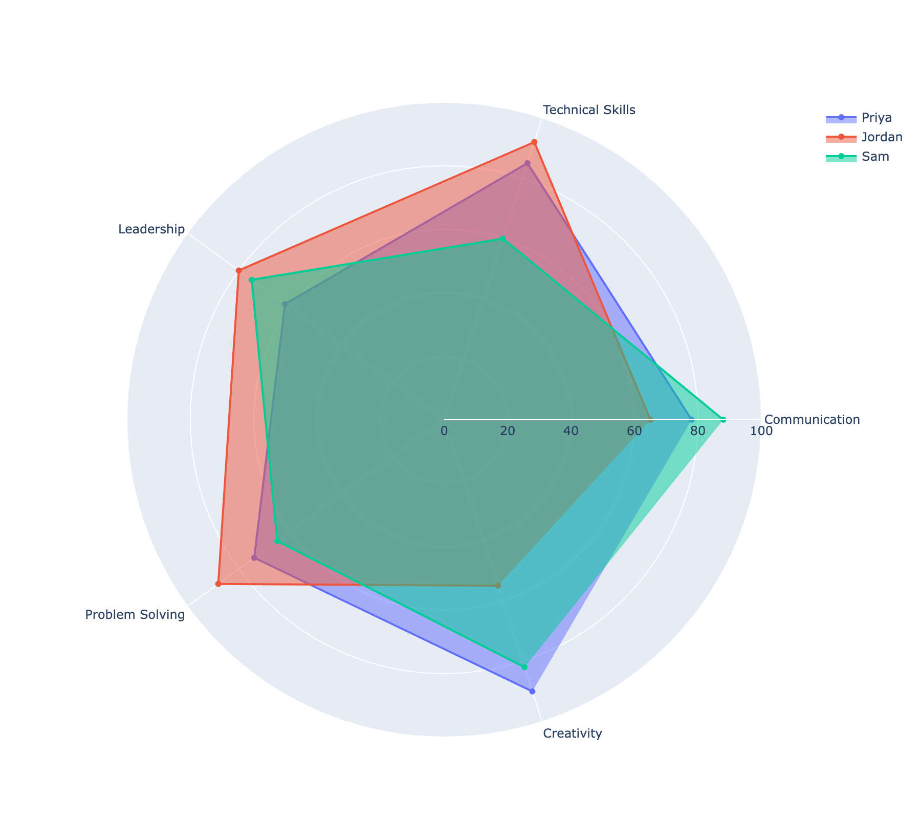
Each trace's name feeds the legend automatically, and clicking a legend entry toggles that trace on and off, which is a genuinely useful way to reduce clutter once more than two or three shapes start overlapping. This is a case where the interactive version has a real edge over a static one: a printed chart with three overlapping filled shapes gets messy fast, but a reader exploring this one in a notebook or dashboard can isolate one person at a time.
Customizing the radial axis
The radial axis doesn't have to start at zero. Narrowing its range stretches out the visual distance between values that would otherwise look close together near the center.
fig.update_layout(
    polar=dict(radialaxis=dict(visible=True, range=[40, 100])),
)
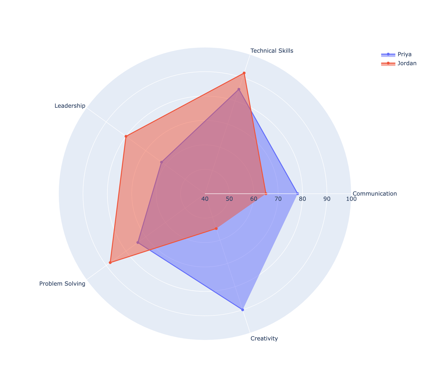
Every point on a Scatterpolar trace is hoverable by default, showing its exact value without cluttering the chart with permanent labels, which is the callout shown on Jordan's "Technical Skills" point above. Narrowing the range is worth doing deliberately, though: it exaggerates real differences, but it can also make a small, meaningless gap look dramatic, so it's best reserved for cases where the low end of the scale (below 40 here) genuinely never comes into play.
Practical Tips
- Set a fixed
rangeonradialaxis([0, 100], or whatever the data's real scale is) rather than leaving it automatic, especially once you're comparing more than one radar chart. fill="toself"closes the polygon automatically; there's no need to repeat the first category at the end ofrandthetathe way Matplotlib's polar axes require.- One
go.Scatterpolartrace per entity is what makes multiple radar shapes comparable on the same chart, and gives each one its own toggleable legend entry for free. - Narrow the radial range's lower bound to stretch out real differences between similar values, but only when the excluded range is genuinely not meaningful to the comparison.
- For a quick one-off chart from a tidy DataFrame,
plotly.express.line_polar()(withline_close=Trueandfill="toself") needs less setup than building traces by hand withgo.Scatterpolar.