A radar chart (also known as a spider or star chart) is a visualization used to display multivariate data across three or more dimensions, using a consistent scale. Not everyone is a huge fan of these charts, but I think they have their place in comparing entities across a range of dimensions in a visually appealing way.
Get our data
A radar chart is useful when trying to compare the relative weight or importance of different dimensions within one or more entities. The example we'll use here is with cars. Cars have different fuel efficiency, range, acceleration, torque, storage capacity and costs. We can use a radar chart to benchmark specific cars against each other and against the broader population. Let's start with getting our data.
import matplotlib.pyplot as plt
import numpy as np
import pandas as pd
# For our sample data.
from vega_datasets import data

# Load cars dataset so we can compare cars across
# a few dimensions in the radar plot.
df = data.cars()
df.head()
| Acceleration | Cylinders | Displacement | Horsepower | Miles_per_Gallon | Name | Origin | Weight_in_lbs | Year | |
|---|---|---|---|---|---|---|---|---|---|
| 0 | 12.0 | 8 | 307.0 | 130.0 | 18.0 | chevrolet chevelle malibu | USA | 3504 | 1970-01-01 |
| 1 | 11.5 | 8 | 350.0 | 165.0 | 15.0 | buick skylark 320 | USA | 3693 | 1970-01-01 |
| 2 | 11.0 | 8 | 318.0 | 150.0 | 18.0 | plymouth satellite | USA | 3436 | 1970-01-01 |
| 3 | 12.0 | 8 | 304.0 | 150.0 | 16.0 | amc rebel sst | USA | 3433 | 1970-01-01 |
| 4 | 10.5 | 8 | 302.0 | 140.0 | 17.0 | ford torino | USA | 3449 | 1970-01-01 |
Each record is a car with its specs across a range of attributes. We need to transform those attributes into a consistent scale, so let's do a linear transformation of each to convert to a 0-100 scale.
# The attributes we want to use in our radar plot.
factors = ['Acceleration', 'Displacement', 'Horsepower',
           'Miles_per_Gallon', 'Weight_in_lbs']

# New scale should be from 0 to 100.
new_max = 100
new_min = 0
new_range = new_max - new_min

# Do a linear transformation on each variable to change value
# to [0, 100].
for factor in factors:
  max_val = df[factor].max()
  min_val = df[factor].min()
  val_range = max_val - min_val
  df[factor + '_Adj'] = df[factor].apply(
      lambda x: (((x - min_val) * new_range) / val_range) + new_min)


# Add the year to the name of the car to differentiate between
# the same model.
df['Car Model'] = df.apply(lambda row: '{} {}'.format(row.Name, row.Year.year), axis=1)

# Trim down to cols we want and rename to be nicer.
dft = df.loc[:, ['Car Model', 'Acceleration_Adj', 'Displacement_Adj',
                 'Horsepower_Adj', 'Miles_per_Gallon_Adj',
                 'Weight_in_lbs_Adj']]

dft.rename(columns={
    'Acceleration_Adj': 'Acceleration',
    'Displacement_Adj': 'Displacement',
    'Horsepower_Adj': 'Horsepower',
    'Miles_per_Gallon_Adj': 'MPG',
    'Weight_in_lbs_Adj': 'Weight'
}, inplace=True)

dft.set_index('Car Model', inplace=True)

dft.head()
| Acceleration | Displacement | Horsepower | MPG | Weight | |
|---|---|---|---|---|---|
| Car Model | |||||
| chevrolet chevelle malibu 1970 | 23.809524 | 61.757106 | 45.652174 | 23.936170 | 53.614970 |
| buick skylark 320 1970 | 20.833333 | 72.868217 | 64.673913 | 15.957447 | 58.973632 |
| plymouth satellite 1970 | 17.857143 | 64.599483 | 56.521739 | 23.936170 | 51.686986 |
| amc rebel sst 1970 | 23.809524 | 60.981912 | 56.521739 | 18.617021 | 51.601928 |
| ford torino 1970 | 14.880952 | 60.465116 | 51.086957 | 21.276596 | 52.055571 |
We're all set with the data - we have a car in each row with five attributes, each with a value between zero and 100. Let's create some radar charts.
Building the Radar Chart
Creating a radar chart in Matplotlib is definitely not a straightforward affair, so we'll break it down into a few steps. First, let's get the base figure and our data plotted on a polar (aka circular) axis.
# Each attribute we'll plot in the radar chart.
labels = ['Acceleration', 'Displacement', 'Horsepower', 'MPG', 'Weight']

# Let's look at the 1970 Chevy Impala and plot it.
values = dft.loc['chevrolet impala 1970'].tolist()

# Number of variables we're plotting.
num_vars = len(labels)

# Split the circle into even parts and save the angles
# so we know where to put each axis.
angles = np.linspace(0, 2 * np.pi, num_vars, endpoint=False).tolist()

# The plot is a circle, so we need to "complete the loop"
# and append the start value to the end.
values += values[:1]
angles += angles[:1]

# ax = plt.subplot(polar=True)
fig, ax = plt.subplots(figsize=(6, 6), subplot_kw=dict(polar=True))

# Draw the outline of our data.
ax.plot(angles, values, color='red', linewidth=1)
# Fill it in.
ax.fill(angles, values, color='red', alpha=0.25)
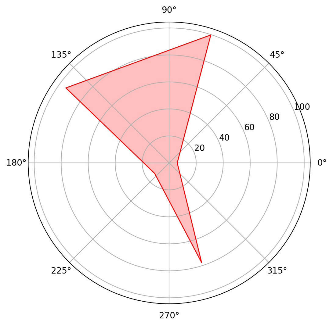
It's a start but still lacking in a few ways. Some things to highlight before we move on. fig, ax = plt.subplots(figsize=(6, 6), subplot_kw=dict(polar=True)) is a nice (object-oriented) way to create the circular plot and figure itself, as well as set the size of the overall chart.
We create the data plot itself by sequentially calling ax.plot(), which plots the line outline, and ax.fill() which fills in the shape. The two main arguments are angles, which is a list of the angle radians between each axis emanating from the center, and values, which is a list of the data values.
You can see numerous things are wrong with the chart though - the axes don't align with the shape, there are no labels, and the grid itself seems to have two lines right around 100.
Fix the axes
We'll first fix the axes by using some methods specific to polar plots.
# Fix axis to go in the right order and start at 12 o'clock.
ax.set_theta_offset(np.pi / 2)
ax.set_theta_direction(-1)

# Draw axis lines for each angle and label.
ax.set_thetagrids(np.degrees(angles), labels)
Better. A few things changed here:
- Our first axis starts right at 12 o'clock (or zero degrees)
- Our axes are ordered clockwise, according to the list of attributes we fed in
- We have labels for both the axes and the gridlines
- The axes and red shape are now aligned
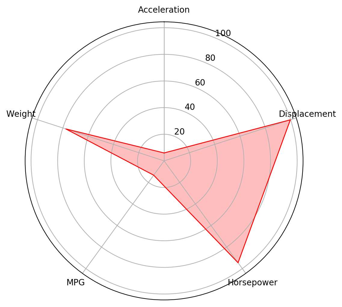
The axis labels though aren't perfect though; several of them overlap with the grid itself and the alignment could be better. Let's fix that.
# Go through labels and adjust alignment based on where
# it is in the circle.
for label, angle in zip(ax.get_xticklabels(), angles):
  if angle in (0, np.pi):
    label.set_horizontalalignment('center')
  elif 0 < angle < np.pi:
    label.set_horizontalalignment('left')
  else:
    label.set_horizontalalignment('right')
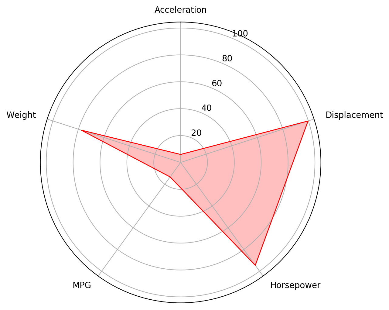
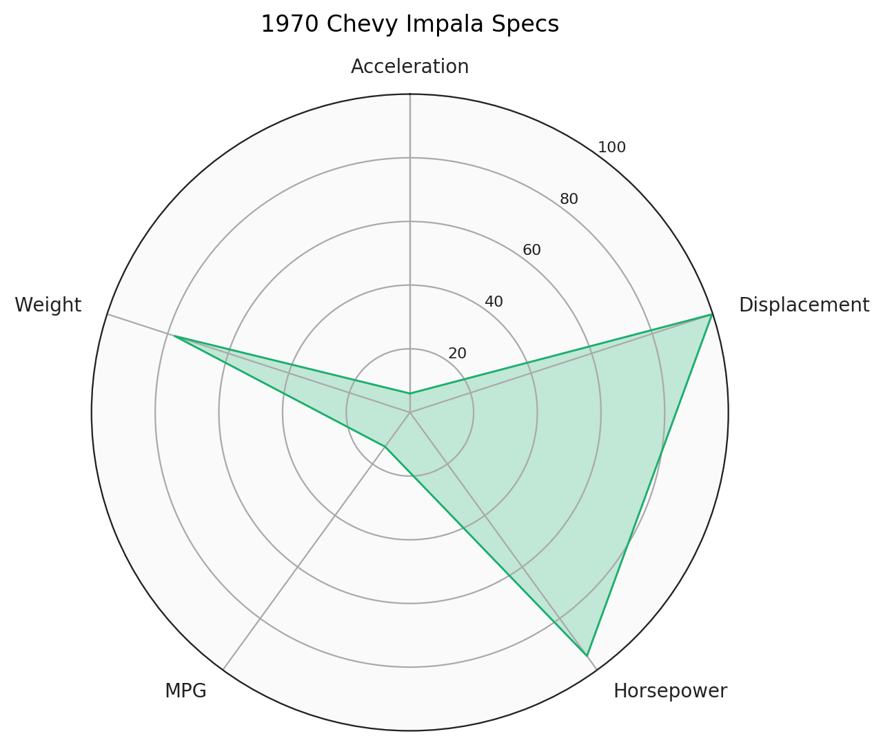
Better! Still a few subtle problems though. Let's make sure the grid goes from 0 to 100, no more, no less. Let's also move the grid labels (0, 20, ... , 100) slightly so they're centered between the first two axes.
# Ensure radar goes from 0 to 100.
ax.set_ylim(0, 100)
# You can also set gridlines manually like this:
# ax.set_rgrids([20, 40, 60, 80, 100])

# Set position of y-labels (0-100) to be in the middle
# of the first two axes.
ax.set_rlabel_position(180 / num_vars)
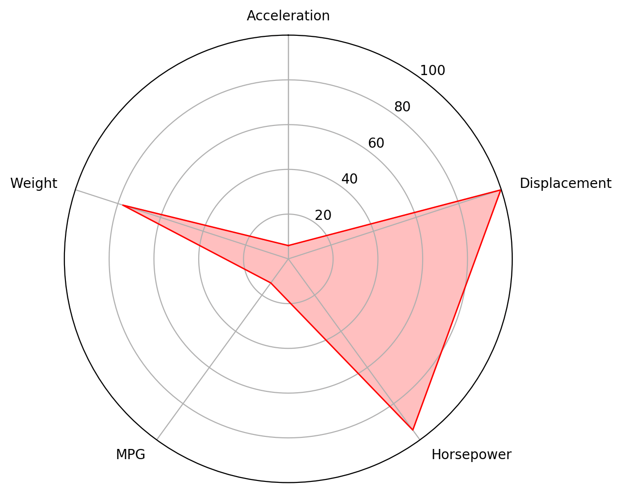
Lastly, let's change the color of the plot and add some styling changes as well as a title for the figure. So all together, that looks like:
# Each attribute we'll plot in the radar chart.
labels = ['Acceleration', 'Displacement', 'Horsepower', 'MPG', 'Weight']

# Let's look at the 1970 Chevy Impala and plot it.
car = 'chevrolet impala 1970'
values = dft.loc[car].tolist()

# Number of variables we're plotting.
num_vars = len(labels)

# Split the circle into even parts and save the angles
# so we know where to put each axis.
angles = np.linspace(0, 2 * np.pi, num_vars, endpoint=False).tolist()

# The plot is a circle, so we need to "complete the loop"
# and append the start value to the end.
values += values[:1]
angles += angles[:1]

# ax = plt.subplot(polar=True)
fig, ax = plt.subplots(figsize=(6, 6), subplot_kw=dict(polar=True))

# Draw the outline of our data.
ax.plot(angles, values, color='#1aaf6c', linewidth=1)
# Fill it in.
ax.fill(angles, values, color='#1aaf6c', alpha=0.25)

# Fix axis to go in the right order and start at 12 o'clock.
ax.set_theta_offset(np.pi / 2)
ax.set_theta_direction(-1)

# Draw axis lines for each angle and label.
ax.set_thetagrids(np.degrees(angles), labels)

# Go through labels and adjust alignment based on where
# it is in the circle.
for label, angle in zip(ax.get_xticklabels(), angles):
  if angle in (0, np.pi):
    label.set_horizontalalignment('center')
  elif 0 < angle < np.pi:
    label.set_horizontalalignment('left')
  else:
    label.set_horizontalalignment('right')

# Ensure radar goes from 0 to 100.
ax.set_ylim(0, 100)
# You can also set gridlines manually like this:
# ax.set_rgrids([20, 40, 60, 80, 100])

# Set position of y-labels (0-100) to be in the middle
# of the first two axes.
ax.set_rlabel_position(180 / num_vars)

# Add some custom styling.
# Change the color of the tick labels.
ax.tick_params(colors='#222222')
# Make the y-axis (0-100) labels smaller.
ax.tick_params(axis='y', labelsize=8)
# Change the color of the circular gridlines.
ax.grid(color='#AAAAAA')
# Change the color of the outermost gridline (the spine).
ax.spines['polar'].set_color('#222222')
# Change the background color inside the circle itself.
ax.set_facecolor('#FAFAFA')

# Lastly, give the chart a title and give it some
# padding above the "Acceleration" label.
ax.set_title('1970 Chevy Impala Specs', y=1.08)
Comparing entities
Radar charts are even more useful when comparing multiple entities. As a final example, we'll add a few more cars to the same plot. To do this, you just call ax.plot() and ax.show() for each record. We create a helper function below to make it a bit more DRY (Don't Repeat Yourself).
Note also that we add label=car_model to each ax.plot() and then call ax.legend() at the very end to add a legend to the chart as well so we can differentiate between the shapes.
# Each attribute we'll plot in the radar chart.
labels = ['Acceleration', 'Displacement', 'Horsepower', 'MPG', 'Weight']

# Number of variables we're plotting.
num_vars = len(labels)

# Split the circle into even parts and save the angles
# so we know where to put each axis.
angles = np.linspace(0, 2 * np.pi, num_vars, endpoint=False).tolist()

# The plot is a circle, so we need to "complete the loop"
# and append the start value to the end.
angles += angles[:1]

# ax = plt.subplot(polar=True)
fig, ax = plt.subplots(figsize=(6, 6), subplot_kw=dict(polar=True))

# Helper function to plot each car on the radar chart.
def add_to_radar(car_model, color):
  values = dft.loc[car_model].tolist()
  values += values[:1]
  ax.plot(angles, values, color=color, linewidth=1, label=car_model)
  ax.fill(angles, values, color=color, alpha=0.25)

# Add each car to the chart.
add_to_radar('chevrolet impala 1970', '#1aaf6c')
add_to_radar('peugeot 504 1979', '#429bf4')
add_to_radar('ford granada 1977', '#d42cea')

# Fix axis to go in the right order and start at 12 o'clock.
ax.set_theta_offset(np.pi / 2)
ax.set_theta_direction(-1)

# Draw axis lines for each angle and label.
ax.set_thetagrids(np.degrees(angles), labels)

# Go through labels and adjust alignment based on where
# it is in the circle.
for label, angle in zip(ax.get_xticklabels(), angles):
  if angle in (0, np.pi):
    label.set_horizontalalignment('center')
  elif 0 < angle < np.pi:
    label.set_horizontalalignment('left')
  else:
    label.set_horizontalalignment('right')

# Ensure radar goes from 0 to 100.
ax.set_ylim(0, 100)
# You can also set gridlines manually like this:
# ax.set_rgrids([20, 40, 60, 80, 100])

# Set position of y-labels (0-100) to be in the middle
# of the first two axes.
ax.set_rlabel_position(180 / num_vars)

# Add some custom styling.
# Change the color of the tick labels.
ax.tick_params(colors='#222222')
# Make the y-axis (0-100) labels smaller.
ax.tick_params(axis='y', labelsize=8)
# Change the color of the circular gridlines.
ax.grid(color='#AAAAAA')
# Change the color of the outermost gridline (the spine).
ax.spines['polar'].set_color('#222222')
# Change the background color inside the circle itself.
ax.set_facecolor('#FAFAFA')

# Add title.
ax.set_title('Comparing Cars Across Dimensions', y=1.08)

# Add a legend as well.
ax.legend(loc='upper right', bbox_to_anchor=(1.3, 1.1))

Thanks and hopefully this is helpful to get a grasp of radar charts in Matplotlib!