
A Pareto chart pairs a bar chart of categories, sorted from most to least frequent, with a cumulative percentage line running on a second axis. It's built around the Pareto principle, the observation that roughly 80% of effects tend to come from roughly 20% of causes, and the chart makes that split visible: the bars show where the volume actually is, and the line shows how quickly it adds up.
Quick Example
Bars on the primary axis, a cumulative-percentage line on a twin secondary axis, sharing the same x-axis.
import matplotlib.pyplot as plt
import matplotlib.ticker as mtick

df = df.sort_values("count", ascending=False).reset_index(drop=True)
df["cum_pct"] = df["count"].cumsum() / df["count"].sum() * 100

fig, ax1 = plt.subplots(figsize=(9, 5.5))
ax1.bar(df["category"], df["count"], color="#264653")
ax1.set_ylabel("Number of Tickets")

ax2 = ax1.twinx()
ax2.plot(df["category"], df["cum_pct"], color="#e76f51", marker="o", linewidth=2)
ax2.set_ylabel("Cumulative Percentage")
ax2.set_ylim(0, 105)
ax2.yaxis.set_major_formatter(mtick.PercentFormatter())
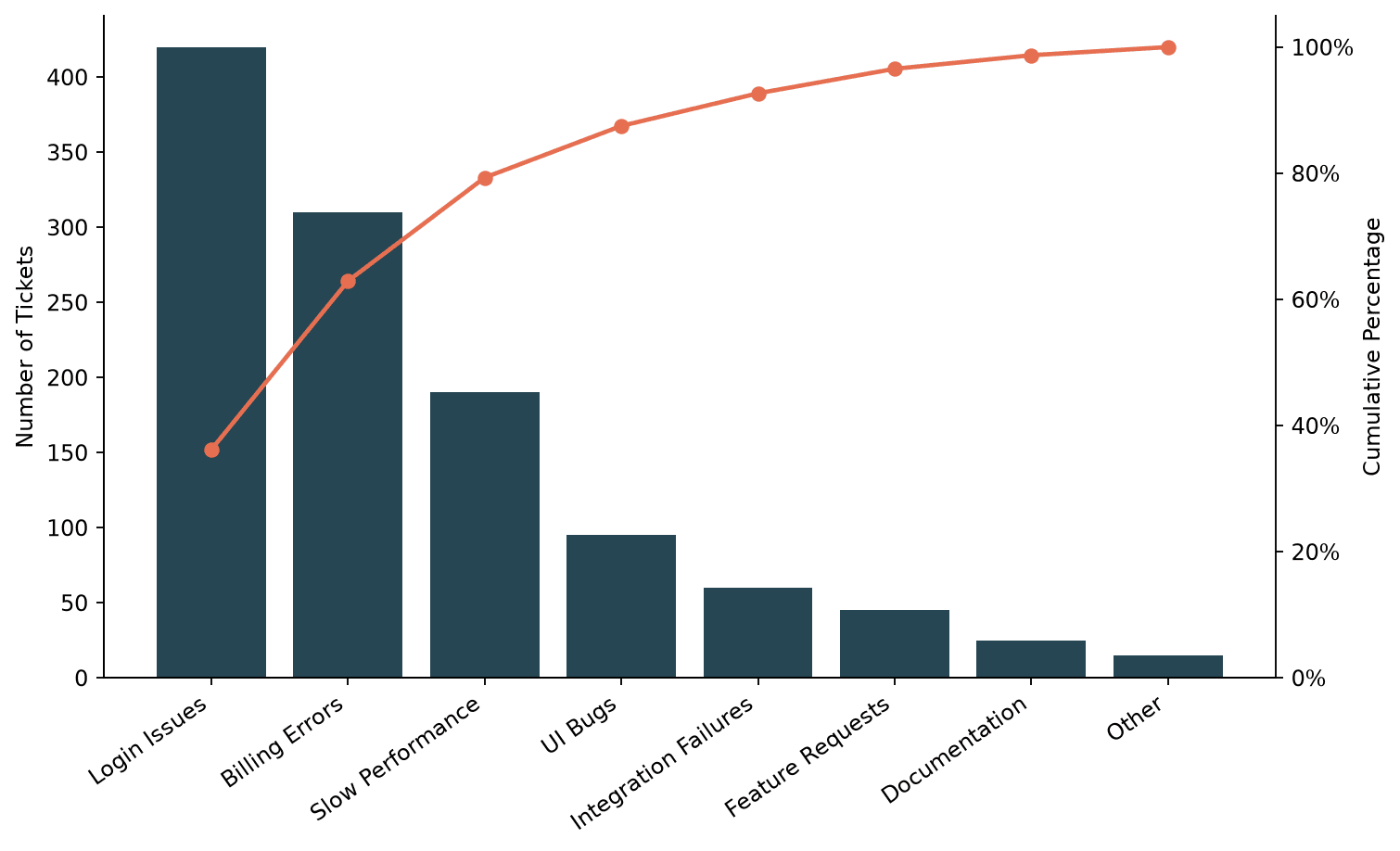
Three things make this a Pareto chart rather than just a bar-and-line combo: the bars are sorted descending by value, cumsum() builds a running total rather than plotting the raw counts again, and dividing by the grand total converts that running total into a percentage that always finishes at 100%. ax1.twinx() is what creates the second y-axis sharing the same x-axis as the bars.
Highlighting the 80% cutoff
The reference lines are what turn the chart from "a bar chart with a line on it" into something that actually answers "which categories make up 80% of the total?"
cutoff_idx = df[df["cum_pct"] >= 80].index[0]
bar_colors = ["#264653" if i <= cutoff_idx else "#c9c9c9" for i in range(len(df))]

ax1.bar(df["category"], df["count"], color=bar_colors)
ax2.axhline(80, color="#999999", linestyle=":", linewidth=1.3)
ax2.axvline(cutoff_idx, color="#999999", linestyle=":", linewidth=1.3)
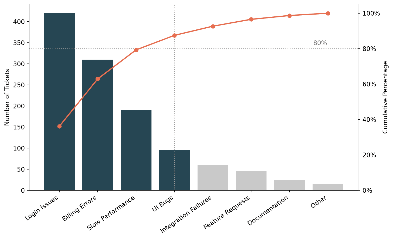
df[df["cum_pct"] >= 80].index[0] finds the first category where the running total crosses 80%, since df is already sorted descending, this is the exact cutoff point. Coloring everything up to and including that category dark, and everything after it gray, makes the "vital few" versus "trivial many" split immediate: four of these eight ticket categories, not the classic 20%, but still a clear minority, account for about 80% of all tickets. The exact split won't always land near the textbook 80/20 ratio; the chart's value is in showing whatever the real cutoff happens to be, not confirming a fixed number.
Practical Tips
- Sort descending before doing anything else;
cumsum()on unsorted data produces a line that has nothing to do with the actual 80/20 story. ax1.twinx()creates the second axis; keep the bar color and line color visually distinct (and consider matching each axis's label color to its series) since two different scales share the same plot area.mtick.PercentFormatter()needs data already expressed as a 0-100 percentage, not a 0-1 fraction; passing a fraction through it will show tick labels like0.36%instead of36%.- Finding the cutoff category (
df[df["cum_pct"] >= 80].index[0]) only works cleanly on already-sorted, already-indexed data; reset the index after sorting if it isn't already sequential. - A Pareto chart works best with a genuinely skewed distribution and a manageable number of categories (rarely more than 8-10); past that, consider grouping the smallest categories into an "Other" bucket before plotting.