
Plotting 500,000 points takes longer than plotting 500, and past a certain size a chart's resolution can't actually show every point distinctly anyway, a line chart a few hundred pixels wide has nowhere to put half a million data points regardless of how fast the plotting is. Downsampling picks a smaller set of points that still looks like the original when plotted. The obvious approach, taking every Nth point, has a real failure mode worth seeing before reaching for something better.
The problem: naive decimation can silently drop real events
Taking every Nth point is fast and simple, but it has no awareness of what's actually in the data between the points it keeps. A brief, sharp spike that falls between two sampled points disappears completely, not smoothed, not flattened, just gone.
step = len(df) // target_points
naive = df.iloc[::step]
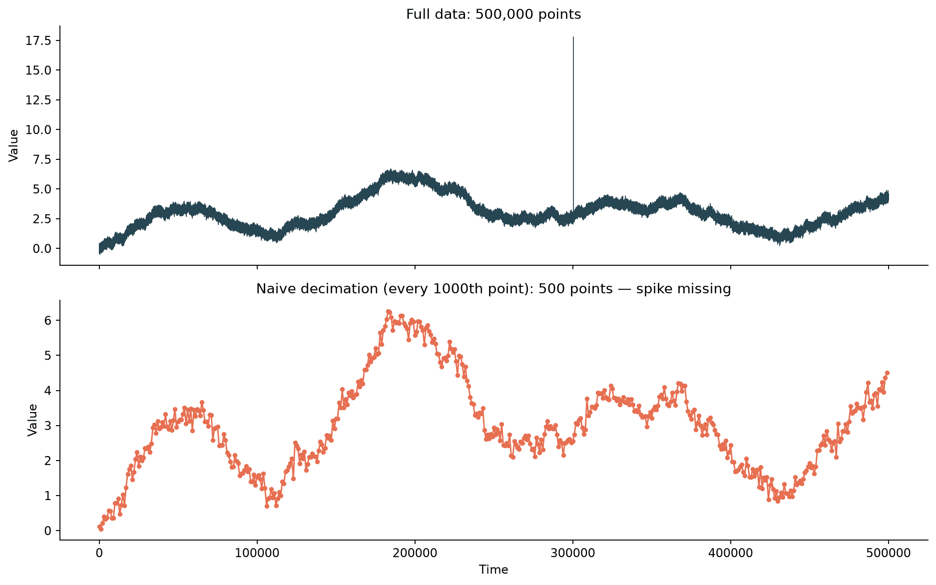
The full data has one unmistakable spike, an anomaly reaching more than twice the height of anything else in the series. The naively decimated version, at the same 500-point budget used for every method in this post, doesn't show it at all: none of the kept points happened to land inside the narrow window where it occurred. This is the core risk with naive decimation on anything that isn't smooth, and outliers, alarms, and anomalies are usually the exact thing a downsampled chart still needs to show.
Min/max envelope downsampling
A straightforward fix: for each bucket of consecutive points, keep both the minimum and the maximum instead of an arbitrary single sample. Whatever the extremes of a bucket are, real or an artifact of noise, at least survive into the downsampled data.
def minmax_downsample(df, n_buckets):
    bucket_size = len(df) // n_buckets
    rows = []
    for i in range(n_buckets):
        chunk = df.iloc[i * bucket_size:(i + 1) * bucket_size]
        min_row = chunk.loc[chunk["value"].idxmin()]
        max_row = chunk.loc[chunk["value"].idxmax()]
        rows.extend(sorted([min_row, max_row], key=lambda r: r["t"]))
    return pd.DataFrame(rows)
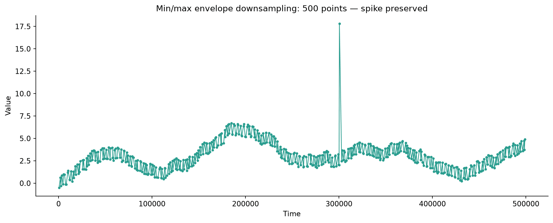
At the same 500-point budget, the spike survives at its full original height, since whichever bucket it fell into kept its maximum specifically because of that spike. The tradeoff: two points per bucket means roughly half the buckets of a same-sized naive sample, and a bucket with pure noise and no real event still emits two extreme points, which can visually exaggerate how noisy a calm stretch of data actually is.
LTTB: preserving overall shape, not just extremes
Largest-Triangle-Three-Buckets (LTTB) is the algorithm most charting libraries reach for when they need to downsample a line series intelligently. Instead of always taking the extremes, it picks, per bucket, whichever single point forms the largest triangle with the previously chosen point and the average of the next bucket, a proxy for "how much does this point change the visual shape of the line."
def lttb(x, y, n_out):
    n = len(x)
    sampled_x, sampled_y = np.zeros(n_out), np.zeros(n_out)
    sampled_x[0], sampled_y[0] = x[0], y[0]
    sampled_x[-1], sampled_y[-1] = x[-1], y[-1]
    bucket_size = (n - 2) / (n_out - 2)
    a = 0
    for i in range(n_out - 2):
        bucket_start = int((i) * bucket_size) + 1
        bucket_end = int((i + 1) * bucket_size) + 1
        next_start = bucket_end
        next_end = int((i + 2) * bucket_size) + 1
        avg_x = x[next_start:next_end].mean()
        avg_y = y[next_start:next_end].mean()
        px, py = x[a], y[a]
        bx, by = x[bucket_start:bucket_end], y[bucket_start:bucket_end]
        areas = np.abs((px - avg_x) * (by - py) - (px - bx) * (avg_y - py)) * 0.5
        max_idx = np.argmax(areas)
        sampled_x[i + 1], sampled_y[i + 1] = bx[max_idx], by[max_idx]
        a = bucket_start + max_idx
    return sampled_x, sampled_y
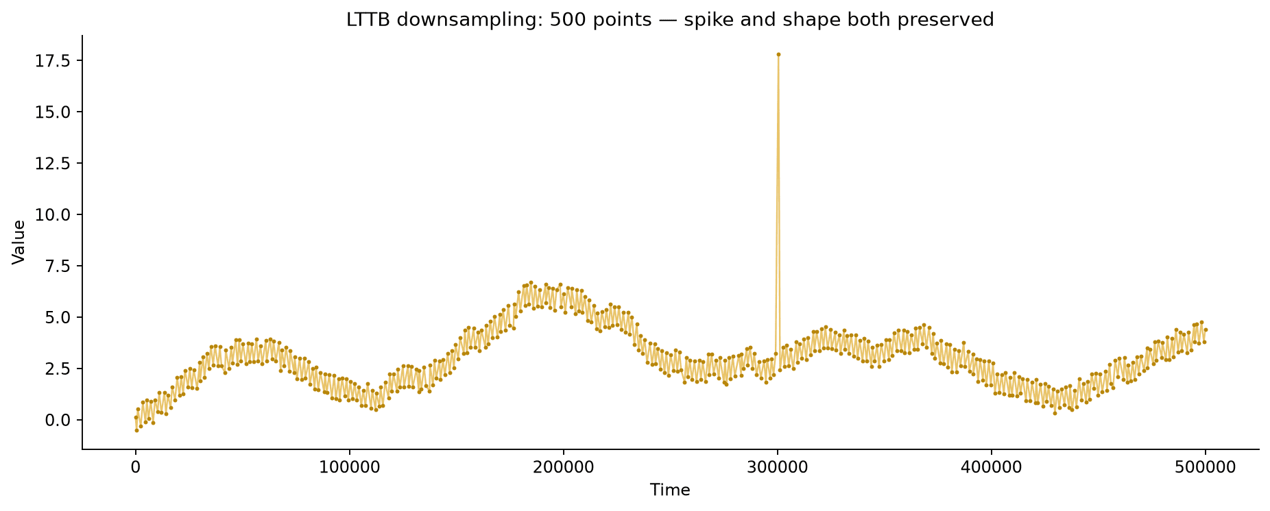
Like the min/max version, the spike survives at full height, one point in whichever bucket it landed in wins by an enormous margin on triangle area, since a huge jump from the surrounding trend is exactly what maximizes that calculation.
Where LTTB and min/max actually differ
Both methods caught the spike; the real difference between them shows up in the calm, noisy stretches that make up most of a typical series.
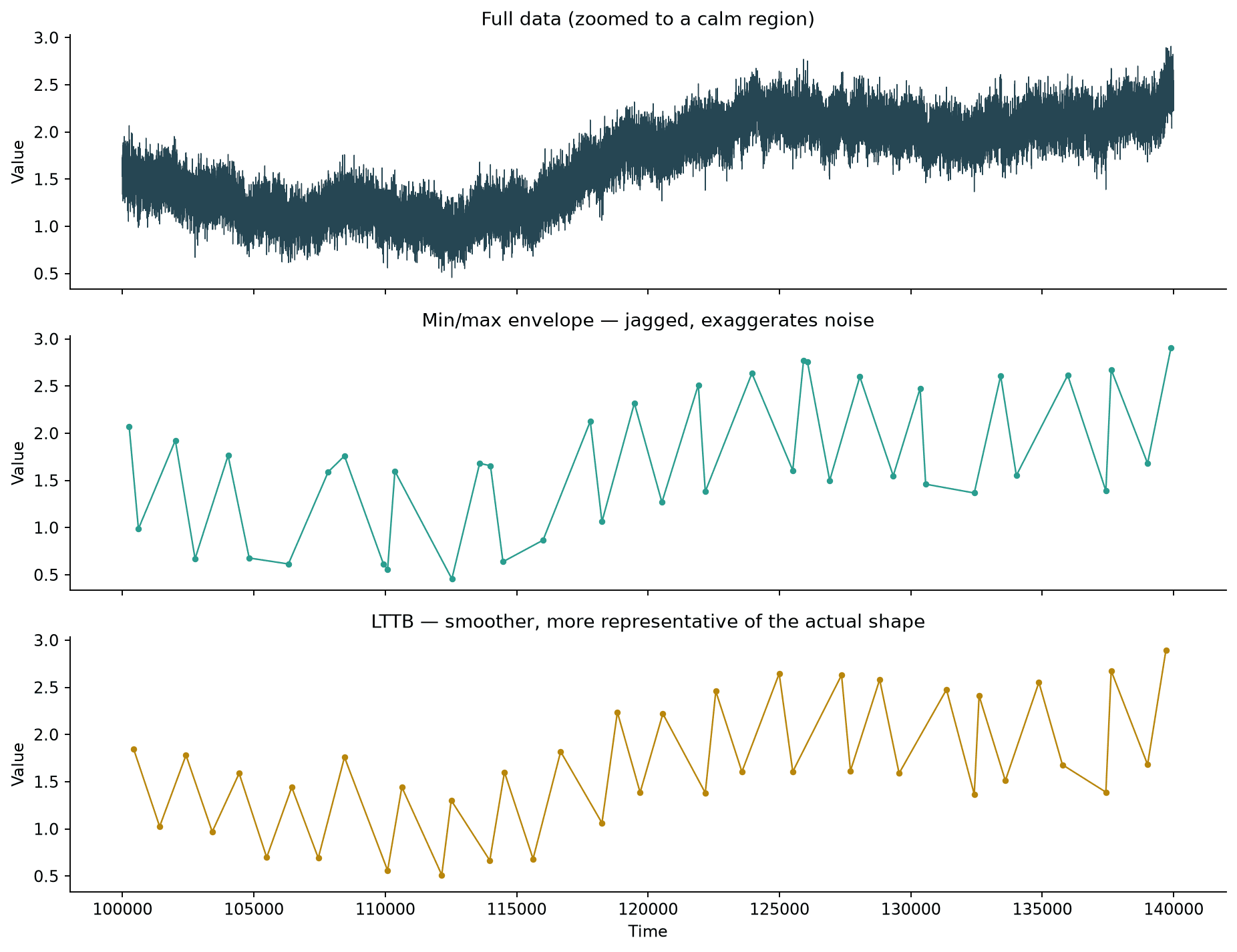
Min/max always emits two points per bucket, the literal high and low, which tends toward a sawtooth look even in a region that's just noise around a slowly drifting trend. LTTB emits one point per bucket chosen by triangle area, which factors in where the line is heading next, not just the extremes, so it tends to track the underlying trend a bit more smoothly through calm stretches while still snapping to real large deviations when they occur.
Practical Tips
- Naive decimation (
df.iloc[::step]) is fine for smooth, slowly-varying data where nothing important happens between samples; it's the wrong choice the moment brief spikes, alarms, or anomalies matter. - Min/max envelope downsampling is a simple, dependency-free way to guarantee extremes survive; expect roughly double the visual "jaggedness" per point compared to a shape-aware method, since it always keeps literal extremes.
- LTTB is the standard choice for downsampling a line chart specifically because it optimizes for visual shape, not just extremes; libraries like Plotly's
plotly-resamplerand many JS charting libraries use it or something close to it internally. - Pick the downsampled point count based on the chart's actual rendered width in pixels, not an arbitrary round number; there's rarely value in keeping more points than the display can show as visually distinct.
- All of these approaches assume line-chart-style visualization; for a genuinely huge scatter plot where individual point identity doesn't matter, aggregating into a rasterized density image (see the Datashader post) is usually a better fit than picking a subset of points at all.