
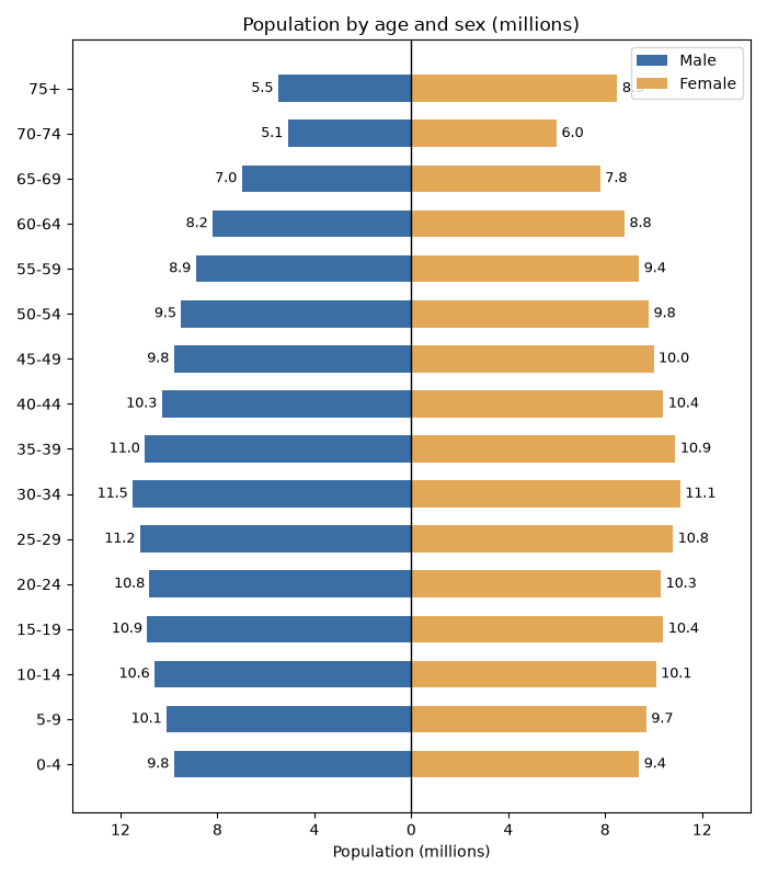
A population pyramid shows the age and sex structure of a population as two mirrored horizontal bar charts. One side holds the males, the other the females, and the age groups run down the middle.
Quick Example
Draw two barh charts on the same axes, with the male values negated so they extend to the left.
import matplotlib.pyplot as plt

fig, ax = plt.subplots()
ax.barh(age, [-m for m in male], color="#4c72b0", label="Male")
ax.barh(age, female, color="#dd8452", label="Female")
ax.axvline(0, color="black", lw=1)
ax.legend()
Negative male values bar to the left of zero, female values bar to the right, and the shared y-axis lists the age groups once in the middle.
The mirrored bars
Negating the male values is the whole trick. Because barh draws positive values to the right of zero, negating the males sends them to the left, producing the pyramid shape.
age = ["0-4", "5-9", "10-14", "15-19", "20-24", "25-29", "30-34", "35-39",
       "40-44", "45-49", "50-54", "55-59", "60-64", "65-69", "70-74", "75+"]
male = [9.8, 10.1, 10.6, 10.9, 10.8, 11.2, 11.5, 11.0,
        10.3, 9.8, 9.5, 8.9, 8.2, 7.0, 5.1, 5.5]
female = [9.4, 9.7, 10.1, 10.4, 10.3, 10.8, 11.1, 10.9,
          10.4, 10.0, 9.8, 9.4, 8.8, 7.8, 6.0, 8.5]

ax.barh(age, [-m for m in male], color="#4c72b0", height=0.6, label="Male")
ax.barh(age, female, color="#dd8452", height=0.6, label="Female")
height=0.6 keeps the bars thin enough that the pairs read as distinct lines rather than solid blocks.
Put the zero axis in the middle
The center line separates the two sides.
ax.axvline(0, color="black", lw=1)
This marks zero so the two halves share a clear baseline. Because the values are symmetric around zero, the axis labels can be centered and shown as positive on both sides, which reads more naturally than a negative "male" scale.
ax.set_xticks([-12, -8, -4, 0, 4, 8, 12])
ax.set_xticklabels(["12", "8", "4", "0", "4", "8", "12"])
Label the values
Add a count to the end of each bar with ax.text. Positions come from the negated male value and the raw female value.
for i, (m, f) in enumerate(zip(male, female)):
    ax.text(-m - 0.2, i, f"{m}", va="center", ha="right")
    ax.text(f + 0.2, i, f"{f}", va="center", ha="left")
The male label sits to the left of the male bar, the female label to the right of the female bar, both vertically centered on the age group.
Practical Tips
- Negate the male values (e.g.,
-m) so they extend left of the center line. - Use the same
heightfor both sides so the bars line up. - Add
ax.axvline(0, ...)to draw the center baseline. - Make the x tick labels positive on both sides for a cleaner read.
- Label each bar with
ax.textwhen the exact counts matter.