
TL;DR
A Sankey diagram shows how a quantity flows from a set of source nodes through intermediate nodes to destination nodes. The width of each band is proportional to the value moving along it. In Plotly you build one with plotly.graph_objects by defining node labels and linking them with the source, target, and value arrays.
import plotly.graph_objects as go

fig = go.Figure(
    go.Sankey(
        node=dict(
            pad=16,
            thickness=20,
            label=["Solar", "Wind", "Hydro", "Coal", "Natural Gas",
                   "Electricity Grid", "Residential", "Commercial", "Industrial"],
        ),
        link=dict(
            source=[0, 1, 2, 3, 4, 5, 5, 5],
            target=[5, 5, 5, 5, 5, 6, 7, 8],
            value=[30, 50, 20, 60, 80, 90, 70, 52],
        ),
    )
)
fig.show()
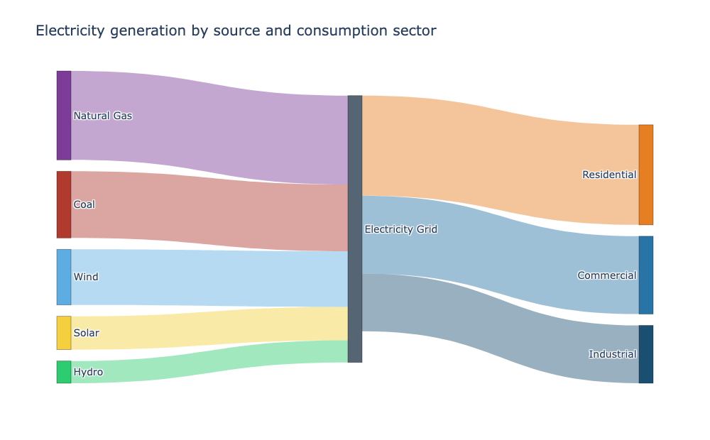
Hover over any band to see where it starts, where it ends, and how much flows along it. Drag a node in the interactive version to rearrange the layout, and hover a node to highlight just the paths that touch it.
What a Sankey diagram is for
Sankey diagrams are built for flows. If your data is a quantity moving from one set of categories to another, a Sankey makes the volume and the direction obvious. Common examples are:
- energy generation by source feeding consumption sectors
- budget allocation across departments
- website traffic by channel flowing through a funnel
- customer journeys and churn
A wide band says a lot moves that way; a thin band says only a little does. That single visual cue is what makes Sankeys so good at telling a part-to-whole-to-part story.
Define the nodes and links
Every Sankey needs two ingredients: the nodes and the links between them.
node.labelis the list of node names.link.sourceandlink.targetare integer indexes into that label list.link.valuesets how wide each band should be.
In the example above, source=[0,1,2,3,4,5,5,5] and target=[5,5,5,5,5,6,7,8]. Indexes 0 through 4 (solar, wind, hydro, coal, gas) all flow into index 5 (the grid), and the grid then splits into indexes 6, 7, and 8 (residential, commercial, industrial).
The index mapping is the part that trips people up. Get the labels and the indexes to line up and the rest follows.
Color the nodes and the flows
The default is readable, but coloring each node and its outgoing bands makes a busy diagram much easier to follow. Node colors are set per index in node.color, and link colors can list one rgba color per link.
fig = go.Figure(
    go.Sankey(
        node=dict(
            pad=16,
            thickness=20,
            line=dict(color="rgba(0,0,0,0.4)", width=0.8),
            label=["Solar", "Wind", "Hydro", "Coal", "Natural Gas",
                   "Electricity Grid", "Residential", "Commercial", "Industrial"],
            color=["#f4d03f", "#5dade2", "#2ecc71", "#b03a2e", "#7d3c98",
                   "#566573", "#e67e22", "#2874a6", "#1b4f72"],
        ),
        link=dict(
            source=[0, 1, 2, 3, 4, 5, 5, 5],
            target=[5, 5, 5, 5, 5, 6, 7, 8],
            value=[30, 50, 20, 60, 80, 90, 70, 52],
            color=[
                "rgba(244,208,63,0.45)", "rgba(93,173,226,0.45)",
                "rgba(46,204,113,0.45)", "rgba(176,58,46,0.45)",
                "rgba(125,60,152,0.45)", "rgba(230,126,34,0.45)",
                "rgba(40,116,166,0.45)", "rgba(27,79,114,0.45)",
            ],
        ),
    )
)
Using rgba with partial opacity keeps the link colors from dominating the nodes. In the interactive version, hover a node and Plotly dims everything except the paths connected to it, which makes tracing one branch trivial.
Interact with it
This is where Sankey differs from a static image. The embedded chart above supports real interactions:
- hover a band to read its source, target, and value
- hover a node to highlight just its connected flows
- drag any node to rearrange the layout for a different view
That interactivity is the whole point of embedding it in the page rather than showing a screenshot. Readers can explore the flow the same way a stakeholder would.
Set the layout
arrangement controls how Plotly positions the nodes. "snap" keeps the flow tidy and is the default. "fixed" honors the x and y positions you provide on each node, which is useful when you want precise control over the columns.
fig.update_layout(
    title_text="Electricity generation by source and consumption sector",
    font_size=14,
    width=1000,
    height=620
)
Node pad and thickness also matter. More pad spreads the nodes vertically so labels do not collide; more thickness makes the node bars chunkier and easier to click.
A few practical tips
- Keep the number of nodes modest. A Sankey with a handful of sources and a few destinations reads cleanly; dozens of nodes turn into spaghetti.
- Make the flow values consistent. A node that sends out more than it receives will look wrong even if Plotly still draws it.
- Give each group of related nodes a similar color so the eye groups them at a glance.
- Sankeys excel at left-to-right flows. When the story is a nested part-to-whole breakdown instead, a sunburst chart is usually the better fit.