
Matplotlib
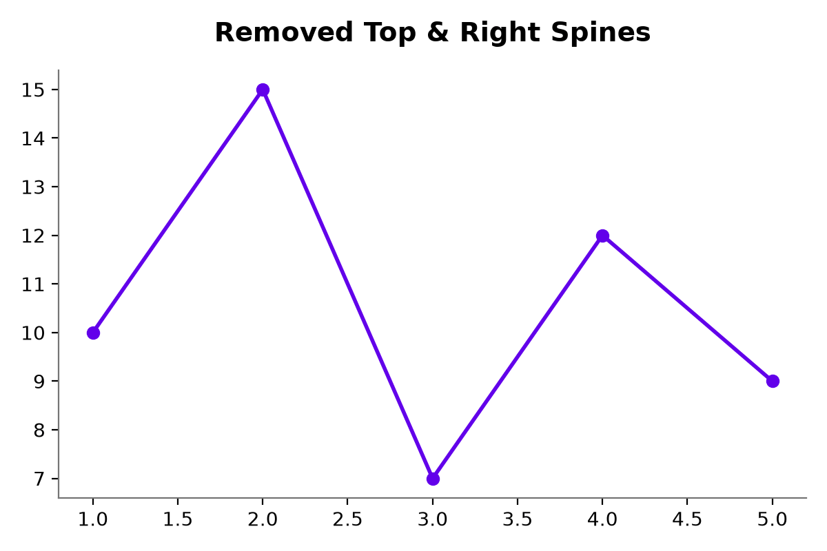
How to Remove the Outer Border/Spines of a Matplotlib Plot
Clear tutorial on removing the outer border (spines) from a Matplotlib chart for a clean, modern aesthetic.
Clear tutorial on removing the outer border (spines) from a Matplotlib chart for a clean, modern aesthetic.
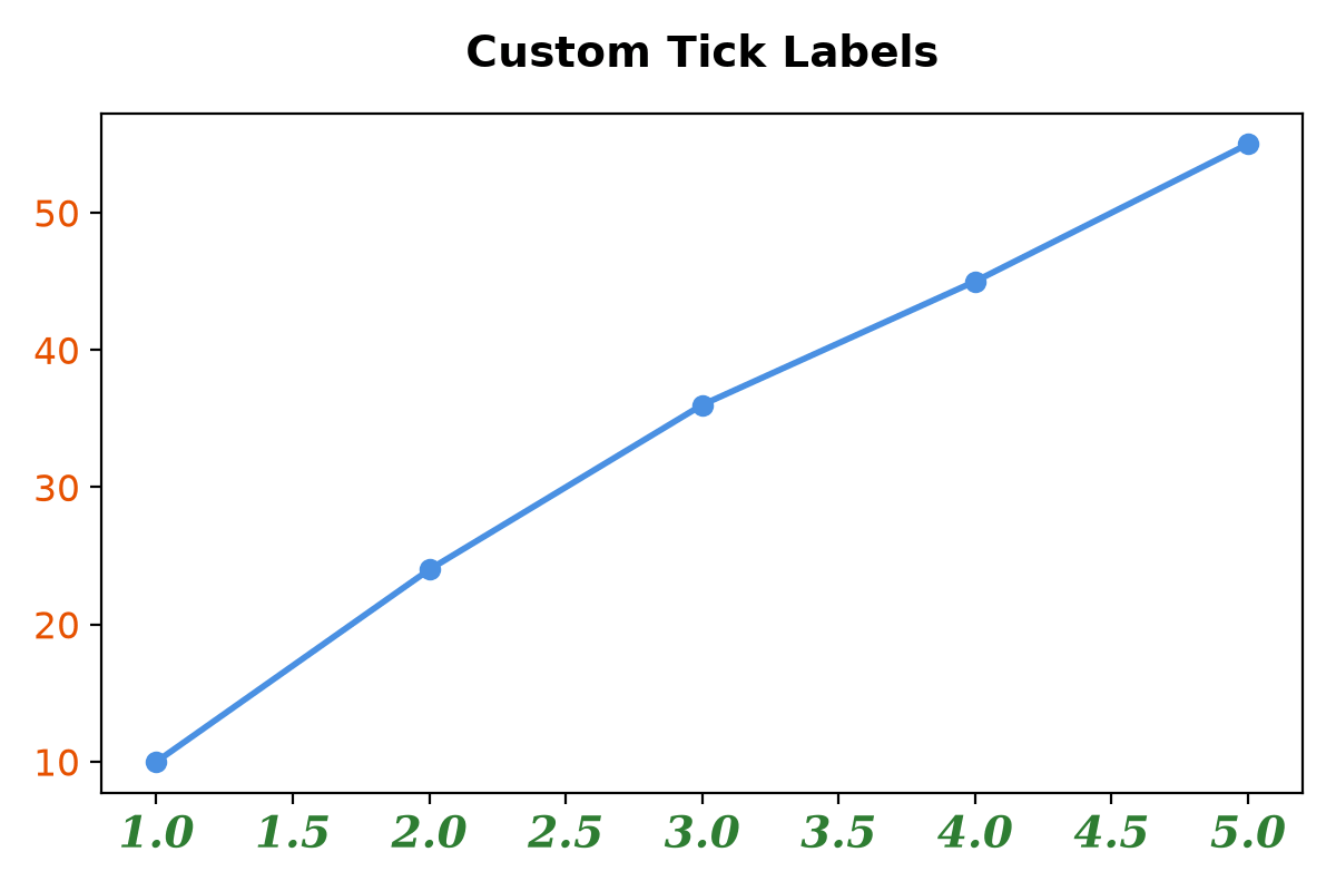
Quick guide to changing the size, weight, color, and font style of tick labels in Matplotlib.
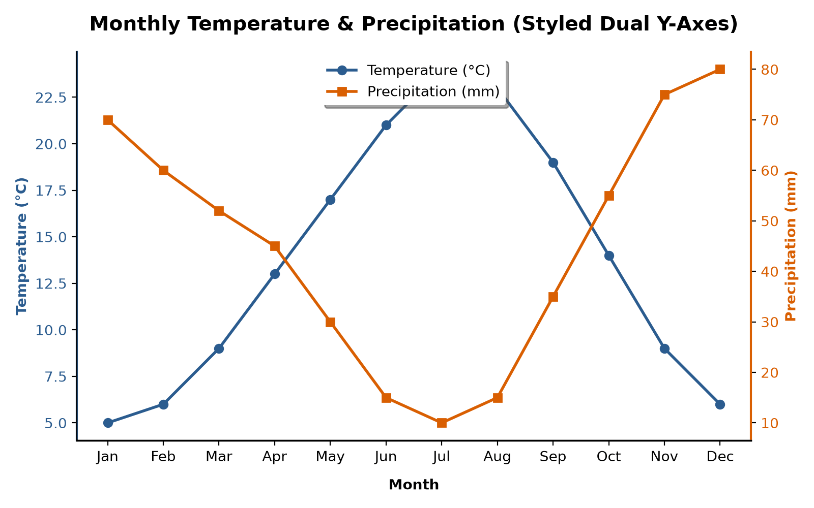
Learn how to use ax.twinx() to plot two datasets with different scales on a shared X-axis.
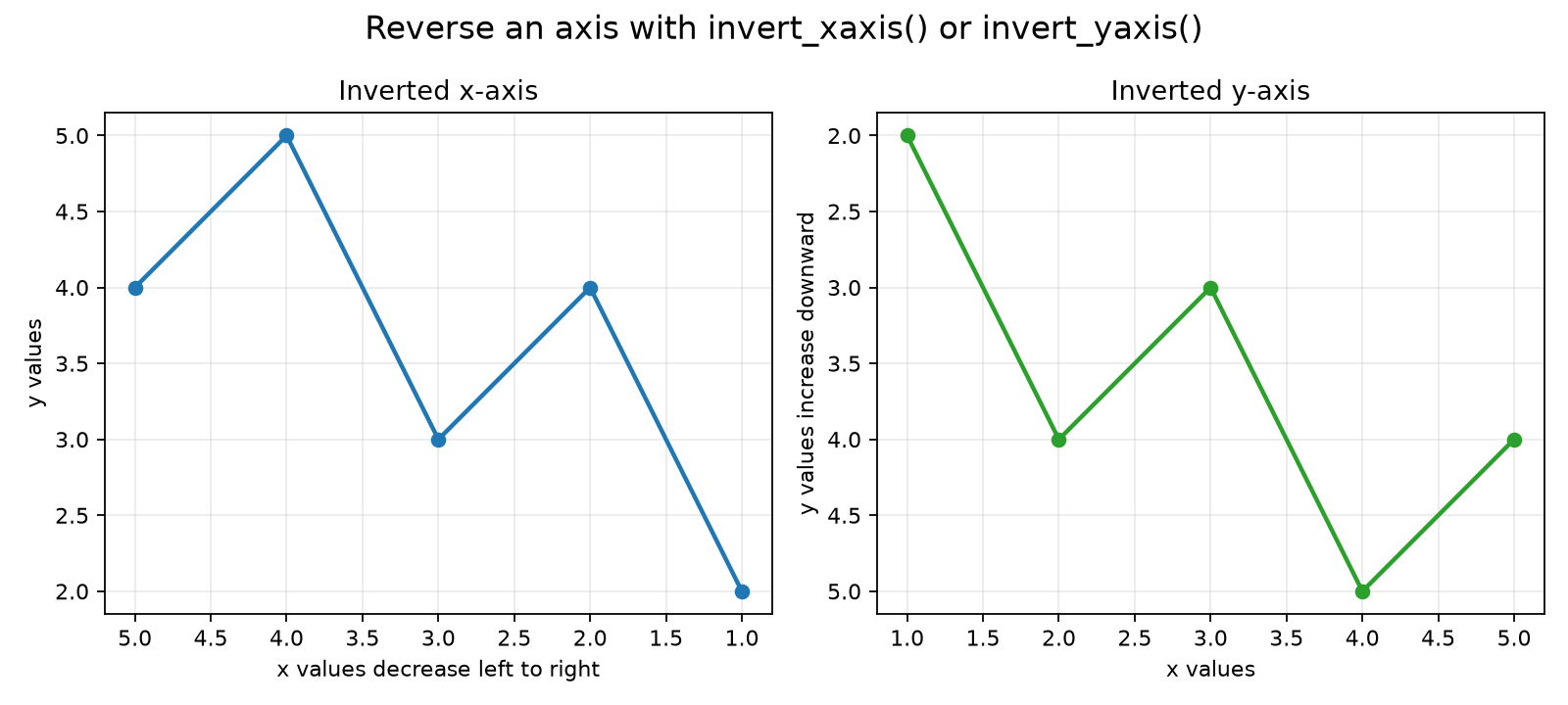
Reverse the direction of Matplotlib x-axes and y-axes.
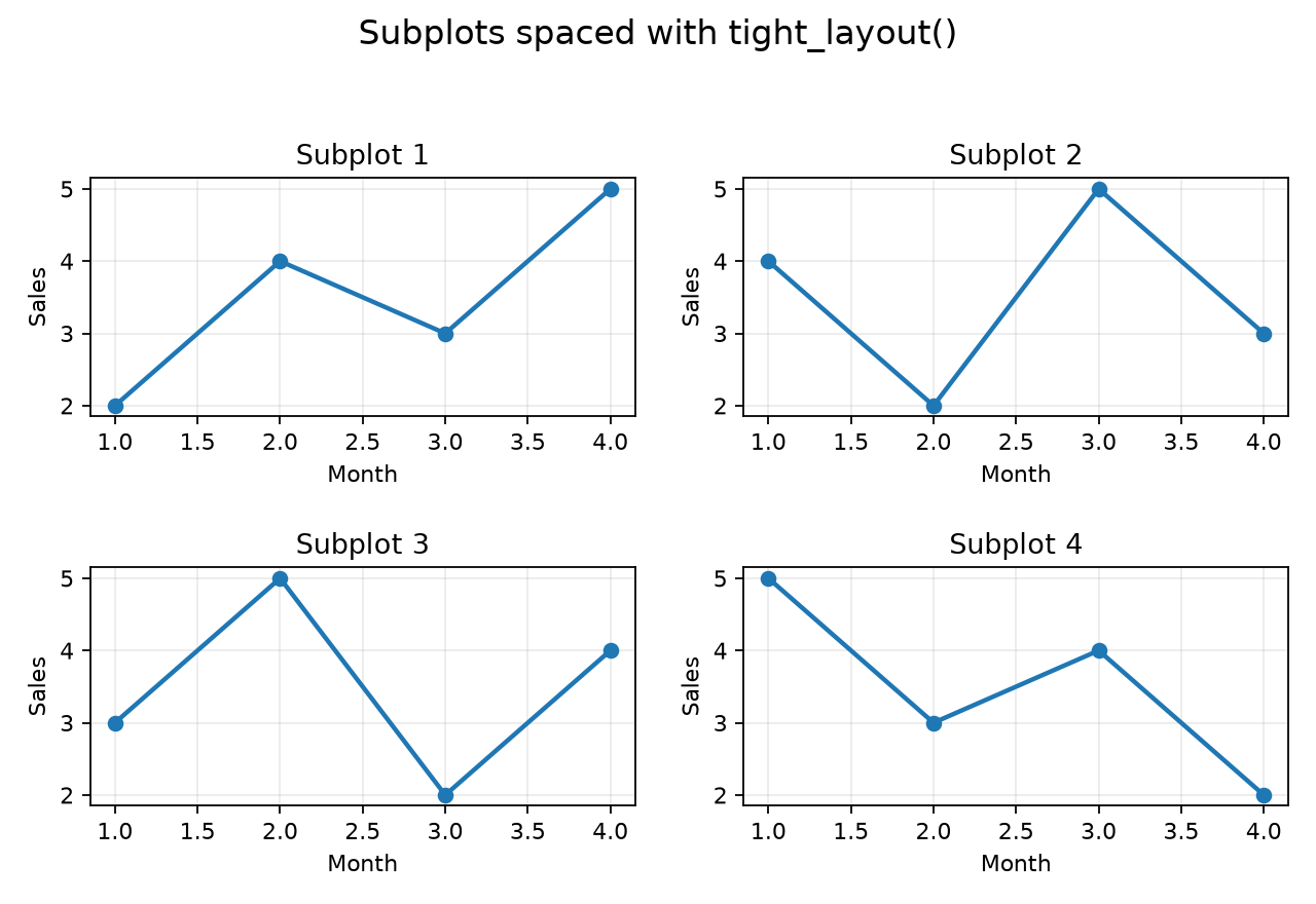
Automatically adjust Matplotlib subplot spacing and margins with tight_layout.
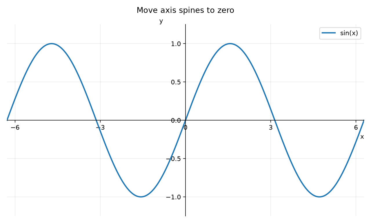
Move Matplotlib x-axis and y-axis spines to the center of a chart.
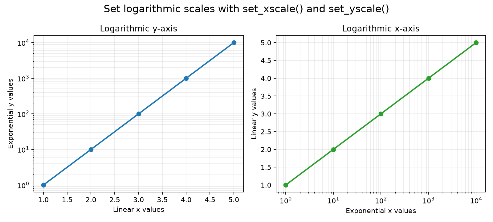
Use logarithmic scales on Matplotlib x-axes and y-axes.
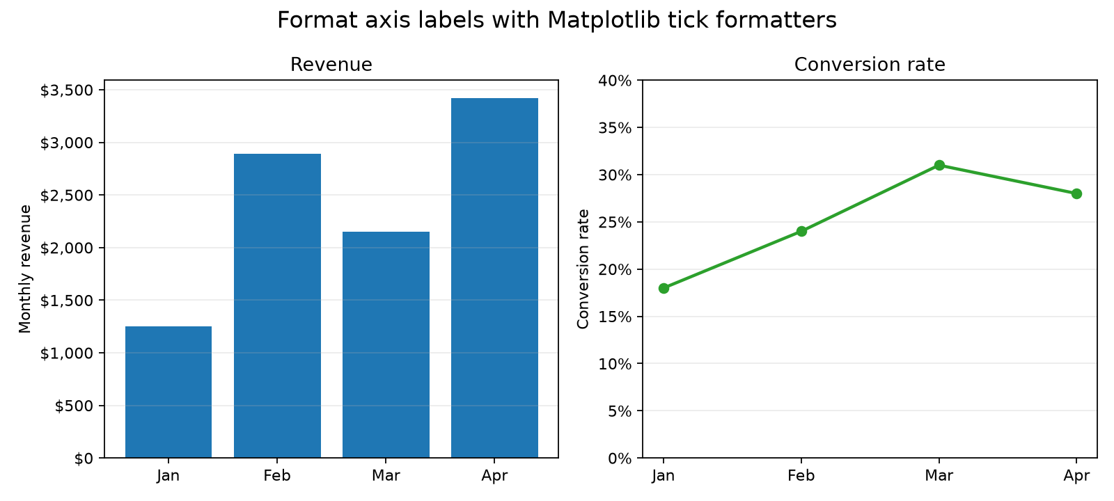
Format Matplotlib axis tick labels as currency or percentages.
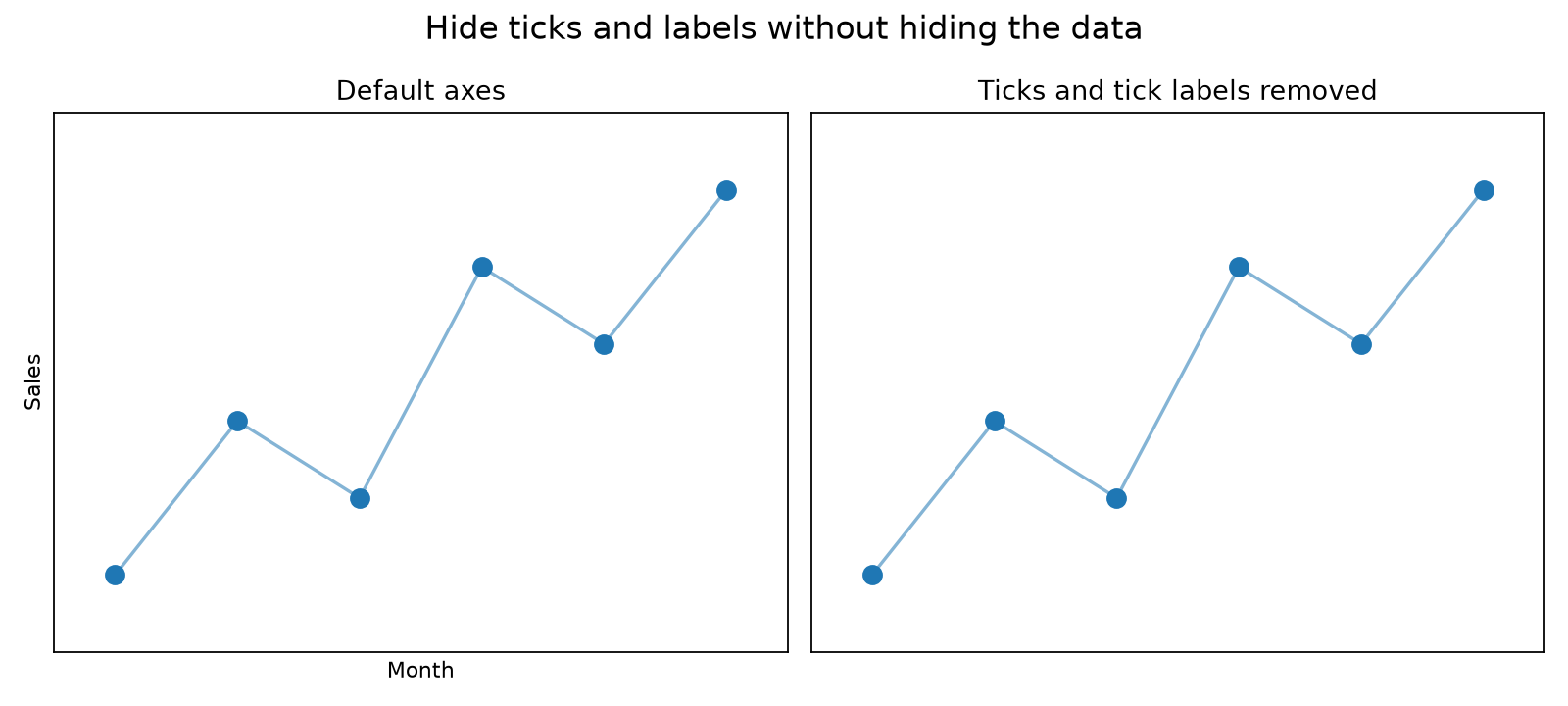
Hide axis ticks, tick labels, axis labels, or an entire Matplotlib axis.
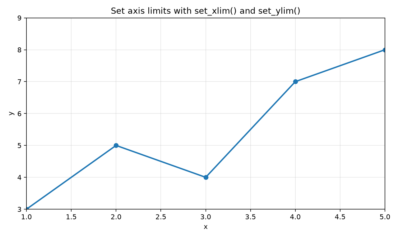
Set x-axis and y-axis limits in Matplotlib with xlim, ylim, set_xlim, and set_ylim.
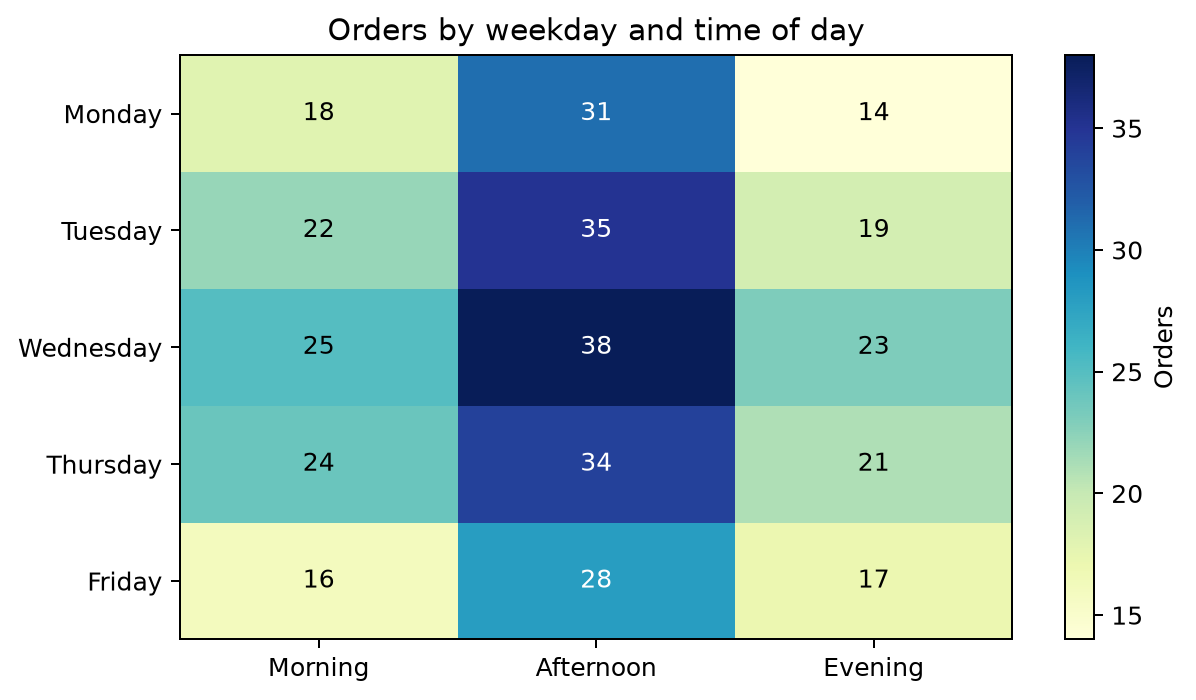
Create and customize heatmaps directly in Matplotlib with imshow() and pcolormesh().
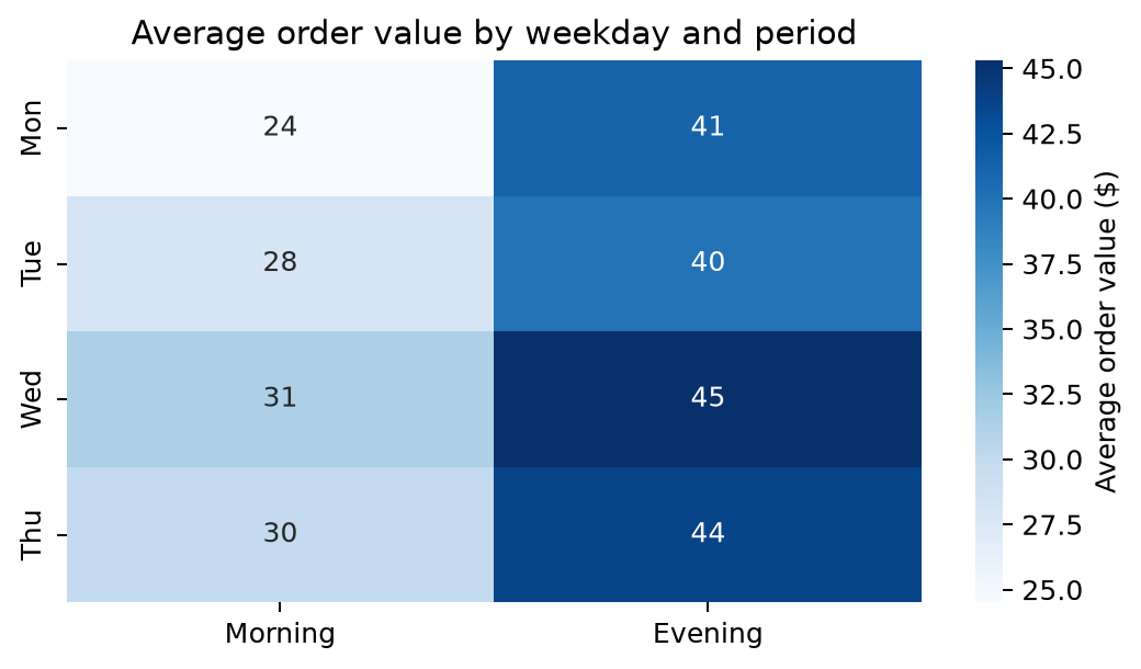
Build clear Seaborn heatmaps, from a simple matrix to annotated correlation charts.
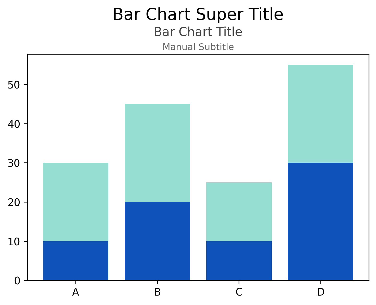
Setting plot titles and subtitles in Matplotlib
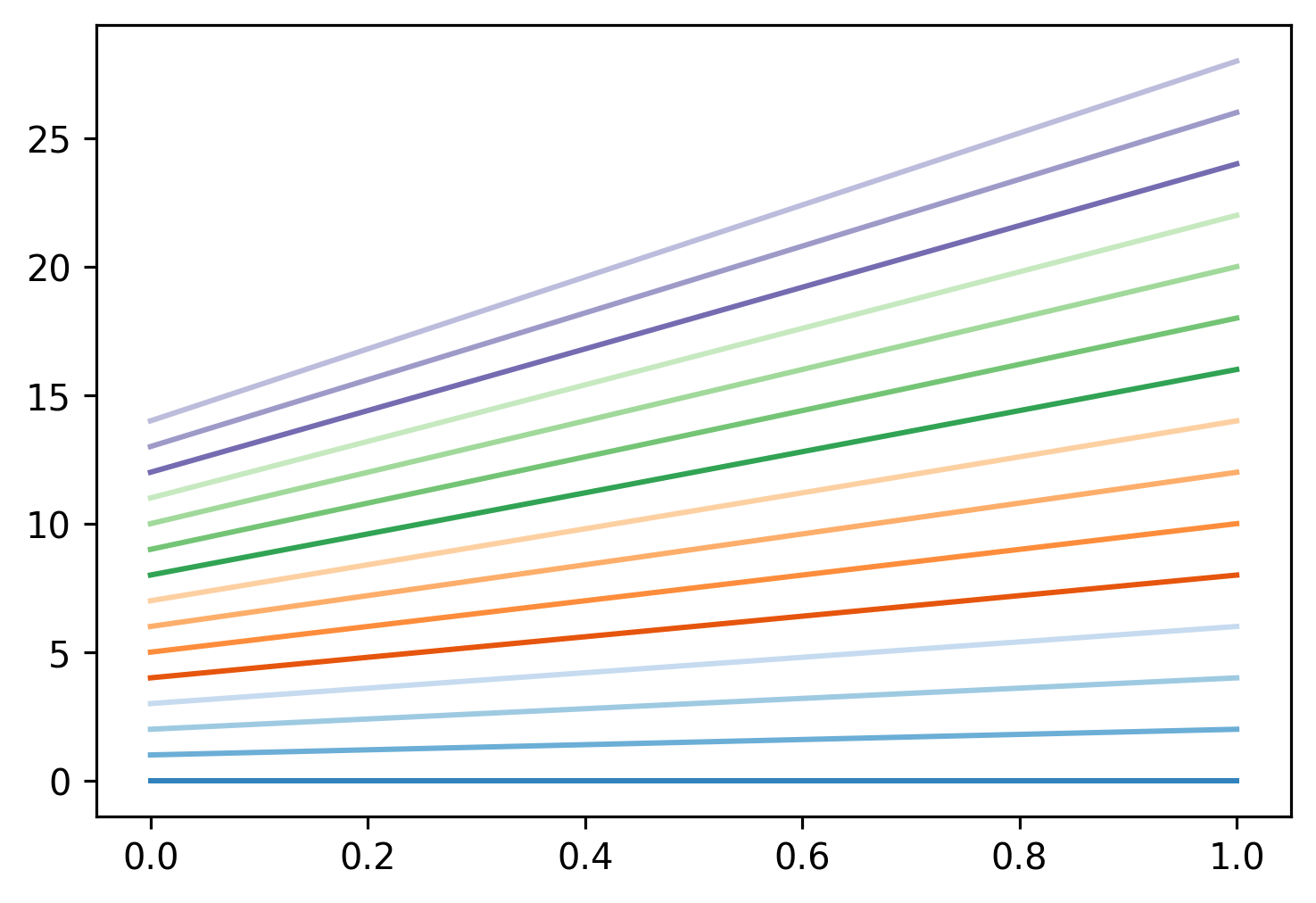
Setting colors, color cycles, and colormaps in Matplotlib
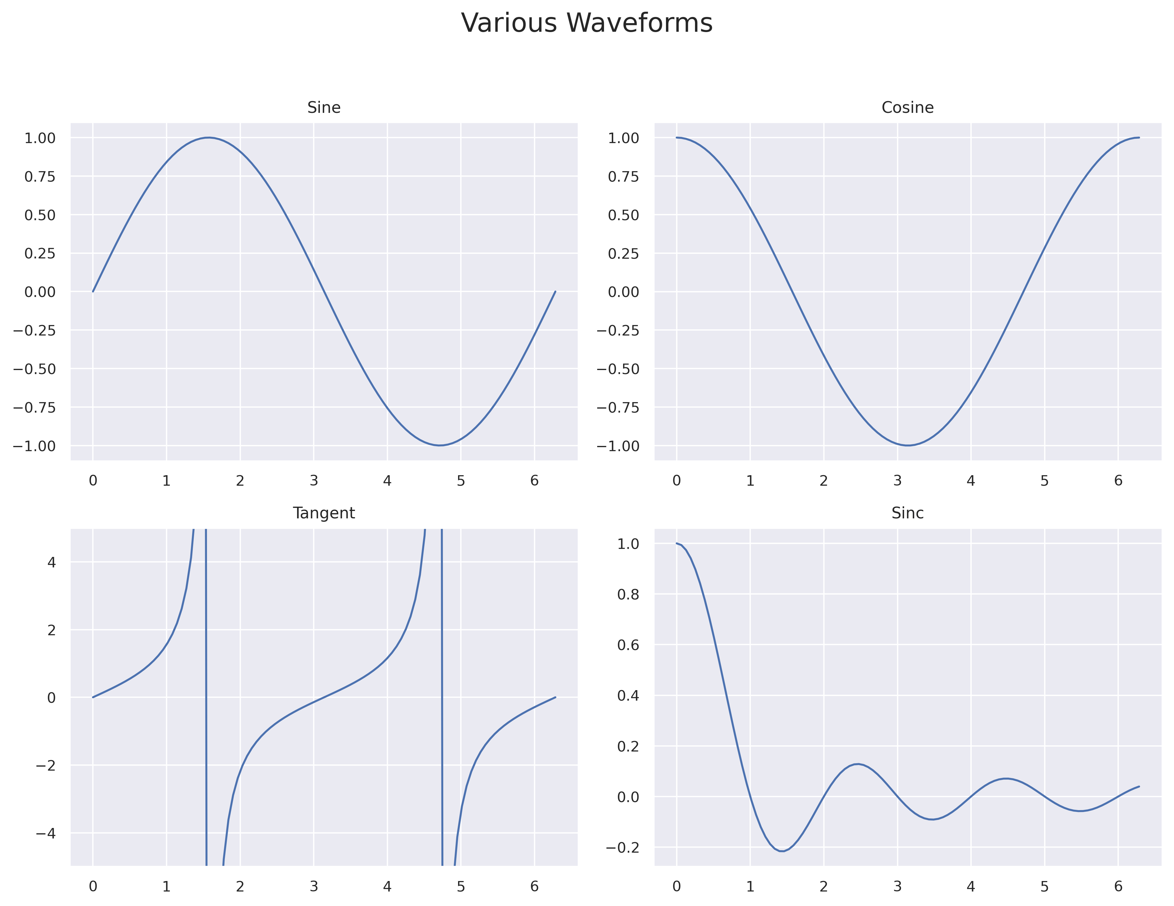
How to use subplots in Matplotlib to create multiple plots in a single figure
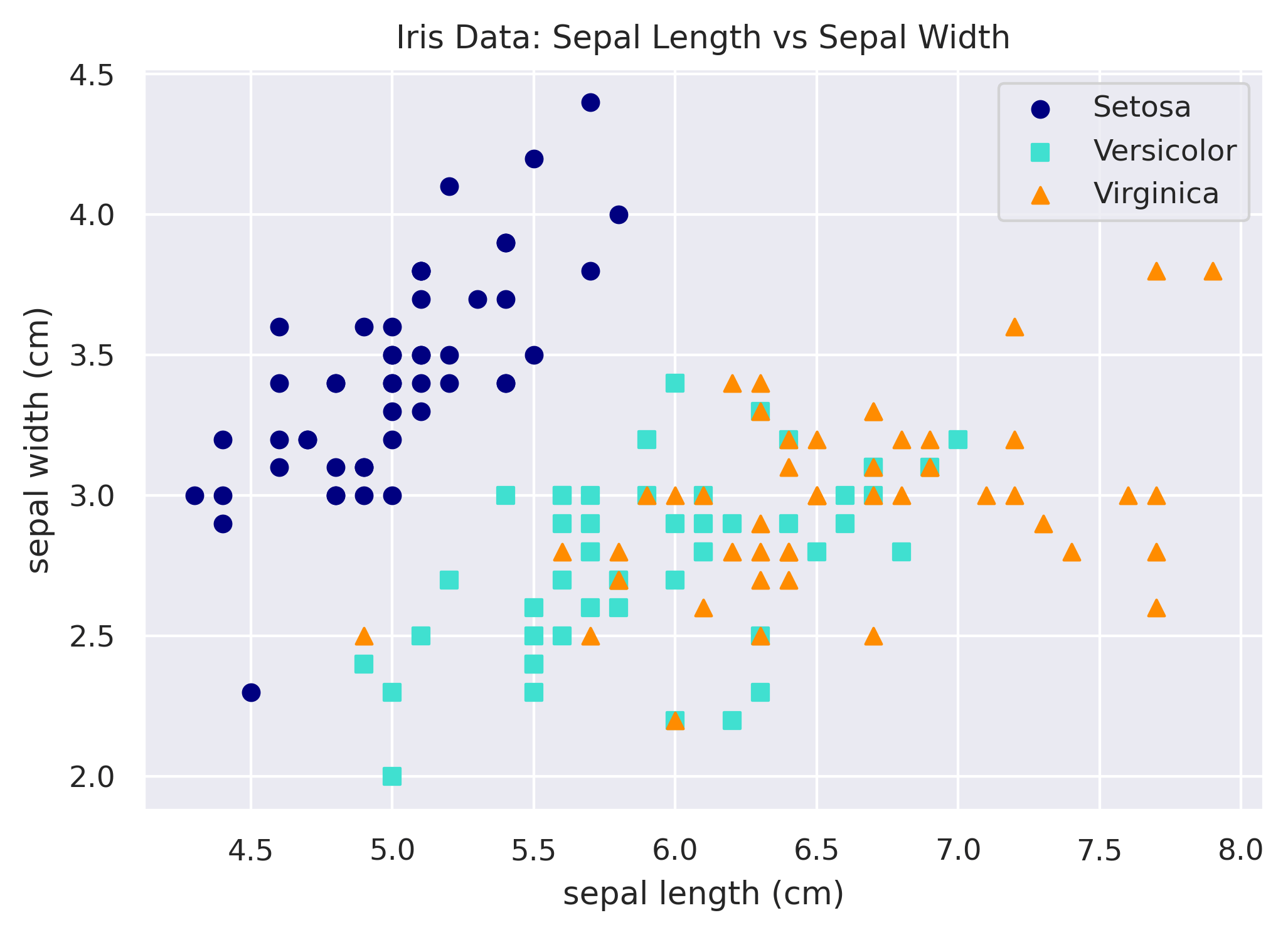
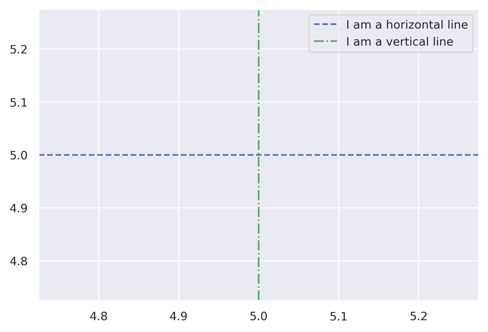
Annotating a Matplotlib chart with horizontal and vertical lines
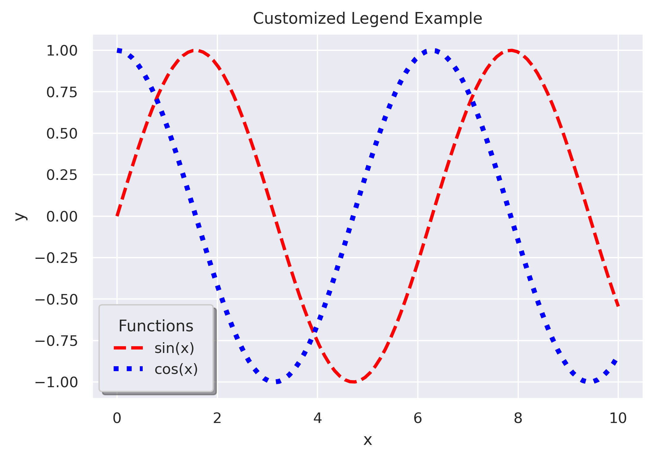
Adding a legend to a plot in Matplotlib and customizing the look and placement of it