TL;DR
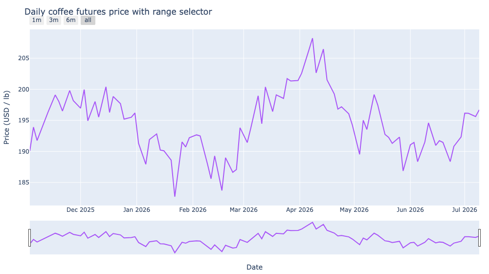
A long time series is hard to read at full zoom. rangeslider_visible adds a draggable mini-chart under the plot for scrubbing, and rangeselector adds buttons that jump to common ranges like the last month or the last year.
import plotly.graph_objects as go

fig = go.Figure(
    go.Scatter(x=dates, y=price, mode="lines")
)

fig.update_xaxes(
    rangeslider_visible=True,
    rangeselector=dict(
        buttons=[
            dict(count=1, label="1m", step="month", stepmode="backward"),
            dict(count=3, label="3m", step="month", stepmode="backward"),
            dict(count=6, label="6m", step="month", stepmode="backward"),
            dict(step="all"),
        ]
    ),
)
fig.show()
Click a button like 3m to zoom the main chart to the last three months, or drag the handles on the slider underneath to pan around the full history.
Why you need them
The longer the series, the harder it is to see detail at full zoom. A range slider solves that by showing the whole series as a small strip underneath and letting you scrub a window with two handles. Range selector buttons solve the complementary problem: jump straight to a preset window like the last month, quarter, or year.
Together they give readers two natural ways to navigate a long time series without losing the big picture.
Add the range slider
The slider is a single flag on the x-axis:
fig.update_xaxes(rangeslider_visible=True)
That is the whole setup. Plotly renders a mini version of the series below the main plot, and dragging its handles changes the visible range of the main axes. The slider shows the full history, so you always know where you are in the series.
Add the selector buttons
Range selectors are button objects in rangeselector. Each button defines a window relative to the most recent data point.
fig.update_xaxes(
    rangeselector=dict(
        buttons=[
            dict(count=1, label="1m", step="month", stepmode="backward"),
            dict(count=3, label="3m", step="month", stepmode="backward"),
            dict(count=6, label="6m", step="month", stepmode="backward"),
            dict(step="all"),
        ]
    ),
)
countis how many units to go back, andstepis the unit ("month","year","day", ...).stepmode="backward"means the window ends at the latest data and extends back bycount.step="all"with nocountresets to show everything.
Combine both
There is no conflict: you can turn on the slider and the selector buttons at once, as the embedded chart above does. The buttons sit above the plot, and the slider runs underneath. update_xaxes() accepts both arguments in one call.
fig.update_xaxes(
    rangeslider_visible=True,
    rangeselector=dict(
        buttons=[
            dict(count=1, label="1m", step="month", stepmode="backward"),
            dict(count=3, label="3m", step="month", stepmode="backward"),
            dict(count=6, label="6m", step="month", stepmode="backward"),
            dict(step="all"),
        ]
    ),
)
A note on candlesticks
Financial charts like candlesticks get a range slider for free by default, which is why the Plotly candlestick post turns it off with xaxis_rangeslider_visible=False. For a plain go.Scatter time series, you opt in with the same flag. Either way, the configuration is identical once you decide it is on or off.
A few practical tips
- Use the slider for continuous scrubbing and the buttons for quick jumps to preset ranges.
- Keep button labels short (
"1m","3m","6m","All") so the row does not crowd the plot title. - Match
stepmode="backward"to what you actually want; the buttons anchor to the latest point, not the plot's current view. - If the series rarely fills the slider with many points, hide the slider and rely on the buttons to keep the layout clean.