
TL;DR
Use fig.add_annotation() or layout.annotations to add text labels, arrows, and custom markers directly onto Plotly charts.
fig.add_annotation(x=3, y=9, text='Peak value', showarrow=True)
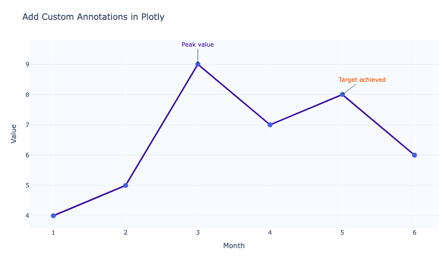
Add a simple annotation
Use fig.add_annotation() to label a point with text and an optional arrow.
fig = go.Figure(data=[go.Scatter(x=[1, 2, 3], y=[2, 5, 4])])
fig.add_annotation(
    x=2,
    y=5,
    text='Important point',
    showarrow=True,
    arrowhead=1,
)
fig.show()
Add multiple annotations at once
Plotly supports a list of annotations in layout.annotations.
fig.update_layout(
    annotations=[
        dict(x=2, y=5, text='High', showarrow=True),
        dict(x=3, y=4, text='Watch this', showarrow=False),
    ]
)
Style annotation text and arrows
You can customize the font, arrow color, and positioning.
fig.add_annotation(
    x=2,
    y=5,
    text='Peak',
    showarrow=True,
    arrowhead=3,
    ax=0,
    ay=-40,
    font=dict(color='white', size=12),
    arrowcolor='darkblue',
    bgcolor='darkblue',
    bordercolor='white',
    borderwidth=1,
    borderpad=5,
)
Use annotations for ranges and labels
Annotations can also mark regions or add inline text next to important areas.
fig.add_annotation(
    x=4,
    y=7.5,
    text='High target range',
    showarrow=False,
    bgcolor='rgba(255, 87, 34, 0.2)',
    font=dict(color='#ff5722'),
)
Add annotations to specific trace coordinates
Use xref='x' and yref='y' to anchor annotations to data coordinates.
fig.add_annotation(
    x=3,
    y=9,
    xref='x',
    yref='y',
    text='Peak value',
    showarrow=True,
)
Summary
- Use
fig.add_annotation()for individual labels. - Use
layout.annotationsfor multiple annotations. - Customize arrows, font, and background styles.
- Anchor annotations to data coordinates with
xref='x'andyref='y'. - Use annotations to highlight points, thresholds, and target ranges.