
TL;DR
Use fig.update_layout(xaxis_tickangle=...) or fig.update_layout(yaxis_tickangle=...) to rotate axis labels so long category names stay readable.
import plotly.express as px

df = px.data.gapminder().query("year == 2007")
fig = px.bar(df.head(10), x='country', y='gdpPercap')
fig.update_layout(xaxis_tickangle=45)
fig.show()
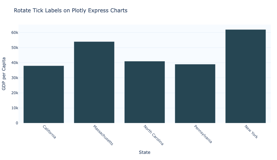
Rotate x-axis tick labels
For long category names on the x-axis, xaxis_tickangle rotates the labels and prevents overlap.
import plotly.express as px

df = px.data.gapminder().query("year == 2007")
fig = px.bar(df.head(10), x='country', y='gdpPercap')
fig.update_layout(xaxis_tickangle=45)
fig.show()
Rotate y-axis tick labels
If your y-axis labels are long (for example, in a horizontal bar chart), use yaxis_tickangle.
import plotly.express as px

df = px.data.gapminder().query("year == 2007")
fig = px.bar(df.head(10), x='gdpPercap', y='country', orientation='h')
fig.update_layout(yaxis_tickangle=0)
fig.show()
Use tickangle in update_layout()
Plotly Express charts return a Figure object, so you can always call fig.update_layout() to rotate ticks after creating the chart.
import plotly.express as px

df = px.data.gapminder().query("year == 2007")
fig = px.line(df.query("country=='United States'"), x='year', y='lifeExp')
fig.update_layout(xaxis_tickangle=45)
fig.show()
Rotate and align labels together
For angled labels, use tickangle along with tickfont and automargin to keep them readable.
import plotly.express as px

df = px.data.gapminder().query("year == 2007")
fig = px.bar(df.head(10), x='country', y='gdpPercap')
fig.update_layout(
    xaxis_tickangle=45,
    xaxis_tickfont=dict(size=10),
    xaxis_tickmode='array',
    xaxis_tickvals=df.head(10)['country'],
    margin=dict(b=140),
)
fig.show()
Summary
- Use
xaxis_tickangleto rotate x-axis labels. - Use
yaxis_tickanglefor vertical or horizontal layouts. - Use
fig.update_layout()after creating a Plotly Express figure. - Add
marginorautomarginwhen labels become long enough to need extra space.