
TL;DR
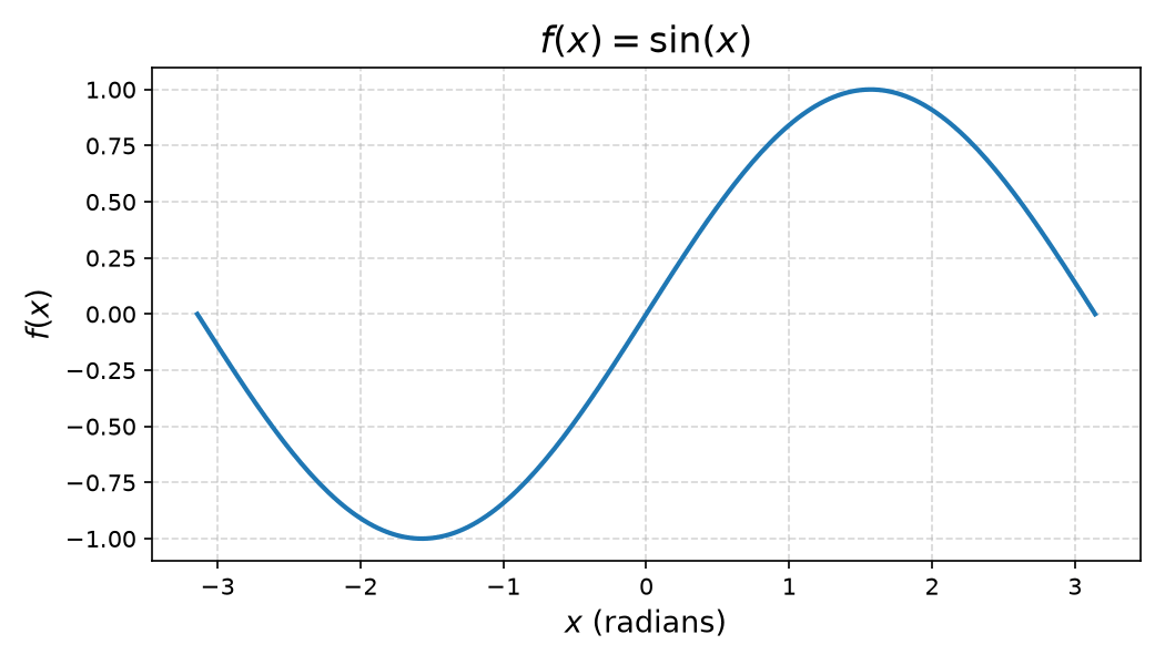
Wrap any label string in a raw string and use $...$ for math:
ax.set_title(r'$f(x) = \sin(x)$')
ax.set_xlabel(r'$x$ (radians)')
ax.set_ylabel(r'$f(x)$')
How it works
Matplotlib ships with its own math rendering engine called mathtext — no external LaTeX installation needed. You activate it by placing your expression between dollar signs inside a raw Python string (prefix r).
The r prefix matters: it stops Python from interpreting backslashes like \n or \t before Matplotlib sees them.
# Without r-prefix: \sin is treated as \s + in -> wrong
ax.set_title('$f(x) = \sin(x)$')   # risky

# With r-prefix: backslash passed straight to mathtext -> correct
ax.set_title(r'$f(x) = \sin(x)$')  # always do this
Common math symbols
| What you want | Mathtext syntax |
|---|---|
| Greek letters | \alpha, \beta, \sigma, \mu |
| Superscript | x^{2} |
| Subscript | x_{0} |
| Fraction | \frac{a}{b} |
| Square root | \sqrt{x} |
| Infinity | \infty |
| Sum / integral | \sum, \int |
Titles and axis labels
import matplotlib.pyplot as plt
import numpy as np

x = np.linspace(-np.pi, np.pi, 200)
y = np.sin(x)

fig, ax = plt.subplots(figsize=(7, 4))
ax.plot(x, y)

ax.set_title(r'$f(x) = \sin(x)$', fontsize=16)
ax.set_xlabel(r'$x$ (radians)', fontsize=13)
ax.set_ylabel(r'$f(x)$', fontsize=13)

plt.tight_layout()
plt.show()
Legend entries
Pass the same raw-string syntax to the label argument:
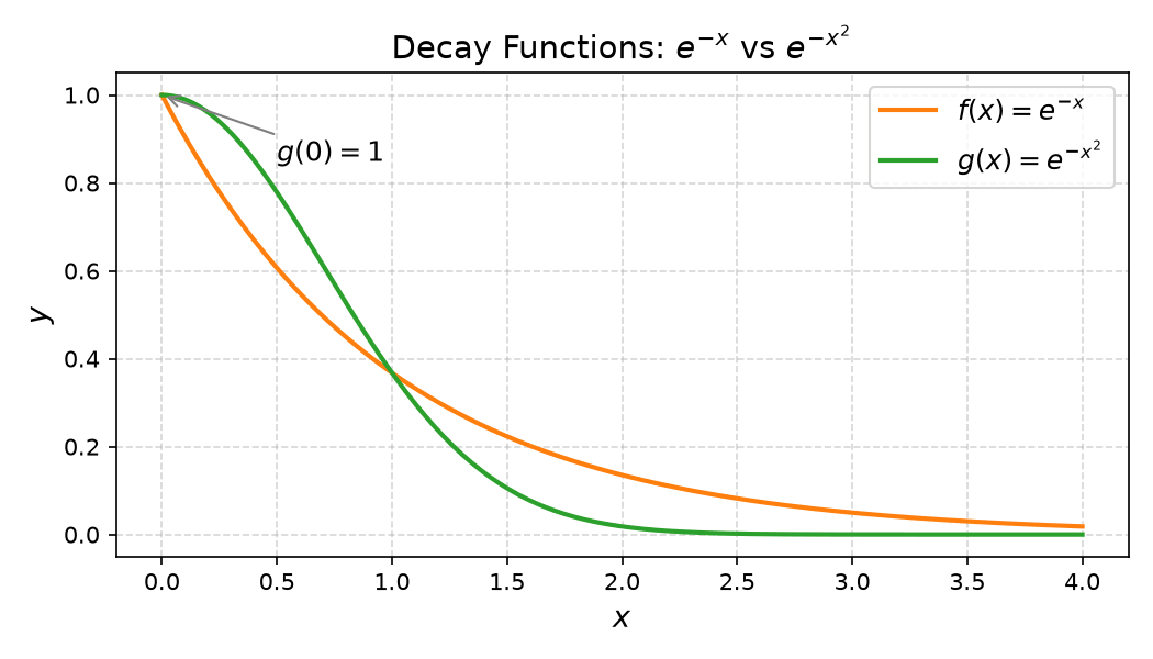
ax.plot(x2, y_exp,   label=r'$f(x) = e^{-x}$')
ax.plot(x2, y_gauss, label=r'$g(x) = e^{-x^2}$')
ax.legend(fontsize=12)
Annotations
ax.annotate() and ax.text() accept mathtext too:
ax.annotate(
    r'$g(0) = 1$',
    xy=(0, 1), xytext=(0.5, 0.85),
    arrowprops=dict(arrowstyle='->', color='gray'),
    fontsize=12
)
Full example
import matplotlib.pyplot as plt
import numpy as np

x = np.linspace(0, 4, 200)
y_exp   = np.exp(-x)
y_gauss = np.exp(-x**2)

fig, ax = plt.subplots(figsize=(7, 4))
ax.plot(x, y_exp,   label=r'$f(x) = e^{-x}$',   color='tab:orange', lw=2)
ax.plot(x, y_gauss, label=r'$g(x) = e^{-x^2}$', color='tab:green',  lw=2)

ax.annotate(
    r'$g(0) = 1$',
    xy=(0, 1), xytext=(0.5, 0.85),
    arrowprops=dict(arrowstyle='->', color='gray'),
    fontsize=12
)

ax.set_title(r'Decay Functions: $e^{-x}$ vs $e^{-x^2}$', fontsize=14)
ax.set_xlabel(r'$x$', fontsize=13)
ax.set_ylabel(r'$y$', fontsize=13)
ax.legend(fontsize=12)
ax.grid(True, linestyle='--', alpha=0.5)
plt.tight_layout()
plt.show()
Mixing plain text and math
You can freely mix regular text and math in the same string:
ax.set_xlabel(r'Time $t$ (seconds)')
ax.set_title(r'Growth rate: $\mu = 0.42\ \mathrm{hr}^{-1}$')
Use \mathrm{...} for upright (roman) text inside a math block — useful for units.
Using a full LaTeX install (optional)
If mathtext is not enough, you can enable a full LaTeX renderer. This requires LaTeX and dvipng/dvisvgm installed on your system:
plt.rcParams.update({
    'text.usetex': True,
    'font.family': 'serif',
})
Only do this when you need features mathtext does not cover — it is slower and adds an external dependency.