
TL;DR
Use plot_bgcolor to change the chart area and paper_bgcolor to style the page behind it.
import plotly.graph_objects as go

fig = go.Figure(
    data=[go.Bar(x=['A', 'B', 'C'], y=[3, 5, 2])],
    layout=dict(
        plot_bgcolor='#f4f4ff',
        paper_bgcolor='#ffffff',
        title='Plotly Plot vs Paper Background'
    )
)
fig.show()
Plot background vs paper background
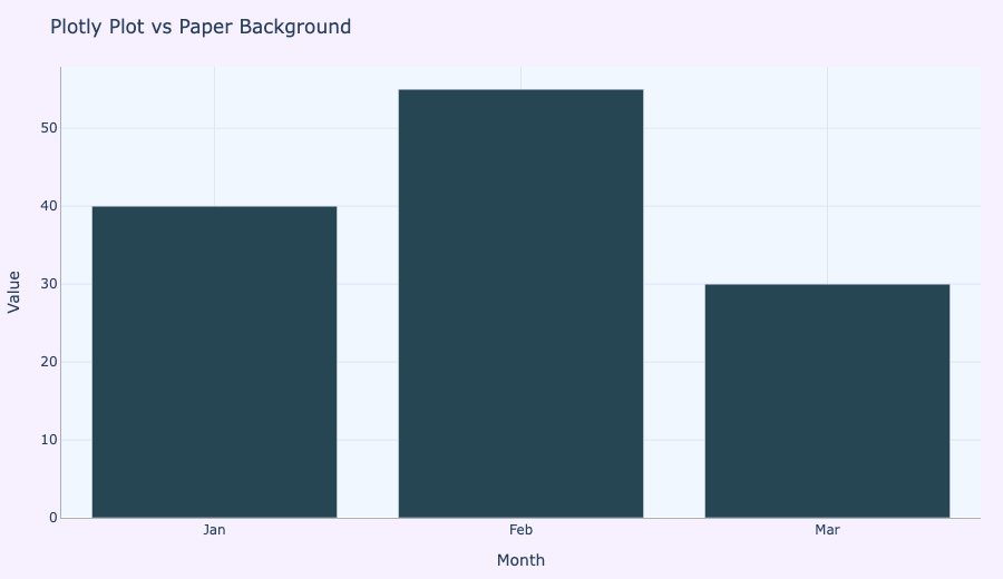
Plotly has two background layers:
plot_bgcolor: the color of the chart area where the traces appear.paper_bgcolor: the color behind that chart area, including margins and outside the axes.
If you want a full-page panel color, use paper_bgcolor. If you want only the chart area to be tinted, use plot_bgcolor.
Change the plot background color
The plot background is the area inside the axes. It is especially useful for making the chart area stand out from the page.
import plotly.graph_objects as go

fig = go.Figure(
    data=[go.Bar(x=['Jan', 'Feb', 'Mar'], y=[40, 55, 30])],
    layout=dict(
        plot_bgcolor='#E8F4FF',
        paper_bgcolor='#ffffff',
        title='Plot Background Color',
        xaxis=dict(title='Month'),
        yaxis=dict(title='Value')
    )
)
fig.show()
Change the paper background color
The paper background is everything outside the plot area. It is a good place to use a subtle accent color or a soft frame behind the chart.
fig = go.Figure(
    data=[go.Bar(x=['Jan', 'Feb', 'Mar'], y=[40, 55, 30])],
    layout=dict(
        plot_bgcolor='#ffffff',
        paper_bgcolor='#f9f4ef',
        title='Paper Background Color',
        xaxis=dict(title='Month'),
        yaxis=dict(title='Value')
    )
)
fig.show()
Use both for a polished appearance
To create a polished visualization, combine both properties: choose a light plot background and a contrasting paper background.
fig = go.Figure(
    data=[go.Bar(x=['Jan', 'Feb', 'Mar'], y=[40, 55, 30])],
    layout=dict(
        plot_bgcolor='#f0f7ff',
        paper_bgcolor='#f7f0ff',
        title='Plot and Paper Backgrounds Together',
        xaxis=dict(title='Month'),
        yaxis=dict(title='Value'),
        margin=dict(l=40, r=20, t=50, b=40)
    )
)
fig.show()
Style the grid and axes for the background
A colored plot area usually looks better with a soft grid and lighter axis lines. Use gridcolor and linecolor to keep the chart readable.
fig = go.Figure(
    data=[go.Bar(x=['Jan', 'Feb', 'Mar'], y=[40, 55, 30])],
    layout=dict(
        plot_bgcolor='#F0F8FF',
        paper_bgcolor='#FAF7FF',
        title='Background and Grid Styling',
        xaxis=dict(title='Month', gridcolor='#dfe7f5', linecolor='#a0aec0'),
        yaxis=dict(title='Value', gridcolor='#dfe7f5', linecolor='#a0aec0')
    )
)
fig.show()
Use a transparent background for overlays
If you want to export a chart with a transparent plot surface, set plot_bgcolor='rgba(0,0,0,0)' or paper_bgcolor='rgba(0,0,0,0)'.
fig = go.Figure(
    data=[go.Bar(x=['Jan', 'Feb', 'Mar'], y=[40, 55, 30])],
    layout=dict(
        plot_bgcolor='rgba(0,0,0,0)',
        paper_bgcolor='rgba(255,255,255,0.9)',
        title='Transparent Plot Background',
        xaxis=dict(title='Month'),
        yaxis=dict(title='Value')
    )
)
fig.show()
Summary
If the color should only apply behind the chart lines or bars, use plot_bgcolor. If the whole page around the chart should change, use paper_bgcolor.