
TL;DR
Use fig.update_layout(legend=...) to place the legend at the chart edge, inside the plot area, or in a horizontal row.
import plotly.graph_objects as go

fig = go.Figure(
    data=[
        go.Bar(x=['A', 'B', 'C'], y=[3, 4, 2], name='Apples'),
        go.Bar(x=['A', 'B', 'C'], y=[2, 5, 3], name='Oranges'),
    ]
)
fig.update_layout(
    legend=dict(
        orientation='h',
        yanchor='bottom',
        y=1.02,
        xanchor='left',
        x=0,
    )
)
fig.show()
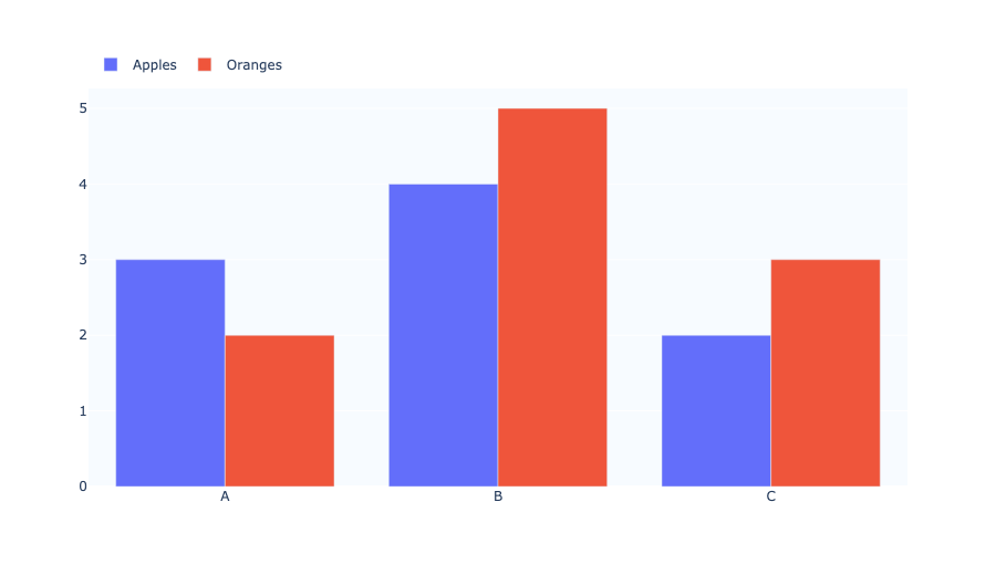
What Legend Positioning Controls
Plotly's legend position is configured through the legend layout property. The main settings are:
xandyfor horizontal and vertical position.xanchorandyanchorto control how the legend box is aligned around that point.orientationto switch between vertical and horizontal layouts.traceorderandtitlefor legend content ordering and caption.
Place the legend above the chart
A common layout is a horizontal legend at the top of the chart.
import plotly.graph_objects as go

fig = go.Figure(
    data=[
        go.Bar(x=['A', 'B', 'C'], y=[3, 4, 2], name='Apples'),
        go.Bar(x=['A', 'B', 'C'], y=[2, 5, 3], name='Oranges'),
    ]
)
fig.update_layout(
    legend=dict(
        orientation='h',
        yanchor='bottom',
        y=1.02,
        xanchor='left',
        x=0,
    ),
    margin=dict(t=80)
)
fig.show()
Put the legend on the right side
To move the legend outside the plotting area on the right, use x=1.02 and xanchor='left'.
import plotly.graph_objects as go

fig = go.Figure(
    data=[
        go.Bar(x=['A', 'B', 'C'], y=[3, 4, 2], name='Apples'),
        go.Bar(x=['A', 'B', 'C'], y=[2, 5, 3], name='Oranges'),
    ]
)
fig.update_layout(
    legend=dict(
        orientation='v',
        xanchor='left',
        x=1.02,
        yanchor='top',
        y=1,
    ),
    margin=dict(r=120)
)
fig.show()
Put the legend inside the plot area
To place the legend on top of the chart itself, use a position like x=0.95, y=0.95 with anchors set to right and top.
import plotly.graph_objects as go

fig = go.Figure(
    data=[
        go.Bar(x=['A', 'B', 'C'], y=[3, 4, 2], name='Apples'),
        go.Bar(x=['A', 'B', 'C'], y=[2, 5, 3], name='Oranges'),
    ]
)
fig.update_layout(
    legend=dict(
        x=0.95,
        y=0.95,
        xanchor='right',
        yanchor='top',
        bgcolor='rgba(255,255,255,0.8)',
        bordercolor='#444',
        borderwidth=1,
    ),
)
fig.show()
Use traceorder and title for clarity
traceorder='normal' keeps legend entries in trace order. Add a legend title with title_text.
import plotly.graph_objects as go

fig = go.Figure(
    data=[
        go.Bar(x=['A', 'B', 'C'], y=[3, 4, 2], name='Apples'),
        go.Bar(x=['A', 'B', 'C'], y=[2, 5, 3], name='Oranges'),
    ]
)
fig.update_layout(
    legend=dict(
        title_text='Fruit type',
        traceorder='normal',
        orientation='h',
        yanchor='bottom',
        y=1.02,
        xanchor='left',
        x=0,
    )
)
fig.show()
Summary
- Use
orientation='h'for top/bottom legends. - Use
xanchor/yanchorto control where the legend box is pinned. - Use
xandyin[0, 1]to keep the legend inside the chart area. - Use values beyond the 0–1 range to move the legend outside the chart.