It's common when working with timeseries, plotting A/B testing results, or conducting other types of analysis to want to plot a line (often the mean of your data over time) and a confidence interval to represent uncertainty in the sample data.
Below we show how to create line charts with confidence intervals using a range of plotting libraries, including interactive versions with Altair and Plotly.
Imports & Setup
Show Code
import altair as alt
from matplotlib import pyplot as plt
from matplotlib_inline.backend_inline import set_matplotlib_formats
import numpy as np
import pandas as pd
import plotly.graph_objects as go
import seaborn as sns

set_matplotlib_formats('retina')

# Create our new styles dictionary for use in rcParams.
dpi = 144
mpl_styles = {
    'figure.figsize': (6, 4),
    # Up the default resolution for figures.
    'figure.dpi': dpi,
    'savefig.dpi': dpi,
}

sns.set_theme(context='paper')
plt.rcParams.update(mpl_styles)
Data
Below we grab some timeseries data from Seaborn's built-in datasets. We keep two versions of the data:
df: "Raw" data with multiple observations per date.df_grouped: Aggregated data with one row per date.
df = sns.load_dataset('taxis')
df.head()
| pickup | dropoff | passengers | distance | fare | tip | tolls | total | color | payment | pickup_zone | dropoff_zone | pickup_borough | dropoff_borough | pickup_date | |
|---|---|---|---|---|---|---|---|---|---|---|---|---|---|---|---|
| 0 | 2019-03-23 20:21:09 | 2019-03-23 20:27:24 | 1 | 1.60 | 7.0 | 2.15 | 0.0 | 12.95 | yellow | credit card | Lenox Hill West | UN/Turtle Bay South | Manhattan | Manhattan | 2019-03-23 |
| 1 | 2019-03-04 16:11:55 | 2019-03-04 16:19:00 | 1 | 0.79 | 5.0 | 0.00 | 0.0 | 9.30 | yellow | cash | Upper West Side South | Upper West Side South | Manhattan | Manhattan | 2019-03-04 |
| 2 | 2019-03-27 17:53:01 | 2019-03-27 18:00:25 | 1 | 1.37 | 7.5 | 2.36 | 0.0 | 14.16 | yellow | credit card | Alphabet City | West Village | Manhattan | Manhattan | 2019-03-27 |
| 3 | 2019-03-10 01:23:59 | 2019-03-10 01:49:51 | 1 | 7.70 | 27.0 | 6.15 | 0.0 | 36.95 | yellow | credit card | Hudson Sq | Yorkville West | Manhattan | Manhattan | 2019-03-10 |
| 4 | 2019-03-30 13:27:42 | 2019-03-30 13:37:14 | 3 | 2.16 | 9.0 | 1.10 | 0.0 | 13.40 | yellow | credit card | Midtown East | Yorkville West | Manhattan | Manhattan | 2019-03-30 |
# Convert the pickup time to datetime and create a new column truncated to day.
df['pickup'] = pd.to_datetime(df.pickup)
df['pickup_date'] = pd.to_datetime(df.pickup.dt.date)
# Altair can't handle more than 5k rows so we truncate the data.
df = df.loc[df['pickup_date'] >= '2019-03-01'][:5000]

# We also create a grouped version, with calculated mean and standard deviation.
df_grouped = (
    df[['pickup_date', 'fare']].groupby(['pickup_date'])
    .agg(['mean', 'std', 'count'])
)
df_grouped = df_grouped.droplevel(axis=1, level=0).reset_index()
# Calculate a confidence interval as well.
df_grouped['ci'] = 1.96 * df_grouped['std'] / np.sqrt(df_grouped['count'])
df_grouped['ci_lower'] = df_grouped['mean'] - df_grouped['ci']
df_grouped['ci_upper'] = df_grouped['mean'] + df_grouped['ci']
df_grouped.head()
| pickup_date | mean | std | count | ci | ci_lower | ci_upper | xlabel | ci_label | |
|---|---|---|---|---|---|---|---|---|---|
| 0 | 2019-03-01 | 11.288462 | 8.877187 | 182 | 1.289721 | 9.998741 | 12.578182 | Avg Fare | Conf Interval (95%) |
| 1 | 2019-03-02 | 11.830128 | 9.505770 | 156 | 1.491699 | 10.338430 | 13.321827 | Avg Fare | Conf Interval (95%) |
| 2 | 2019-03-03 | 12.642308 | 9.787517 | 130 | 1.682507 | 10.959801 | 14.324815 | Avg Fare | Conf Interval (95%) |
| 3 | 2019-03-04 | 13.990233 | 13.538774 | 129 | 2.336364 | 11.653868 | 16.326597 | Avg Fare | Conf Interval (95%) |
| 4 | 2019-03-05 | 12.303944 | 9.448548 | 180 | 1.380336 | 10.923608 | 13.684281 | Avg Fare | Conf Interval (95%) |
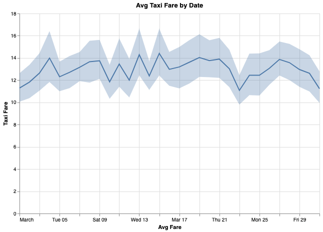
Matplotlib
With pre-aggregated data, and a confidence interval already defined in our dataframe, using Matplotlib to plot this out is pretty straightforward.
fig, ax = plt.subplots()
x = df_grouped['pickup_date']
ax.plot(x, df_grouped['mean'])
ax.fill_between(
    x, df_grouped['ci_lower'], df_grouped['ci_upper'], color='b', alpha=.15)
ax.set_ylim(ymin=0)
ax.set_title('Avg Taxi Fare by Date')
fig.autofmt_xdate(rotation=45)

Seaborn
Seaborn is a nice wrapper around Matplotlib so allows for a very similar syntax, but it also comes with some magic if you just give it the raw data.
ax = sns.lineplot(data=df, x='pickup_date', y='fare')
# A more verbose but explicit version of the above not relying on defaults:
# ax = sns.lineplot(data=df, x='pickup_date', y='fare', estimator='mean', ci=95,
#                   n_boot=1000)
ax.set_title('Avg Taxi Fare by Date')
ax.set_ylim(0)
ax.figure.autofmt_xdate(rotation=45)
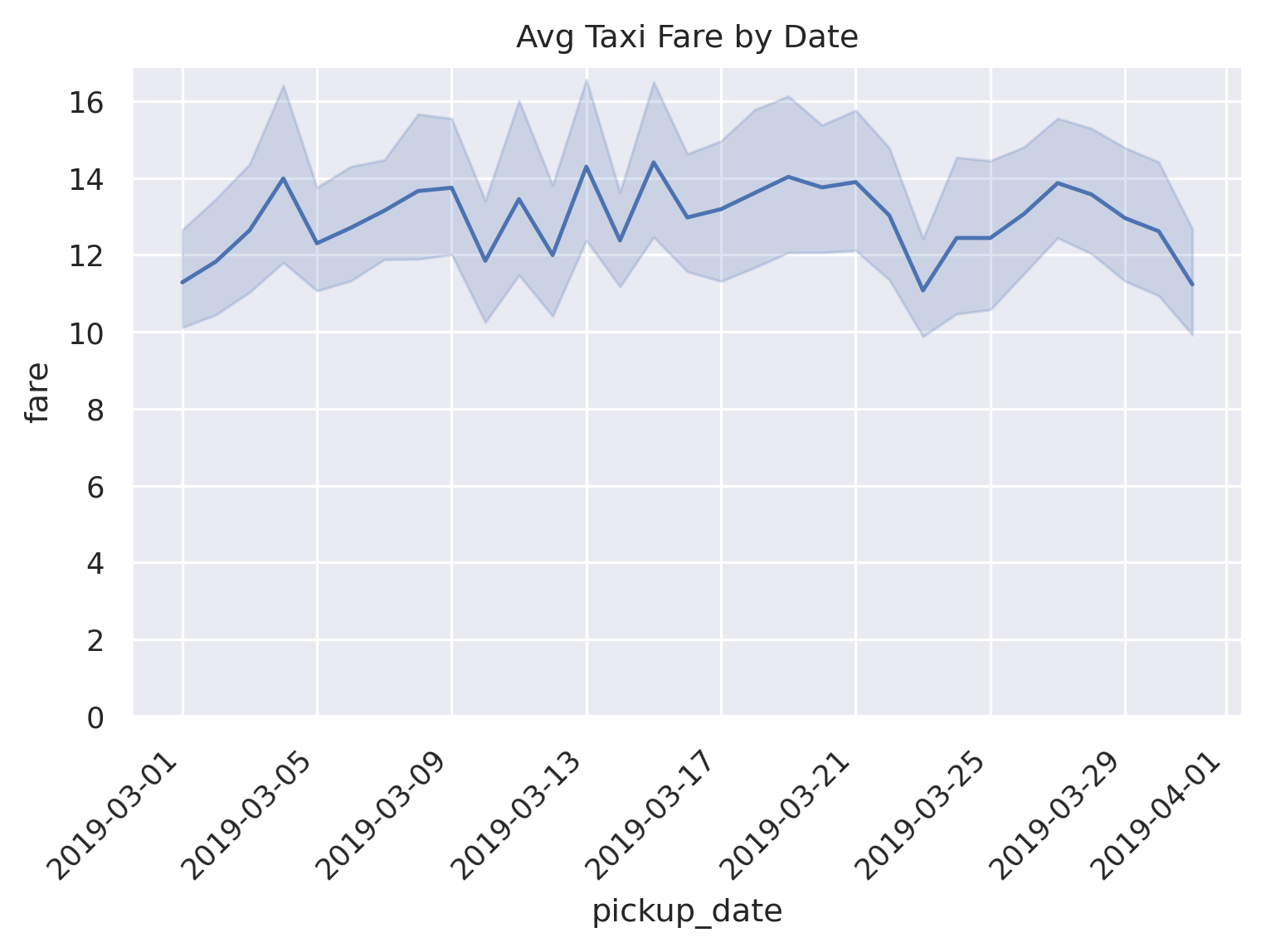
By default, if there are more than one observations for each unique x value,
Seaborn will take the mean of those observations and bootstrap a 95% confidence
interval using 1000 iterations. Pretty nice!
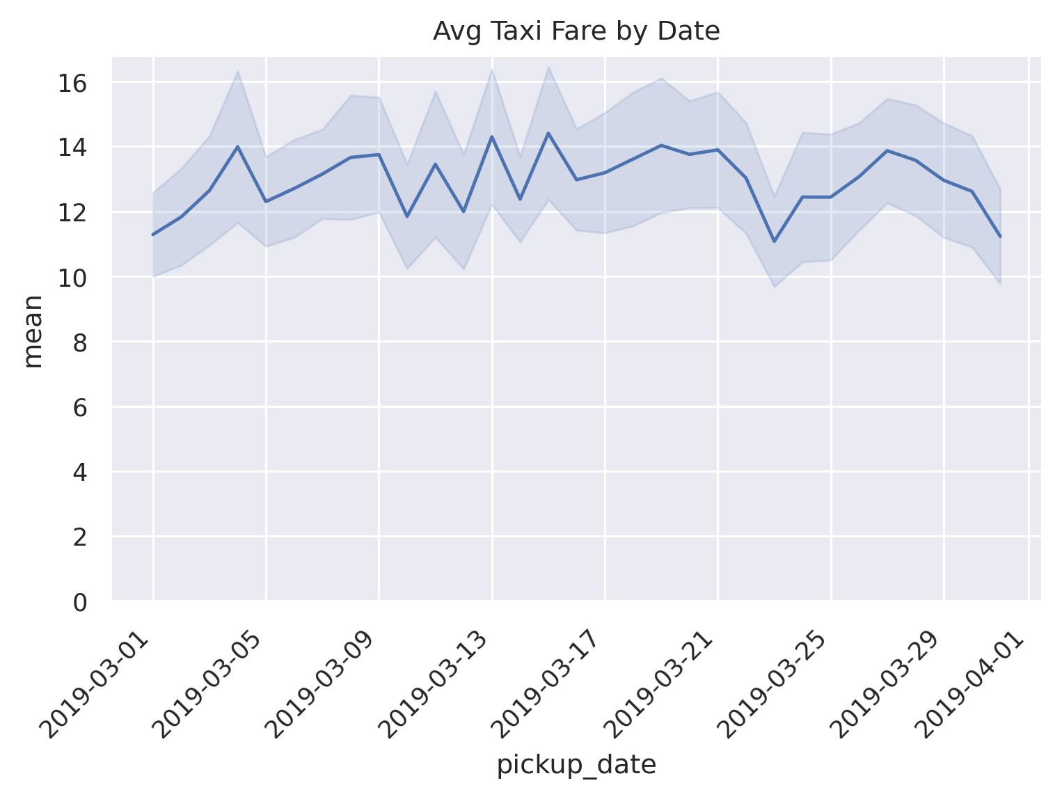
We can also do the same thing with the aggregated data, very similarly to Matplotlib.
ax = sns.lineplot(data=df_grouped, x='pickup_date', y='mean')
ax.fill_between(
    x, df_grouped['ci_lower'], df_grouped['ci_upper'], color='b', alpha=.15)
ax.set_title('Avg Taxi Fare by Date')
ax.set_ylim(0)
ax.figure.autofmt_xdate(rotation=45)
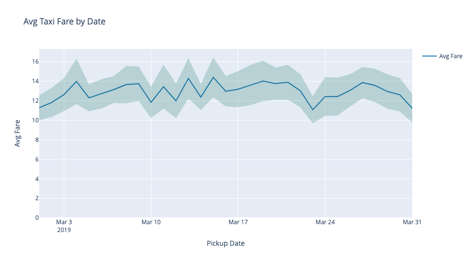
Altair
Altair is similar to Seaborn in that it has some automatated ways of creating and showing a line chart with a confidence interval. The benefit of Altair though is that it's interactive by default (although can be a bit verbose).
We first create the chart using the raw data. Altair allows for aggregate
methods in the specification, so mean(fare) gets us the average fare for
each date. And for the confidence interval, mark_errorband(extent='ci')
is the magic we need.
line = alt.Chart(df).mark_line().encode(
    x='pickup_date',
    y='mean(fare)'
)

band = alt.Chart(df).mark_errorband(extent='ci').encode(
    x=alt.X('pickup_date', title='Avg Fare'),
    y=alt.Y('fare', title='Taxi Fare')
)

chart = alt.layer(
    band,
    line
).properties(
    width=600,
    height=400,
    title='Avg Taxi Fare by Date'
)
chart
Note, this outputs an interactive chart but we just display a static version here since the underlying data for this version (since it uses the raw data) is quite large.
We can also easily do this more explicitly using the aggregated data
and mark_area(). We also add a nice tooltip to display all values on
mouseover.
line = alt.Chart(df_grouped).mark_line().encode(
    x=alt.X('pickup_date:T', title='Pickup Date'),
    y=alt.Y('mean:Q', title='Avg Fare')
)

band = alt.Chart(df_grouped).mark_area(
    opacity=0.25, color='gray'
).encode(
    x='pickup_date:T',
    y='ci_lower',
    y2='ci_upper',
    tooltip=[
        'pickup_date:T',
        alt.Tooltip('mean', format='.2f'),
        alt.Tooltip('ci_lower', format='.2f'),
        alt.Tooltip('ci_upper', format='.2f')
    ]
)

chart = alt.layer(
    band,
    line
).properties(
    width=600,
    height=400,
    title='Avg Taxi Fare by Date'
)
chart
Below is the embedded output, with tooltip.
Lastly, we go a bit further and use some Altair selection logic to display values alongside a vertical rule, with highlighted points, instead of relying on the tooltip. It's pretty verbose but looks really nice in the end.
df_grouped['xlabel'] = 'Avg Fare'
df_grouped['ci_label'] = 'Conf Interval (95%)'
line_color = 'steelblue'
ci_color = 'darkslategray'

line = alt.Chart(df_grouped).mark_line(color=line_color).encode(
    x=alt.X('pickup_date:T', title='Pickup Date'),
    y=alt.Y('mean:Q', title='Avg Fare')
)

band = alt.Chart(df_grouped).mark_area(
    opacity=0.25, color=ci_color
).encode(
    x='pickup_date:T',
    y='ci_lower:Q',
    y2='ci_upper:Q'
)

# Create a selection that chooses the nearest point & selects based on x-value.
nearest = alt.selection(type='single', nearest=True, on='mouseover',
                        fields=['pickup_date'], empty='none')

# Transparent selectors across the chart. This is what tells us
# the x-value of the cursor.
selectors = alt.Chart(df_grouped).mark_point().encode(
    x='pickup_date:T',
    opacity=alt.value(0),
).add_selection(
    nearest
)

# Draw points on the line, and highlight based on selection
points = line.mark_point(color=line_color).encode(
    opacity=alt.condition(nearest, alt.value(1), alt.value(0))
)

points2 = band.mark_point(shape='triangle-up').encode(
    opacity=alt.condition(nearest, alt.value(1), alt.value(0))
)

points3 = alt.Chart(df_grouped).mark_point(shape='triangle-down').encode(
    x='pickup_date:T',
    y='ci_upper:Q',
    opacity=alt.condition(nearest, alt.value(1), alt.value(0))
)

text = line.mark_text(align='left', dx=5, dy=-5, color=line_color).encode(
    text=alt.condition(nearest, 'mean', alt.value(' '), format='.2f')
)

text2 = band.mark_text(align='left', dx=5, dy=5, color=ci_color).encode(
    text=alt.condition(nearest, 'ci_lower', alt.value(' '), format='.2f')
)

text3 = alt.Chart(df_grouped).mark_text(
    align='left', dx=5, dy=-5, color=ci_color
).encode(
    x='pickup_date:T',
    y='ci_upper:Q',
    text=alt.condition(nearest , 'ci_upper:Q', alt.value(' '), format='.2f'),
)

text4 = alt.Chart(df_grouped).mark_text(align='left', dx=5, dy=10).encode(
    x='pickup_date:T',
    y=alt.value(0),
    text=alt.condition(nearest, 'pickup_date', alt.value(' '))
)

# Draw a rule at the location of the selection
rules = alt.Chart(df_grouped).mark_rule(color='black', strokeDash=[1,1]).encode(
    x='pickup_date:T'
).transform_filter(
    nearest
)

chart = alt.layer(
    band,
    line,
    selectors,
    points,
    points2,
    points3,
    rules,
    text,
    text2,
    text3,
    text4
).configure(
    # Add padding so the text doesn't get cut off on the right.
    padding={"left": 5, "top": 5, "right": 75, "bottom": 5}
).properties(
    width=600,
    height=400,
    title='Avg Taxi Fare by Date'
)

chart
Again, this is very nicely dynamic, hover your mouse over the chart!
Plotly
Plotly is another interactive visualization library that gives us really nice hover tooltips for free (along with other functionality).
fig = go.Figure([
    go.Scatter(
        name='Avg Fare',
        x=df_grouped['pickup_date'],
        y=round(df_grouped['mean'], 2),
        mode='lines',
        line=dict(color='rgb(31, 119, 180)'),
    ),
    go.Scatter(
        name='95% CI Upper',
        x=df_grouped['pickup_date'],
        y=round(df_grouped['ci_upper'], 2),
        mode='lines',
        marker=dict(color='#444'),
        line=dict(width=0),
        showlegend=False
    ),
    go.Scatter(
        name='95% CI Lower',
        x=df_grouped['pickup_date'],
        y=round(df_grouped['ci_lower'], 2),
        marker=dict(color='#444'),
        line=dict(width=0),
        mode='lines',
        fillcolor='rgba(68, 68, 68, 0.3)',
        fill='tonexty',
        showlegend=False
    )
])
fig.update_layout(
    xaxis_title='Pickup Date',
    yaxis_title='Avg Fare',
    title='Avg Taxi Fare by Date',
    hovermode='x'
)
fig.update_yaxes(rangemode='tozero')
Play around with the viz below; pretty slick right?
Another way to do it is to just have one Scatter element for the confidence
band. You append the upper bound values to the reversed lower bound values and
then fill in the area inside of it. The only issue with this method is that
getting the nice tooltip for upper/lower bounds isn't possible (or at least
isn't easy).
fig = go.Figure([
    go.Scatter(
        name='Avg Fare',
        x=df_grouped['pickup_date'],
        y=round(df_grouped['mean'], 2),
        mode='lines',
        line=dict(color='rgb(31, 119, 180)'),
    ),
    go.Scatter(
        x=list(df_grouped['pickup_date'])+list(df_grouped['pickup_date'][::-1]), # x, then x reversed
        y=list(df_grouped['ci_upper'])+list(df_grouped['ci_lower'][::-1]), # upper, then lower reversed
        fill='toself',
        fillcolor='rgba(0,100,80,0.2)',
        line=dict(color='rgba(255,255,255,0)'),
        hoverinfo='skip',
        showlegend=False,
        name='95% CI'
    )
])
fig.update_layout(
    xaxis_title='Pickup Date',
    yaxis_title='Avg Fare',
    title='Avg Taxi Fare by Date',
    hovermode='x'
)
fig.update_yaxes(rangemode='tozero')
Again, just saving bandwidth here and embedding the static image here, but this is really an interactive plot.
And that's how to plot a line chart with a confidence interval using four difference python libraries.