By default, at least as of this writing, Matplotlib hides the underlying Axes grid. In this post, we'll walk through a few simple ways to show the grid in your plots, on both the major and minor ticks.
First let's import Matplotlib and create a simple function to plot some lines:
from matplotlib import pyplot as plt
import numpy as np


def sinplot():
    """Example plot we'll use throughout."""
    fig, ax = plt.subplots()
    x = np.linspace(0, 14, 100)
    for i in range(1, 7):
        ax.plot(x, np.sin(x + i * .5) * (7 - i))
    return ax
The default Matplotlib style:
ax = sinplot()

As you can see, no grid.
Showing the Grid
It's a simple one-liner to get a grid to show up in your plot:
ax = sinplot()
# Show the grid!
ax.grid(True)
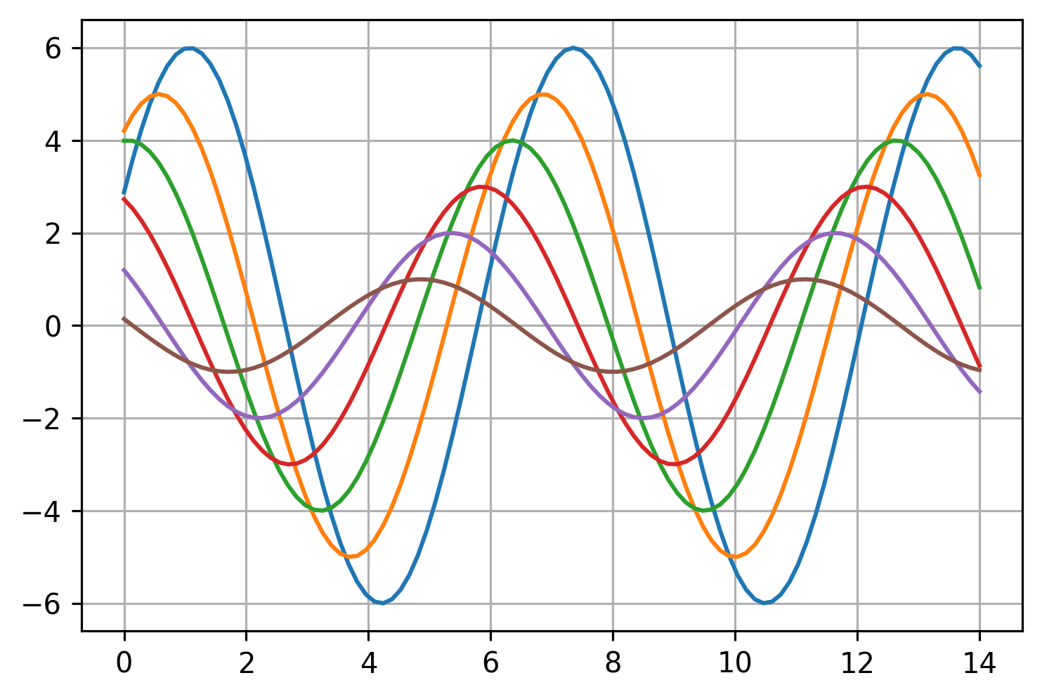
Showing Both Major and Minor Grid
By default the grid() method on the Axes object shows just the major
grid, but it can be used to show just the minor grid or both.
ax = sinplot()
# Show the major grid and style it slightly.
ax.grid(which='major', color='#DDDDDD', linewidth=0.8)
# Show the minor grid as well. Style it in very light gray as a thin,
# dotted line.
ax.grid(which='minor', color='#EEEEEE', linestyle=':', linewidth=0.5)
# Make the minor ticks and gridlines show.
ax.minorticks_on()
Using the which argument, with possible values of major, minor or
both, you can tell Matplotlib which grid you want to show or style.
Matplotlib doesn't show the minor ticks / grid by default so you also
need explicitly show them using minorticks_on().
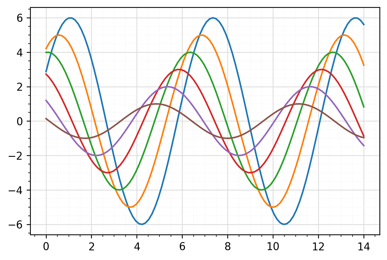
Customizing the Grid and Minor Ticks
Now let's say you want to mimic the look of R's ggplot2 charts. They
have a light gray background with white gridlines. And while they show
the minor gridlines, the minor ticks themselves are hidden.
Matplotlib sets the tick cadence automatically and sometimes it's not exactly what you want. So let's change it to be less frequent as well.
from matplotlib.ticker import AutoMinorLocator

ax = sinplot()
# Give plot a gray background like ggplot.
ax.set_facecolor('#EBEBEB')
# Remove border around plot.
[ax.spines[side].set_visible(False) for side in ax.spines]
# Style the grid.
ax.grid(which='major', color='white', linewidth=1.2)
ax.grid(which='minor', color='white', linewidth=0.6)
# Show the minor ticks and grid.
ax.minorticks_on()
# Now hide the minor ticks (but leave the gridlines).
ax.tick_params(which='minor', bottom=False, left=False)

# Only show minor gridlines once in between major gridlines.
ax.xaxis.set_minor_locator(AutoMinorLocator(2))
ax.yaxis.set_minor_locator(AutoMinorLocator(2))
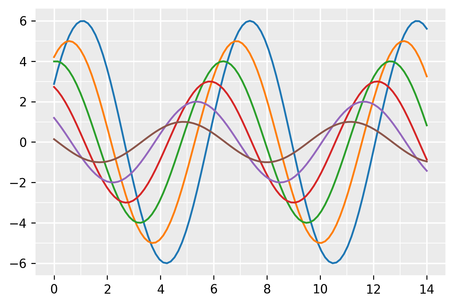
Setting the Grid for All Charts
Doing the above for every chart would be cumbersome. You could always
throw it in a function and call it for every chart, but there is an
easier solution - just update Matplotlib's rcParams with the styles
we want.
# Set ggplot styles and update Matplotlib with them.
ggplot_styles = {
    'axes.edgecolor': 'white',
    'axes.facecolor': 'EBEBEB',
    'axes.grid': True,
    'axes.grid.which': 'both',
    'axes.spines.left': False,
    'axes.spines.right': False,
    'axes.spines.top': False,
    'axes.spines.bottom': False,
    'grid.color': 'white',
    'grid.linewidth': '1.2',
    'xtick.color': '555555',
    'xtick.major.bottom': True,
    'xtick.minor.bottom': False,
    'ytick.color': '555555',
    'ytick.major.left': True,
    'ytick.minor.left': False,
}

plt.rcParams.update(ggplot_styles)
That gets us most of the way there. You'll still have to edit the
cadence of the minor ticks if you want to change them and unfortunately,
as of this writing, there are no rcParams options to differentiate
styling between the major and minor gridlines so you'll have to manually
style the minor grid:
from matplotlib.ticker import AutoMinorLocator

ax = sinplot()

# Set minor ticks/gridline cadence.
ax.xaxis.set_minor_locator(AutoMinorLocator(2))
ax.yaxis.set_minor_locator(AutoMinorLocator(2))

# Turn minor gridlines on and make them thinner.
ax.grid(which='minor', linewidth=0.6)

So that's how you show and customize the plot grid in Matplotlib. Hope this was helpful and let us know if there are other grid examples you'd like to see.