Histograms are useful for visualizing distributions of data and are pretty simple in Maplotlib.
The Basics
Let's get the tips data from Seaborn:
from matplotlib import pyplot as plt
import numpy as np
import seaborn as sns

df = sns.load_dataset('tips')
df.head()
| total_bill | tip | sex | smoker | day | time | size | |
|---|---|---|---|---|---|---|---|
| 0 | 16.99 | 1.01 | Female | No | Sun | Dinner | 2 |
| 1 | 10.34 | 1.66 | Male | No | Sun | Dinner | 3 |
| 2 | 21.01 | 3.50 | Male | No | Sun | Dinner | 3 |
| 3 | 23.68 | 3.31 | Male | No | Sun | Dinner | 2 |
| 4 | 24.59 | 3.61 | Female | No | Sun | Dinner | 4 |
# Plot a simple, default histogram.
# ax.hist() returns a tuple of three objects describing the histogram.
# The default number of bins is 10.
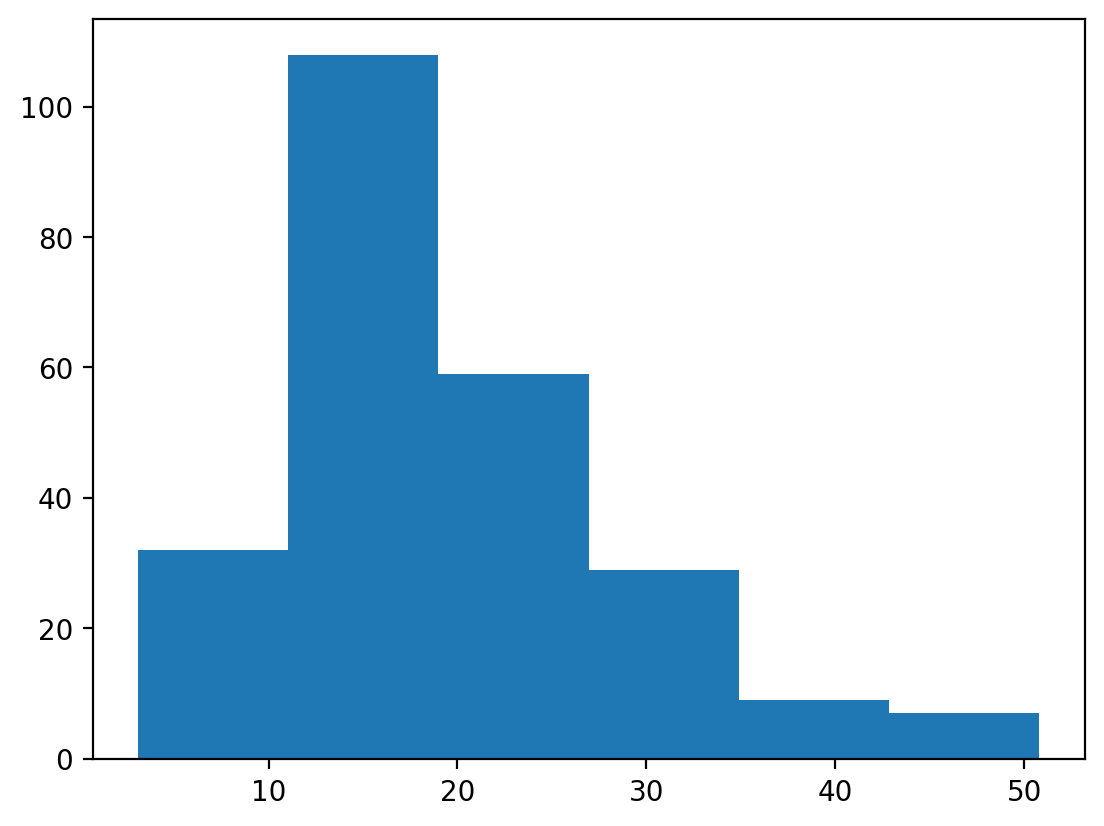
n, bins, patches = plt.hist(df['total_bill'])

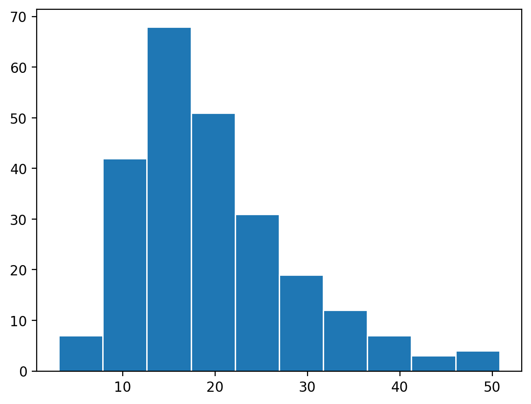
# Let's plot again but using 6 bins instead.
n, bins, patches = plt.hist(df['total_bill'], bins=6)
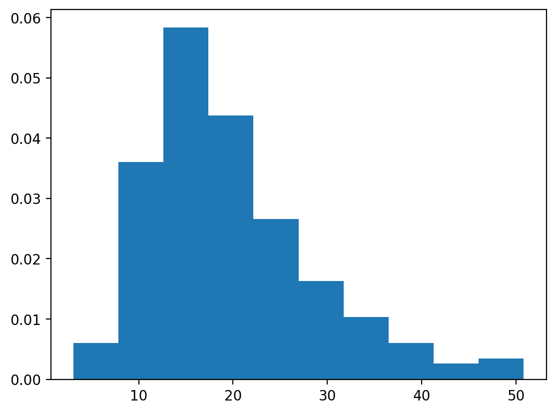
# Plot the density instead
n, bins, patches = plt.hist(df['total_bill'], density=True)
Styling the Histogram
The histogram bars have no separation by default since the edgecolor is the same as the bar. By making the edgecolor the same as the background color, you create some separation between the bar.
n, bins, patches = plt.hist(df['total_bill'], edgecolor='white')
An alternative is just to make the bars skinnier using rwidth.
# We adjust the color as well as the relative width of the bars.
n, bins, patches = plt.hist(df['total_bill'], color='teal', rwidth=0.9)

Binned / Aggregated Data
Have data that is already aggregated and binned? You can still use plt.hist
or you can just use plt.bar.
# If you have data that is already binned, e.g.:
counts, bins = np.histogram(df['total_bill'])
# You can plot it directly... or just use plt.bar()
n, bins, patches = plt.hist(bins[:-1], bins, weights=counts)

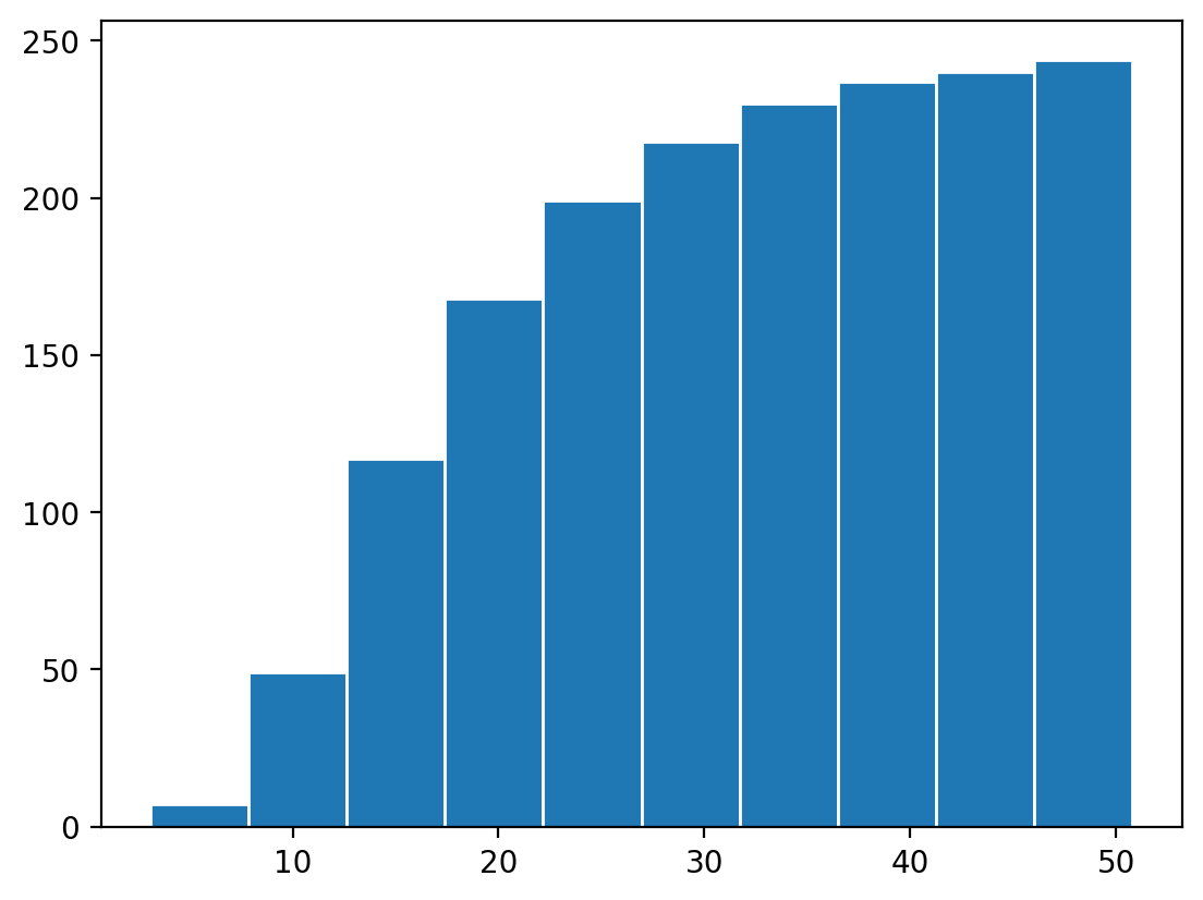
Cumulative Histograms
Cumulative histograms are simple as well:
n, bins, patches = plt.hist(
    df['total_bill'], cumulative=True, edgecolor='white')
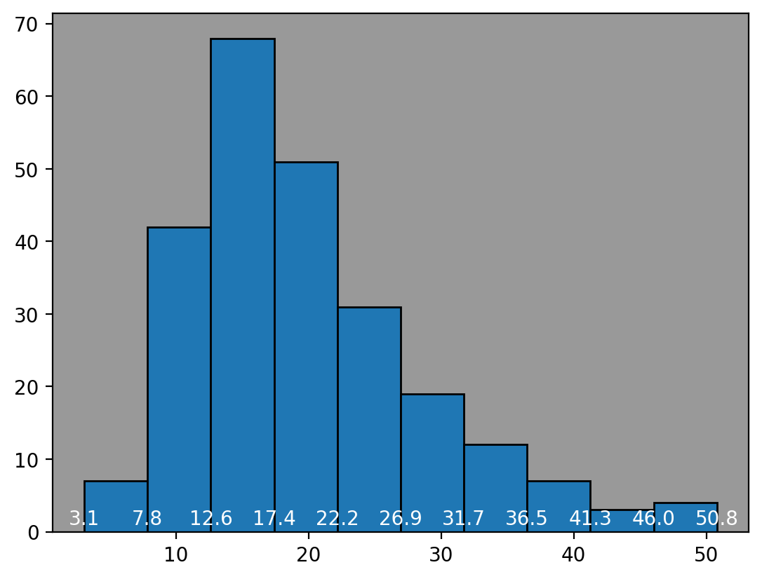
Understanding Bin Borders
Histograms separate data into bins with a start value and end value. The start value is included in the bin and the end value is not, it's included in the next bin. This is true for all bins except the last bin, which includes the end value as well (since there's no next bin).
Here we show the bin values on the histogram.
# Bins are: [, ) except for the last one which is [, ]
n, bins, patches = plt.hist(df['total_bill'], align='mid', edgecolor='black')
for num in bins:
  plt.text(num, 1, round(num, 1), ha='center', color='white')

plt.gca().set_facecolor('#999')
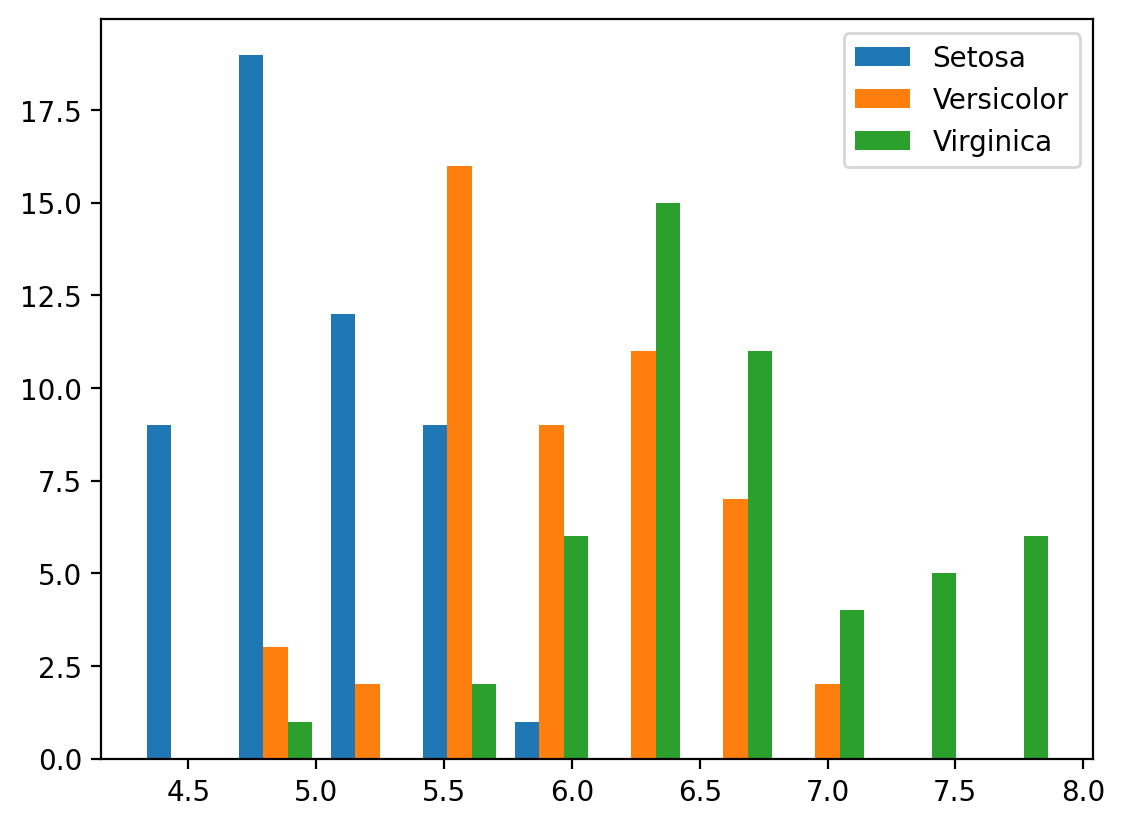
Comparing Histograms Across Data
Let's load in the iris dataset and show an example of how to plot and compare
histograms against each other with multiple variables or data.
df = sns.load_dataset('iris')
b, bins, patches = plt.hist(
    [df.loc[df['species'] == 'setosa', 'sepal_length'],
     df.loc[df['species'] == 'versicolor', 'sepal_length'],
     df.loc[df['species'] == 'virginica', 'sepal_length']],
    label=['Setosa', 'Versicolor', 'Virginica'])
plt.legend()
You can either plot them side by side, as above, or stacked, as below.
b, bins, patches = plt.hist(
    [df.loc[df['species'] == 'setosa', 'sepal_length'],
     df.loc[df['species'] == 'versicolor', 'sepal_length'],
     df.loc[df['species'] == 'virginica', 'sepal_length']],
    stacked=True,
    label=['Setosa', 'Versicolor', 'Virginica'],
    edgecolor='white')
plt.legend()
