Quick Summary
There are two functions each for horizontal and vertical lines in Matplotlib.
axhline(...)axvline(...)hlines(...)vlines(...)
The first two are the simplest way to get horizontal or vertical lines across the entire plot. The second two allow you to set a "start" and "end" in the horizontal or vertical direction, respectively. They also allow for defining more than one line at a time.
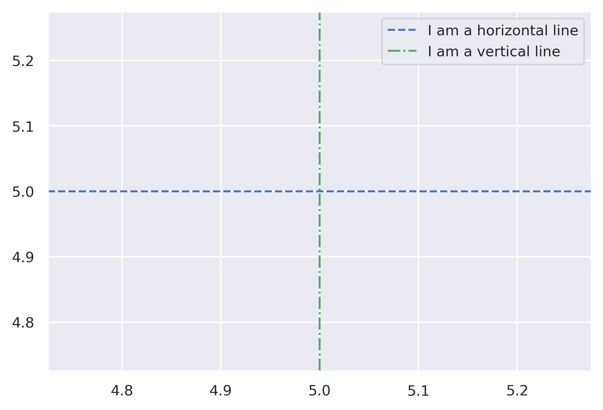
The Basics
from matplotlib import pyplot as plt
import numpy as np

fig, ax = plt.subplots()
ax.axhline(y=5, color='r', linestyle='--', label='I am a horizontal line')
ax.axvline(x=5, color='g', linestyle='-.', label='I am a vertical line')
ax.legend()

# Or using plt directly.
plt.figure()
plt.axhline(y=5, color='b', linestyle='--', label='I am a horiztonal line')
plt.axvline(x=5, color='g', linestyle='-.', label='I am a vertical line')
plt.legend()
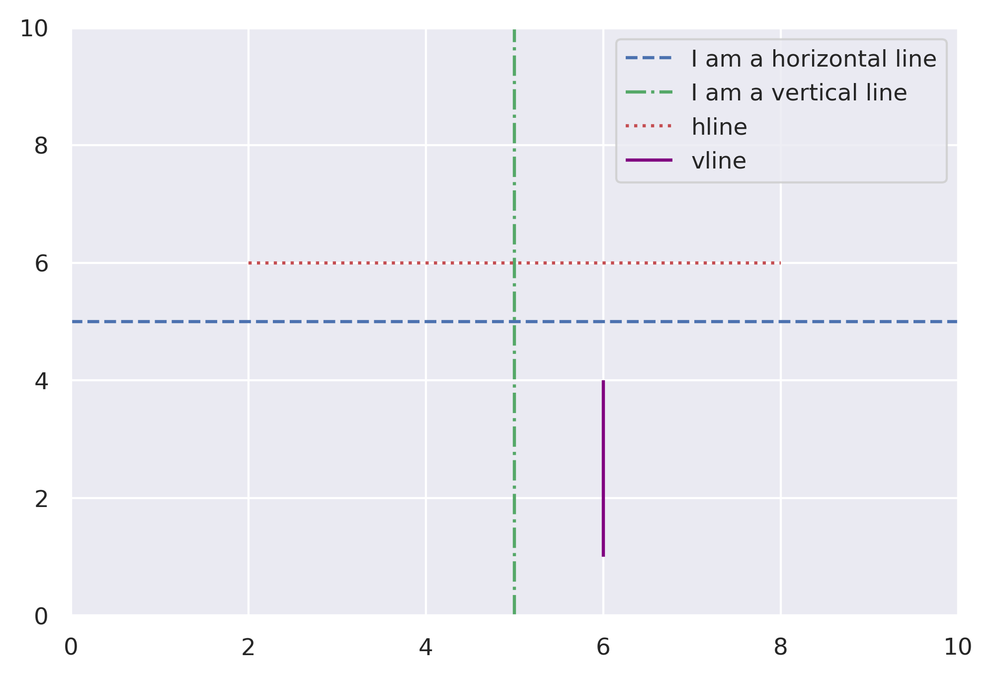
hlines and vlines
These functions are very similar, but allow us to set min and max for each line.
fig, ax = plt.subplots()
plt.xlim(0, 10)
plt.ylim(0, 10)
ax.axhline(y=5, color='b', linestyle='--', label='I am a horizontal line')
ax.axvline(x=5, color='g', linestyle='-.', label='I am a vertical line')
# Plot lines but only going part of the way across.
plt.hlines(y=6, xmin=2, xmax=8, color='r', linestyles=':', label='hline')
plt.vlines(x=6, ymin=1, ymax=4, color='purple', linestyles='-', label='vline')
ax.legend()
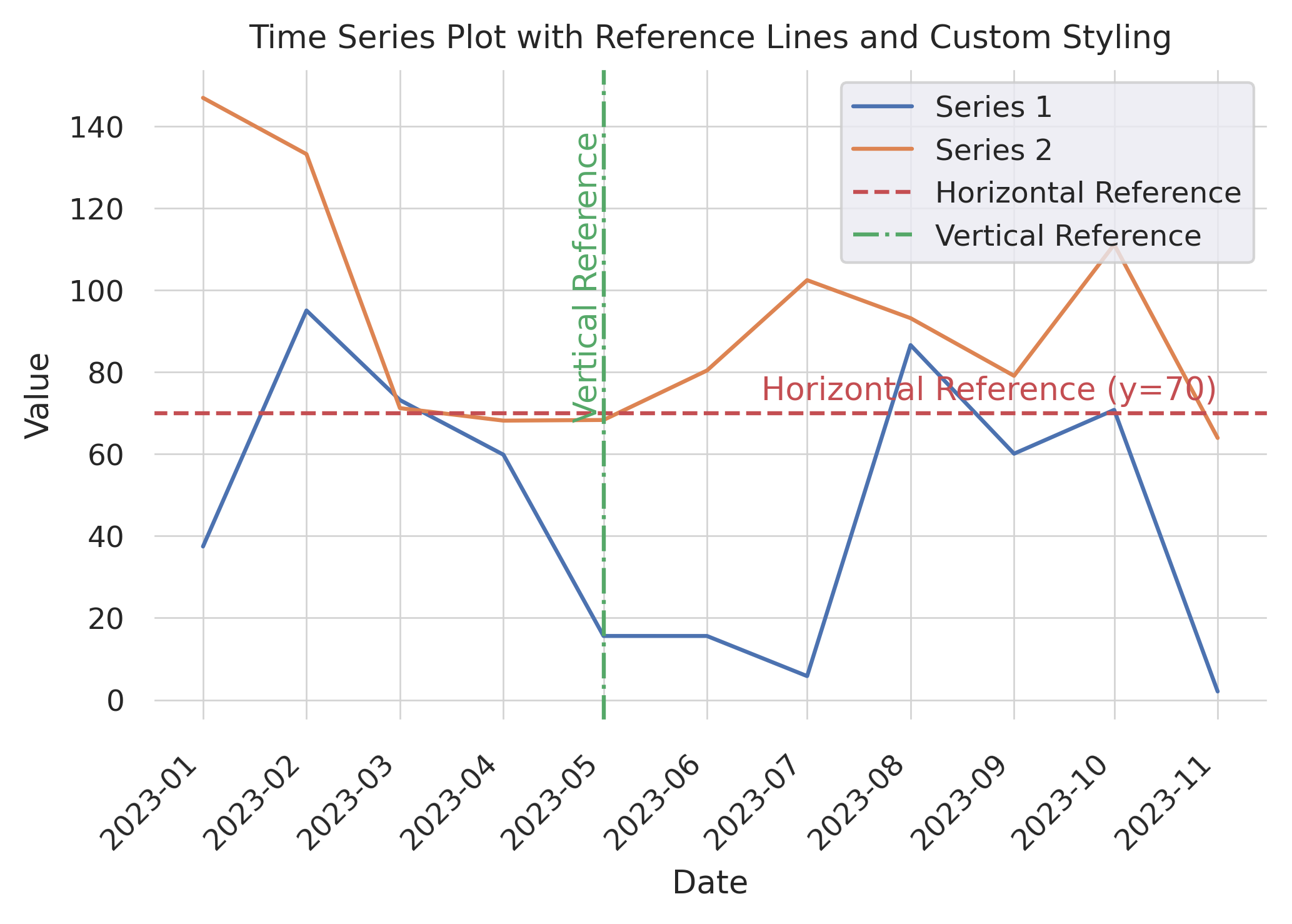
Annotating the Lines with Text
Often, instead of (or in addition to) adding the horizontal or vertical lines to the legend, it's nice to show a text annotation near the line, indicating what it represents. Below we'll demonstrate how to add text annotations and style and position them so that they are easily associated with the line.
# Generate some sample data for the time series plot
np.random.seed(42)
dates = np.arange('2023-01', '2023-12', dtype='datetime64[M]')
data1 = np.random.rand(len(dates)) * 100
data2 = np.random.rand(len(dates)) * 100 + 50

# Create a figure and axes using subplots
fig, ax = plt.subplots()

# Plot the two time series lines
ax.plot(dates, data1, label='Series 1')
ax.plot(dates, data2, label='Series 2')

# Add horizontal and vertical reference lines
ax.axhline(y=70, color='r', linestyle='--', label='Horizontal Reference')
ax.axvline(x=dates[4], color='g', linestyle='-.', label='Vertical Reference')

# Add text annotations to the reference lines, positioned to avoid overlap
ax.text(dates[-1], 70 + ax.get_ylim()[1]*0.01 , 'Horizontal Reference (y=70)',
    color='r', va='bottom', ha='right')
ax.text(dates[4], ax.get_ylim()[1] * 0.9, 'Vertical Reference', color='g',
    ha='right', va='top', rotation=90)

# Add labels and title
ax.set_xlabel('Date')
ax.set_ylabel('Value')
ax.set_title('Time Series Plot with Reference Lines and Custom Styling')

# Set background color and grid properties
ax.set_facecolor('white')
ax.grid(color='lightgray', linestyle='-', linewidth=0.5)

# Add a legend
ax.legend()

# Rotate x-axis tick labels.
fig.autofmt_xdate(rotation=45)

# Display the plot
plt.show()