Load Data
Let's use the iris dataset for this tutorial. It's available via many packages; we'll
load it from Seaborn.
import seaborn as sns
df = sns.load_dataset('iris')
df.head()
| sepal_length | sepal_width | petal_length | petal_width | species | |
|---|---|---|---|---|---|
| 0 | 5.1 | 3.5 | 1.4 | 0.2 | setosa |
| 1 | 4.9 | 3.0 | 1.4 | 0.2 | setosa |
| 2 | 4.7 | 3.2 | 1.3 | 0.2 | setosa |
| 3 | 4.6 | 3.1 | 1.5 | 0.2 | setosa |
| 4 | 5.0 | 3.6 | 1.4 | 0.2 | setosa |
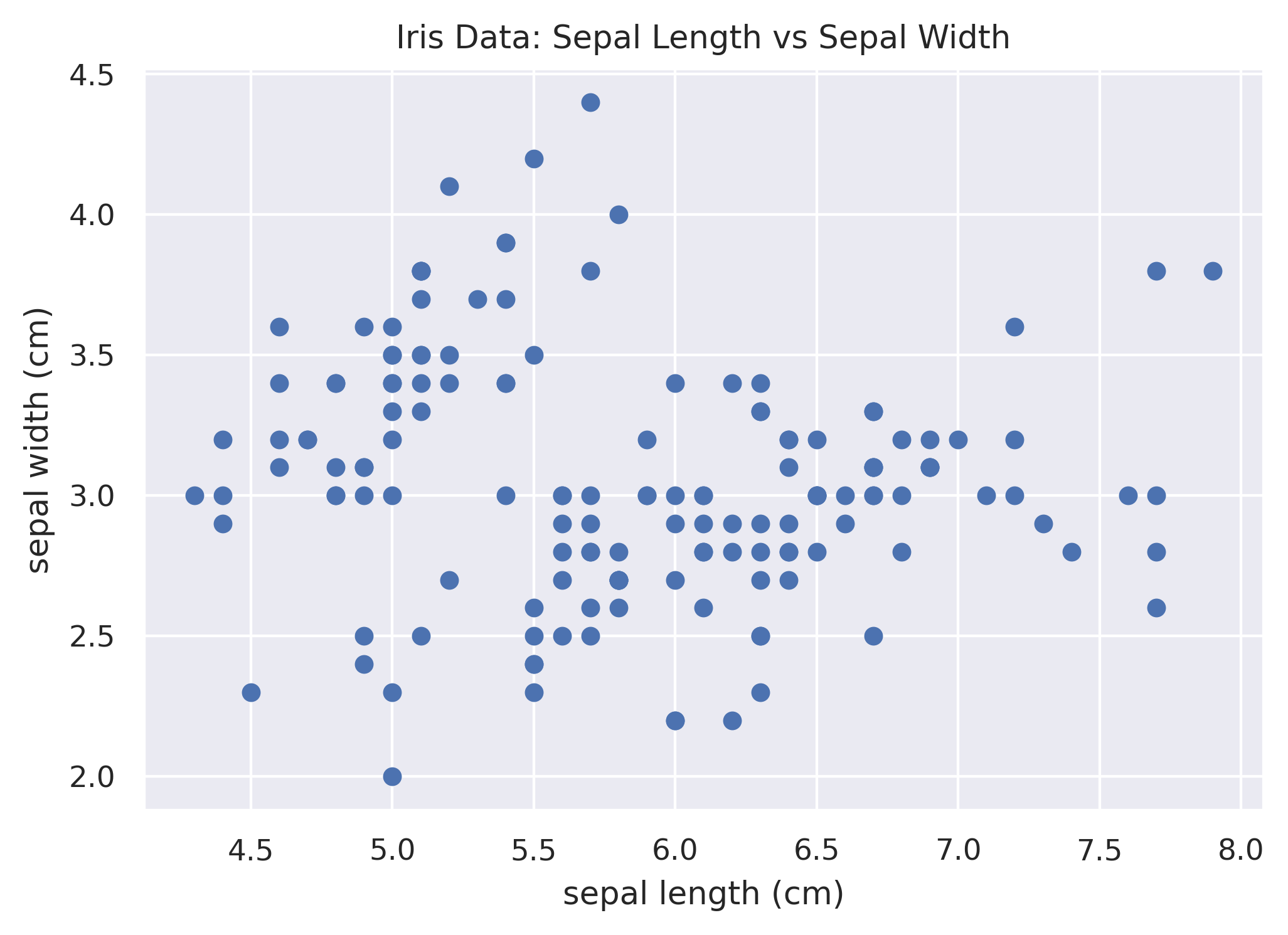
Simple Scatterplot
Let's see what we get by default if we just throw two numeric columns from the data into Matplotlib's scatter
function.
plt.figure()
plt.scatter(df['sepal_length'], df['sepal_width'])
plt.xlabel('sepal length (cm)')
plt.ylabel('sepal width (cm)')
plt.title('Iris Data: Sepal Length vs Sepal Width')
plt.show()
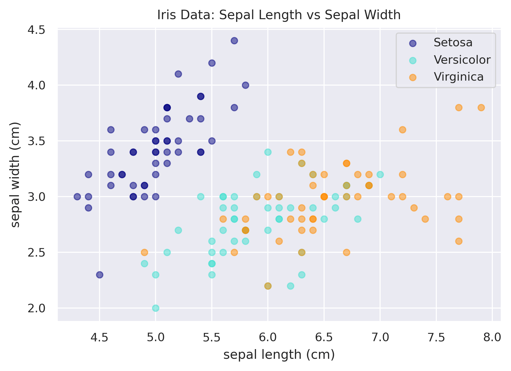
Not bad, but really what we want is each species of iris to have a different color so that we can differentiate the
data. This is not super easy to do in Matplotlib; it's a bit of a manual process of plotting each species separately.
Below we subset the data to each species, assign it a color, and a label, so that the legend works as well.
plt.scatter(df.loc[df['species'] == 'setosa', 'sepal_length'],
            df.loc[df['species'] == 'setosa', 'sepal_width'],
            color='navy', label='setosa')
plt.scatter(df.loc[df['species'] == 'versicolor', 'sepal_length'],
            df.loc[df['species'] == 'versicolor', 'sepal_width'],
            color='turquoise', label='versicolor')
plt.scatter(df.loc[df['species'] == 'virginica', 'sepal_length'],
            df.loc[df['species'] == 'virginica', 'sepal_width'],
            color='darkorange', label='virginica')
plt.xlabel('sepal length (cm)')
plt.ylabel('sepal width (cm)')
plt.title('Iris Data: Sepal Length vs Sepal Width')
plt.legend()
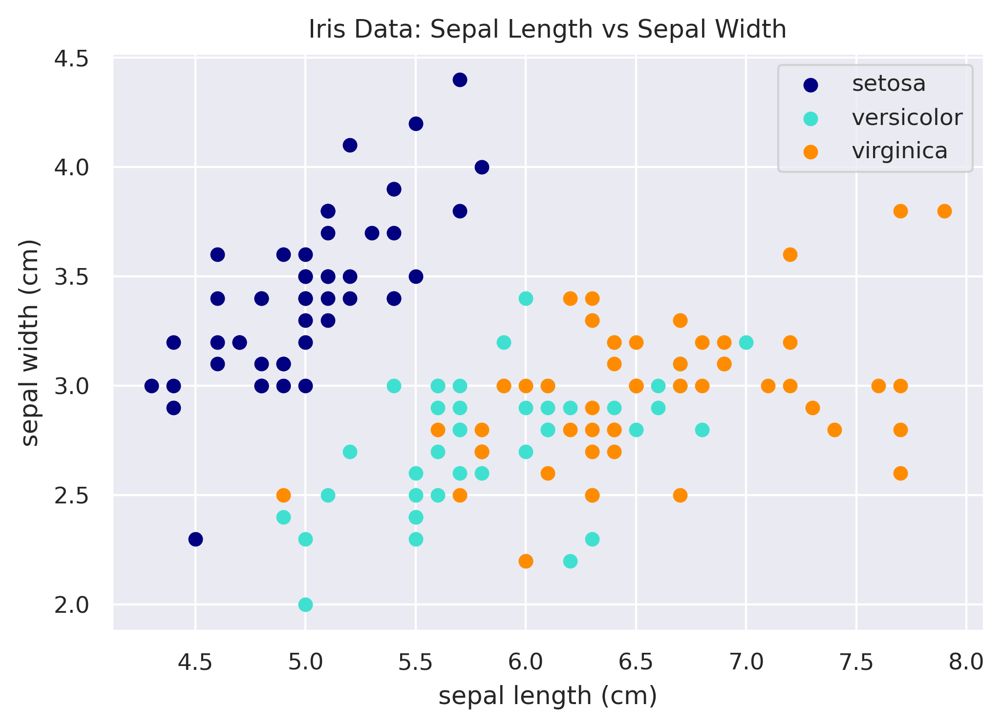
Reducing Duplication
A common pattern in Matplotlib is to use a for loop to plot each layer instead. This can reduce duplication of the
code. Below we create the same plot as above, but use a mapping of the iris species to color to help us.
# Mapping of species to color.
species_to_color = {
    'setosa': 'navy',
    'versicolor': 'turquoise',
    'virginica': 'darkorange',
}

# Loop through each species to plot it.
fig, ax = plt.subplots()
for species in species_to_color:
    x = df.loc[df['species'] == species, 'sepal_length']
    y = df.loc[df['species'] == species, 'sepal_width']
    ax.scatter(x, y, color=species_to_color[species], label=species.title())
ax.set_xlabel('sepal length (cm)')
ax.set_ylabel('sepal width (cm)')
ax.set_title('Iris Data: Sepal Length vs Sepal Width')
ax.legend()

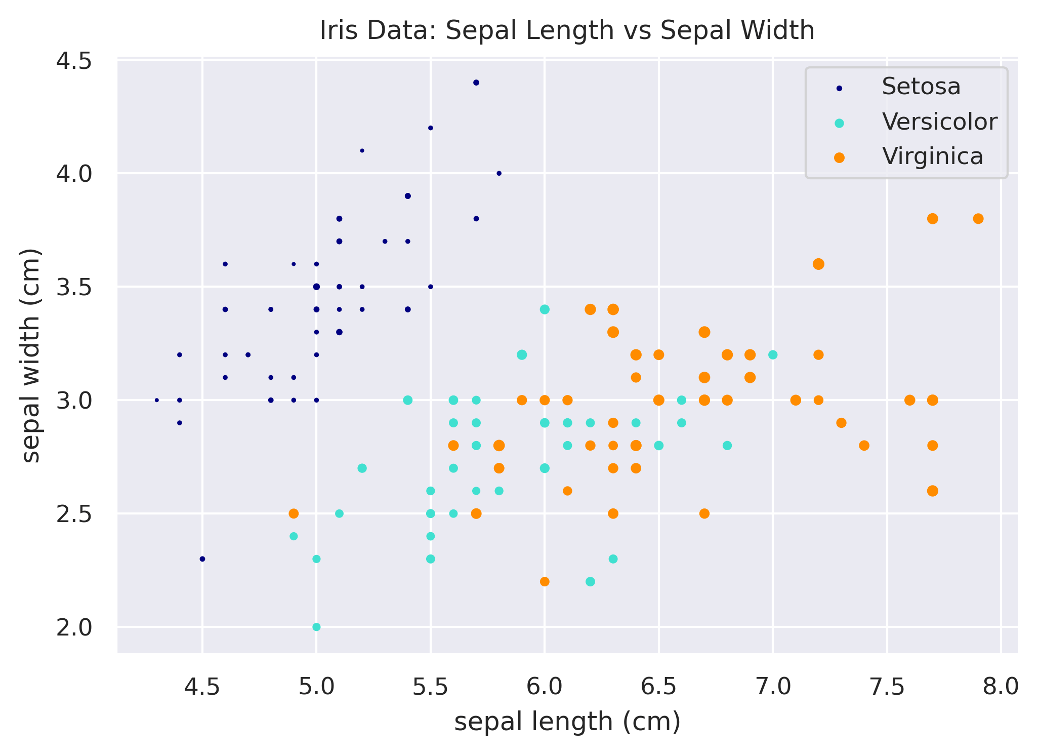
Customizing the Plot
A few other neat tricks you'll likely want to implement at some point are (1) changing the size of the scatter dots based on another column, (2) altering the opacity of the points, and (3) changing the symbol used to plot, instead of the plain circle.
Scatterplot Dot Size
# Mapping of species to color.
species_to_color = {
    'setosa': 'navy',
    'versicolor': 'turquoise',
    'virginica': 'darkorange',
}

# Loop through each species to plot it.
fig, ax = plt.subplots()
for species in species_to_color:
    x = df.loc[df['species'] == species, 'sepal_length']
    y = df.loc[df['species'] == species, 'sepal_width']
    size = df.loc[df['species'] == species, 'petal_width'] * 5
    ax.scatter(x, y, color=species_to_color[species], label=species.title(), s=size)
ax.set_xlabel('sepal length (cm)')
ax.set_ylabel('sepal width (cm)')
ax.set_title('Iris Data: Sepal Length vs Sepal Width')
ax.legend()
Adding Transparency / Changing Opacity
You can use the alpha argument in the scatter function to change the opacity of each point. For example, in the
code above, you could do:
ax.scatter(x, y, color=species_to_color[species], label=species.title(), alpha=0.5)
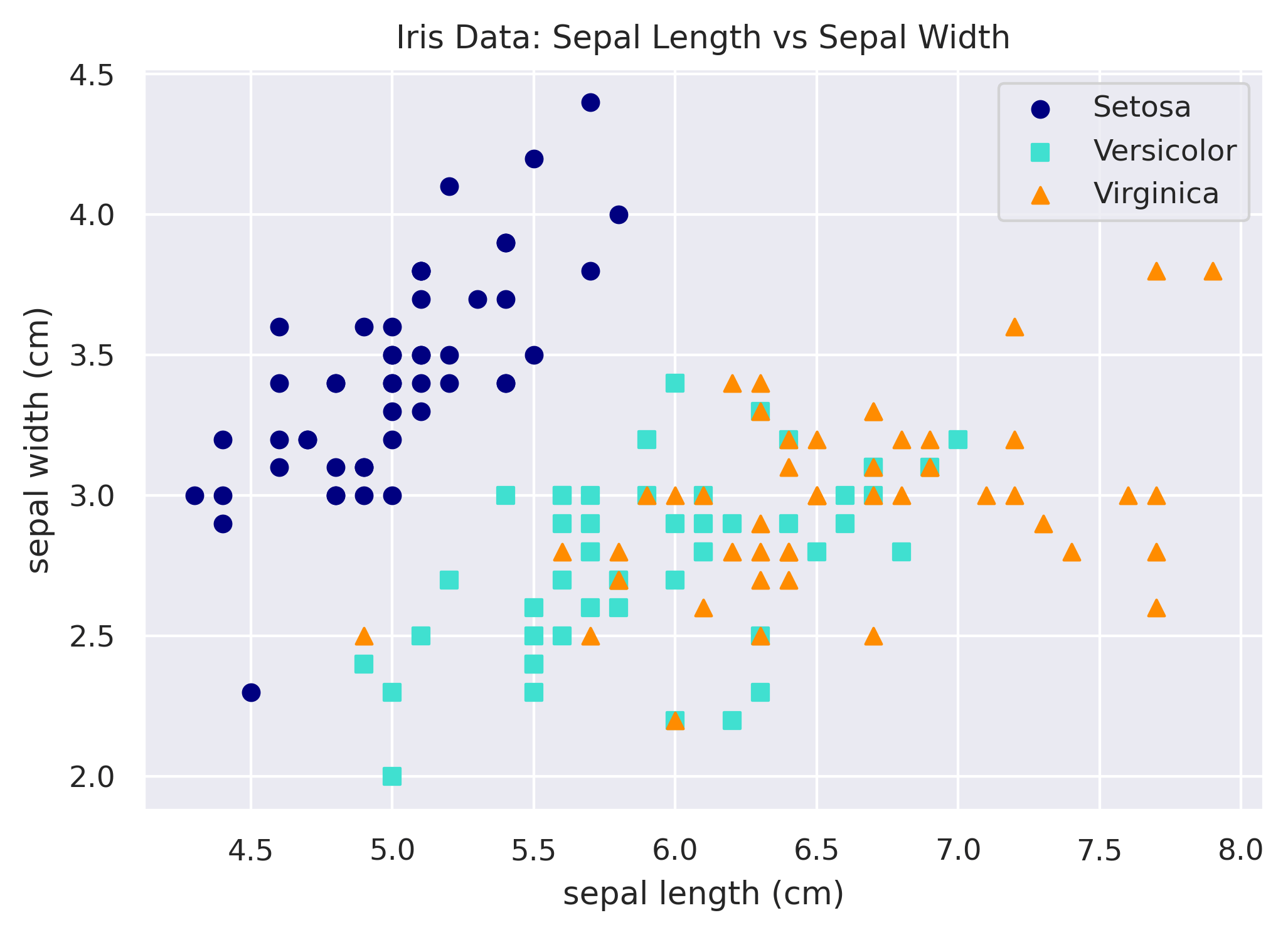
Changing the Symbol / Marker
Lastly, let's use not only a different color for each species but a different symbol as well. We can easily do that
by adding a dimension to our mapping for defining the marker, and then using that via the marker argument in scatter.
# Mapping of species to attributes.
species_map = {
    'setosa': {
        'color': 'navy',
        'marker': 'o',
    },
    'versicolor': {
        'color': 'turquoise',
        'marker': 's',
    },
    'virginica': {
        'color': 'darkorange',
        'marker': '^',
    },
}

# Loop through each species to plot it.
fig, ax = plt.subplots()
for species in species_to_color:
    x = df.loc[df['species'] == species, 'sepal_length']
    y = df.loc[df['species'] == species, 'sepal_width']
    size = df.loc[df['species'] == species, 'petal_width'] * 5
    ax.scatter(x, y, color=species_map[species]['color'],
            marker=species_map[species]['marker'], label=species.title())
ax.set_xlabel('sepal length (cm)')
ax.set_ylabel('sepal width (cm)')
ax.set_title('Iris Data: Sepal Length vs Sepal Width')
ax.legend()