Getting Started - A Simple Example
In this post we'll show you how to set a title and subtitle on a Matplotlib chart using various methods. Additionally, if you need two subtitles or want an overall figure title with a title and subtitle for multiple plots (axes) within the figure, you can do that too.
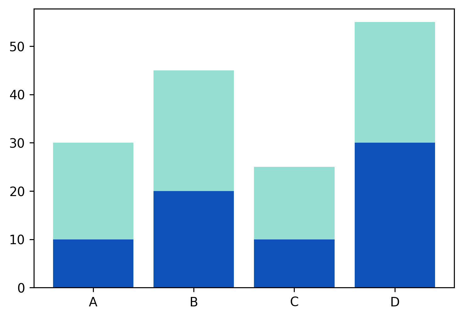
To get started, we'll generate a simple bar chart.
from matplotlib import pyplot as plt

x = ['A', 'B', 'C', 'D']
y1 = [10, 20, 10, 30]
y2 = [20, 25, 15, 25]

plt.bar(x, y1, color='#0F52BA')
plt.bar(x, y2, bottom=y1, color='#96DED1')
plt.show()
We'll put that plot inside a function to save some duplication.
def generate_bar_chart():
    x = ['A', 'B', 'C', 'D']
    y1 = [10, 20, 10, 30]
    y2 = [20, 25, 15, 25]

    plt.bar(x, y1, color='#0F52BA')
    plt.bar(x, y2, bottom=y1, color='#96DED1')
Now let's go through the various methods we can use to set titles on the plot - suptitle, title, and text.
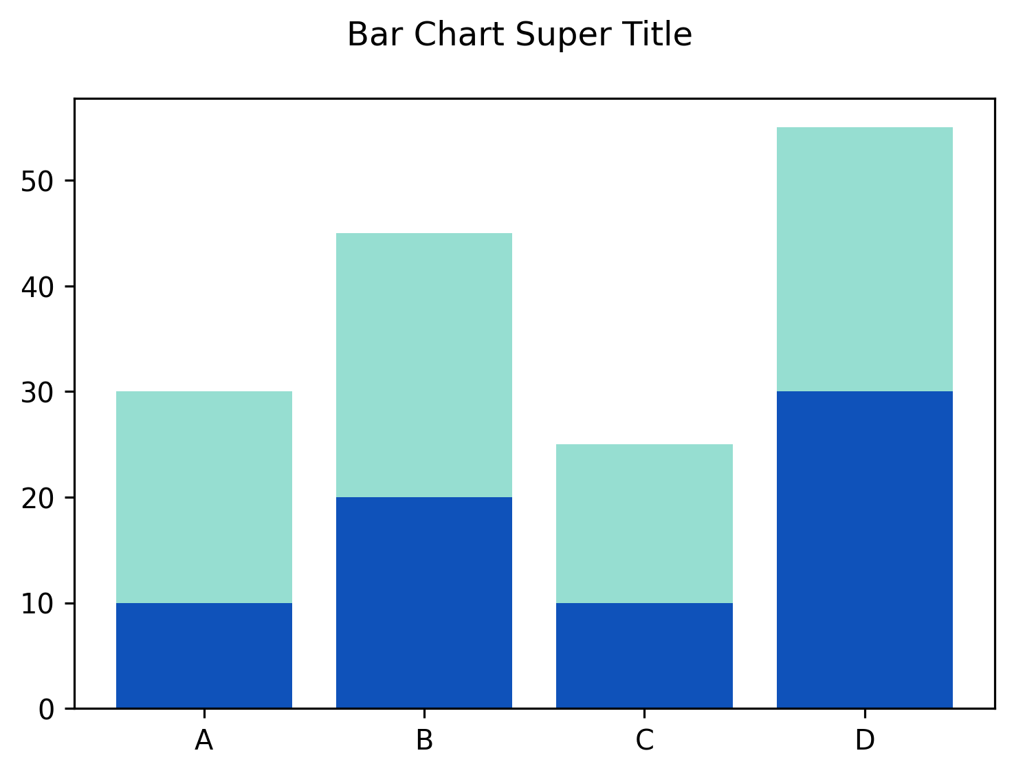
generate_bar_chart()
plt.suptitle("Bar Chart Super Title")
plt.show()
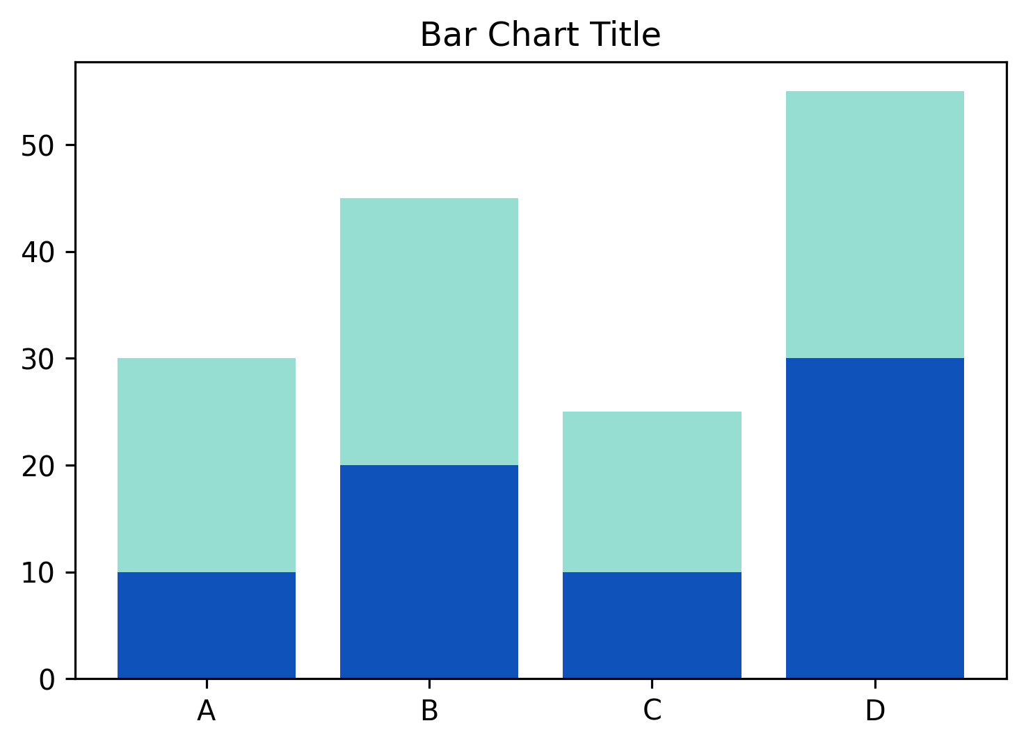
generate_bar_chart()
plt.title("Bar Chart Title")
plt.show()
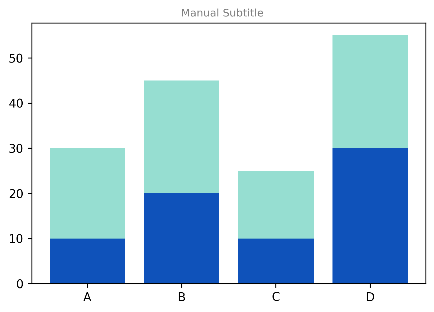
generate_bar_chart()
# Set a text element on the figure itself, which we can get via plt.gcf() (get
# current figure).
plt.gcf().text(0.5, 0.9, "Manual Subtitle", ha='center', fontsize=9,
            color='gray')
plt.show()
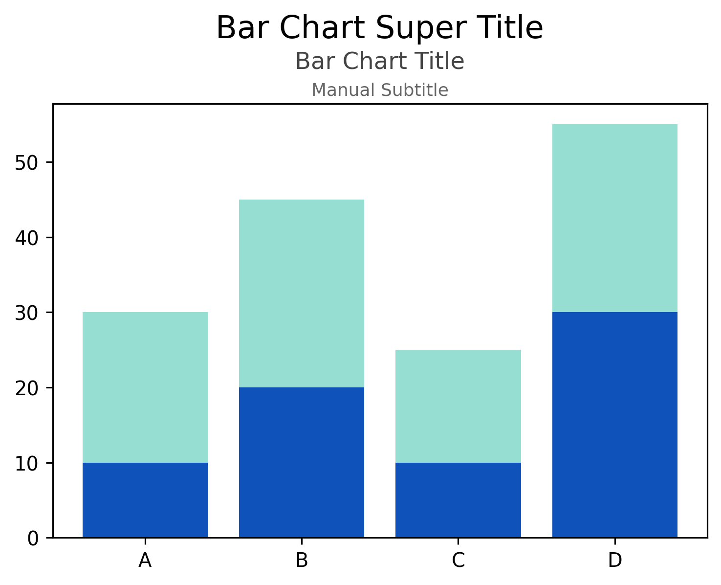
Super Title, Title and Subtitle
Matplotlib doesn't have a subtitle per se, but the above methods can be used to have both a title and subtitle, and
even a sub-subtitle if needed. Putting the above example together, we can plot all three on the same figure, each
centered.
generate_bar_chart()
# Notice that for the suptitle and the text, we have to manually adjust the `x`
# coordinate - this is because the axis ticks and labels on the y-axis make the
# figure wider than the axes/plot itself, so while the title is centered on the
# boxed in plot, the suptitle and text are centered on the entire figure. To
# center everything on the boxed-in plot, we have to shift it to the right
# slightly using an `x` a bit over 0.5.
plt.suptitle("Bar Chart Super Title", x=0.512, y=1.04, fontsize=16, ha='center')
plt.title("Bar Chart Title", fontsize=12, y=1.055, color='#444', ha='center')
plt.gcf().text(0.512, 0.9, "Manual Subtitle", ha='center', fontsize=9,
            color='#666')
plt.show()

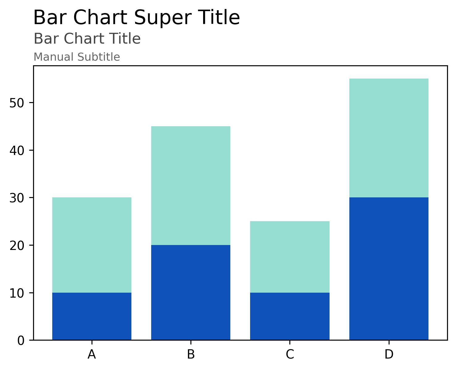
We can do the same as above via the object-oriented subplots way as well.
x = ['A', 'B', 'C', 'D']
y1 = [10, 20, 10, 30]
y2 = [20, 25, 15, 25]

fig, ax = plt.subplots()
ax.bar(x, y1, color='#0F52BA')
ax.bar(x, y2, bottom=y1, color='#96DED1')

# Notice that for the suptitle and the text, we have to manually adjust the `x`
# coordinate - this is because the axis ticks and labels on the y-axis make the
# figure wider than the axes/plot itself, so while the title is centered on the
# boxed in plot, the suptitle and text are centered on the entire figure. To
# center everything on the boxed-in plot, we have to shift it to the right
# slightly using an `x` a bit over 0.5.
fig.suptitle("Bar Chart Super Title", x=0.512, y=1.04, fontsize=16, ha='center')
ax.set_title("Bar Chart Title", fontsize=12, y=1.055, color='#444', ha='center')
fig.text(0.512, 0.9, "Manual Subtitle", ha='center', fontsize=9, color='#666')
plt.show()

As noted in the comment in the code snippets above, it's not super easy/automatic to center text on the plot when
annotating the figure. Both suptitle and text are figure annotations while title is an axes annotation.
The default coordinates used in ax.text() are the data coordinates, so for something like a title, it's not
recommended. Luckily, we can provide an argument to ax.text() of transform=ax.transAxes, which does exactly what we
want - it uses the coordinates of the Axes object (the plot itself), not the data, and using 0.5 as the x
coordinate, will always center it nicely.
x = ['A', 'B', 'C', 'D']
y1 = [10, 20, 10, 30]
y2 = [20, 25, 15, 25]

fig, ax = plt.subplots()
ax.bar(x, y1, color='#0F52BA')
ax.bar(x, y2, bottom=y1, color='#96DED1')

# We still have to adjust the suptitle since it's based on the figure.
fig.suptitle("Bar Chart Super Title", x=0.512, y=1.04, fontsize=16, ha='center')
ax.set_title("Bar Chart Title", fontsize=12, y=1.055, color='#444', ha='center')
# Using `transform` we can get everything to align in a nicer, simpler way.
ax.text(0.5, 1.02, "Manual Subtitle", ha='center', fontsize=9, color='#666',
        transform=ax.transAxes)
plt.show()
Align to the Left
It's pretty easy to do the same, but left-align everything, if that's your preference. Note that we still have to use
a custom x coordinate when using fig.suptitle; we also use loc='left' on the title, as well as ha='left'
throughout. For ax.text(), we can just set the x to 0 while using transform=ax.transAxes.
x = ['A', 'B', 'C', 'D']
y1 = [10, 20, 10, 30]
y2 = [20, 25, 15, 25]

fig, ax = plt.subplots()
ax.bar(x, y1, color='#0F52BA')
ax.bar(x, y2, bottom=y1, color='#96DED1')

fig.suptitle("Bar Chart Super Title", x=0.124, y=1.04, fontsize=16, ha='left')
ax.set_title("Bar Chart Title", loc='left', y=1.055, fontsize=12, color='#444',
            ha='left')
ax.text(0, 1.02, "Manual Subtitle", ha='left', fontsize=9, color='#666',
        transform=ax.transAxes)
plt.show()
While this works well, it's still error-prone, hard to automate, and manual in that we need to set the x coordinate
on suptitle to align it perfectly. The recommendation is to not use suptitle at all when just working with a single
plot! Just use ax.text alone, or supplement ax.set_title with one or more ax.text.
Below we'll show an identical example as above, but just using ax.text().
x = ['A', 'B', 'C', 'D']
y1 = [10, 20, 10, 30]
y2 = [20, 25, 15, 25]

fig, ax = plt.subplots()
ax.bar(x, y1, color='#0F52BA')
ax.bar(x, y2, bottom=y1, color='#96DED1')

ax.text(0, 1.15, "Bar Chart Super Title", ha='left', fontsize=16,
        color='#222', transform=ax.transAxes)
ax.text(0, 1.08, "Bar Chart Title", ha='left', fontsize=12, color='#444',
        transform=ax.transAxes)
ax.text(0, 1.02, "Manual Subtitle", ha='left', fontsize=9, color='#666',
        transform=ax.transAxes)
plt.show()

Easy peasy. While we still need to adjust the y coordinates to make sure everything fits well vertically, the x
coordinate can always be 0 for left alignment while using transform=ax.transAxes.
Multiple Plots
The above should be sufficient for titling any individual plot, but it's often the case that you'll want an overall figure title, and then a title (and potentially subtitle) for individual axes or plots. Below we'll show how to do this using very similar techniques we've used above.
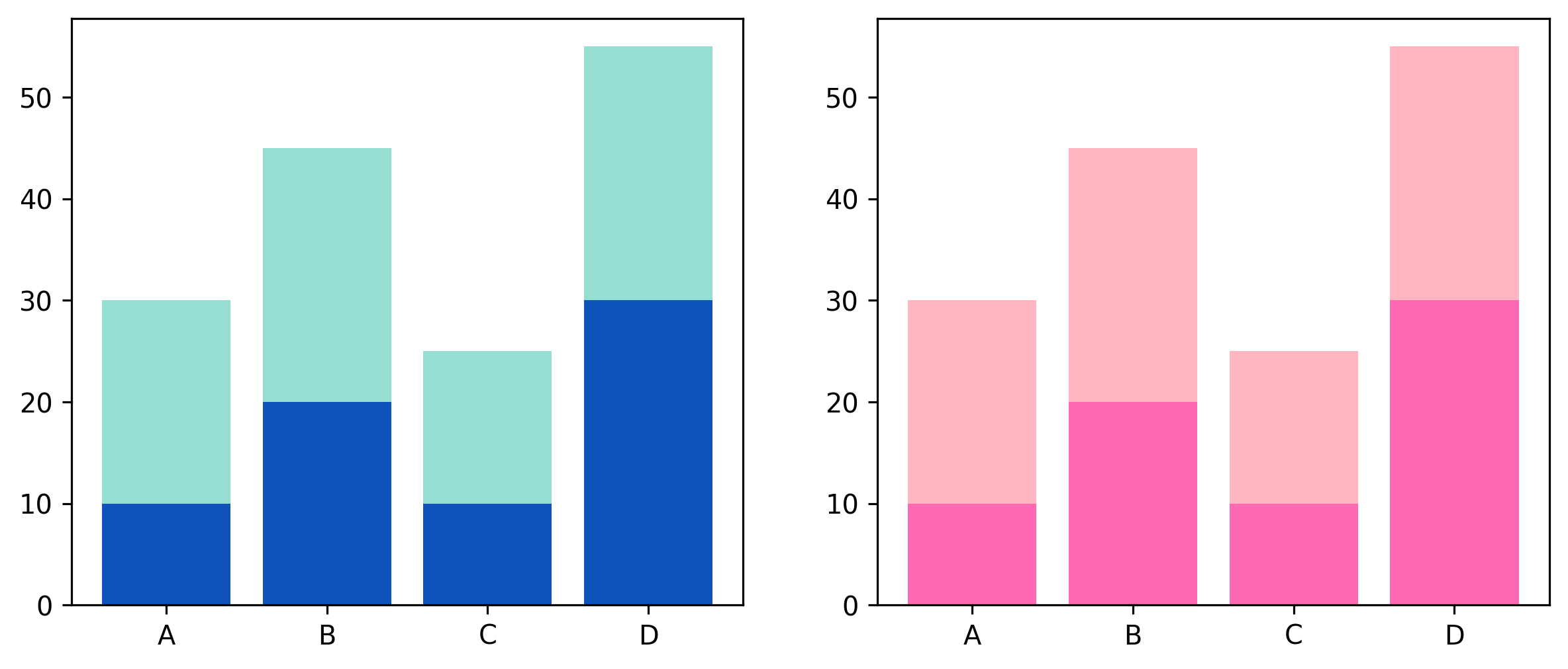
Let's first get our plot ready. We'll do two bar charts, side by side, using ax.subplots().
# Two subplots...
fig, (ax1, ax2) = plt.subplots(1, 2, figsize=(10, 4))

ax1.bar(x, y1, color='#0F52BA')
ax1.bar(x, y2, bottom=y1, color='#96DED1')

ax2.bar(x, y1, color='#FF69B4')
ax2.bar(x, y2, bottom=y1, color='#FFB6C1')

plt.show()
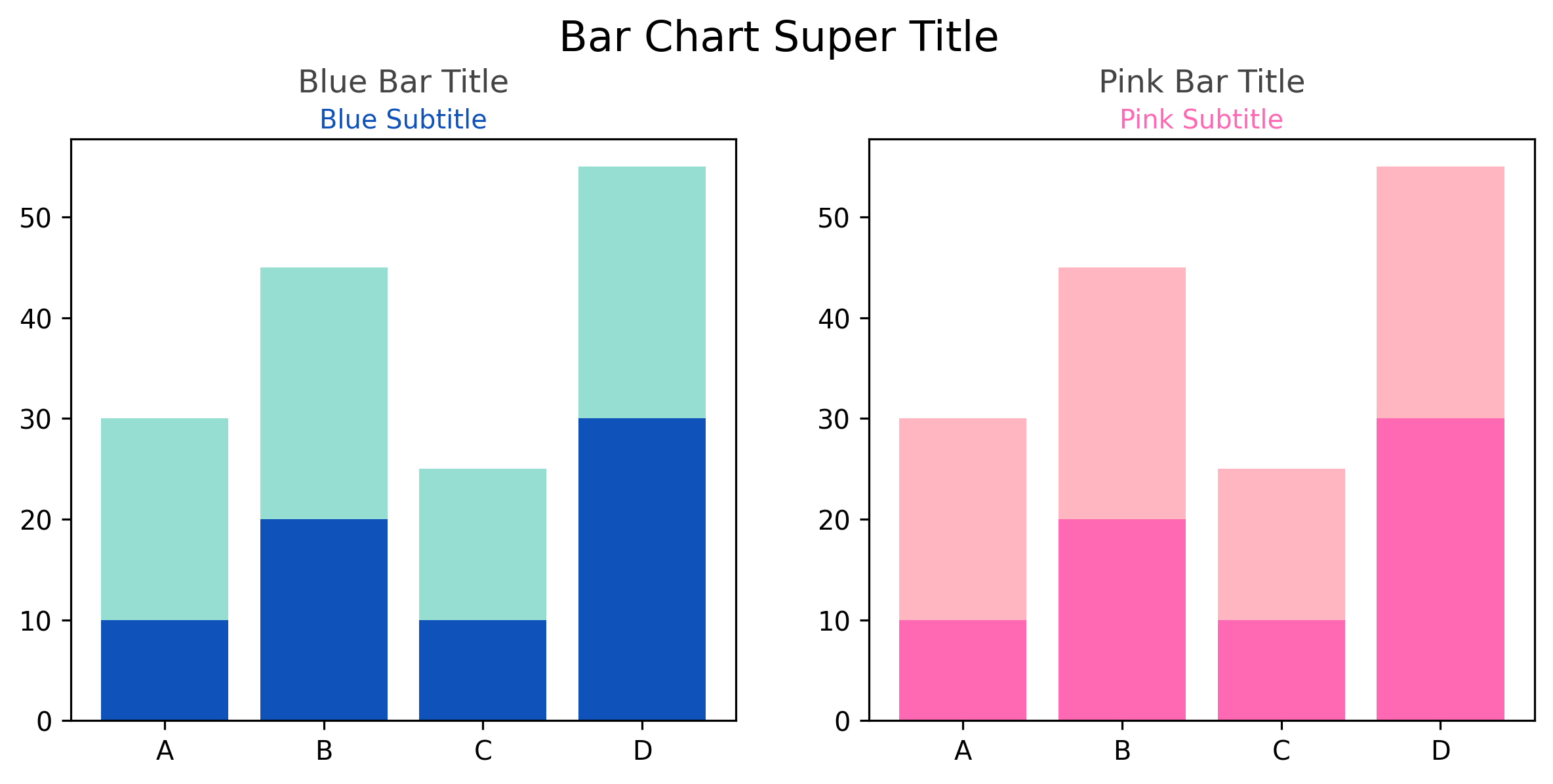
We'll now append to the code above to add a figure title, and both a title and subtitle for each underlying chart.
# ... chart generation code above omitted ...

fig.suptitle("Bar Chart Super Title", y=1.04, fontsize=16, ha='center')
# Title and subtitle for the first chart.
ax1.set_title("Blue Bar Title", fontsize=12, y=1.055, color='#444', ha='center')
fig.text(0.303, 0.9, "Blue Subtitle", ha='center', fontsize=10, color='#0F52BA')

# Title and subtitle for the second chart.
ax2.set_title("Pink Bar Title", fontsize=12, y=1.055, color='#444', ha='center')
fig.text(0.725, 0.9, "Pink Subtitle", ha='center', fontsize=10, color='#FF69B4')

While that works and looks good, it was annoying to again set the x coordinates perfectly to get the fig.text()
to be properly centered on each subplot.
We can instead use ax.text() as we've demonstrated previously.
fig.suptitle("Bar Chart Super Title", y=1.04, fontsize=16, ha='center')
# Title and subtitle for the first chart.
ax1.set_title("Blue Bar Title", fontsize=12, y=1.055, color='#444', ha='center')
ax1.text(0.5, 1.02, "Blue Subtitle", ha='center', fontsize=10, color='#0F52BA',
        transform=ax1.transAxes)

# Title and subtitle for the second chart.
ax2.set_title("Pink Bar Title", fontsize=12, y=1.055, color='#444', ha='center')
fig.text(0.5, 1.02, "Pink Subtitle", ha='center', fontsize=10, color='#FF69B4',
        transform=ax2.transAxes)