An entire post on how to rotate axis labels?? Yes indeed. After playing around with Matplotlib for some time, I could never remember how to rotate axis labels. Part of the reason it's hard to remember is that there are a plethora of ways to do it. In this post, we'll go through all the ways I've uncovered, with a few recommendations of which to use and when.
Just want the answers? Scroll to the very bottom.
Get our data
Let's get some simple data to use for this example. We'll use the EPA's gas efficiency dataset.
import matplotlib.pyplot as plt
import pandas as pd

fuel_economy = pd.read_csv('https://raw.githubusercontent.com/getup8/datasets/master/2019_Car_Fuel_Economy.csv')
fields = ['Manufacturer', 'Comb FE (Guide) - Conventional Fuel']
df = fuel_economy[fields].copy()
df.rename(columns={'Comb FE (Guide) - Conventional Fuel': 'Combined MPG'},
          inplace=True)
# Get the top 10 manufacturers by their average MPG.
dfg = df.groupby('Manufacturer').mean().sort_values(
    'Combined MPG', ascending=False)
df = dfg[:10].reset_index()
# Get the rest, we'll use these later for an example.
df2 = dfg[10:].reset_index()

df
| Manufacturer | Combined MPG | |
|---|---|---|
| 0 | Honda | 28.375000 |
| 1 | Mitsubishi Motors Co | 28.375000 |
| 2 | MAZDA | 28.285714 |
| 3 | Kia | 28.000000 |
| 4 | Hyundai | 26.672727 |
| 5 | Toyota | 26.663366 |
| 6 | Subaru | 25.954545 |
| 7 | Volvo | 25.050000 |
| 8 | BMW | 23.950820 |
| 9 | Volkswagen Group of | 23.746032 |
Plot our data
Let's just create a simple bar chart to see what we're working with.
fig, ax = plt.subplots()

ax.bar(df['Manufacturer'], df['Combined MPG'])
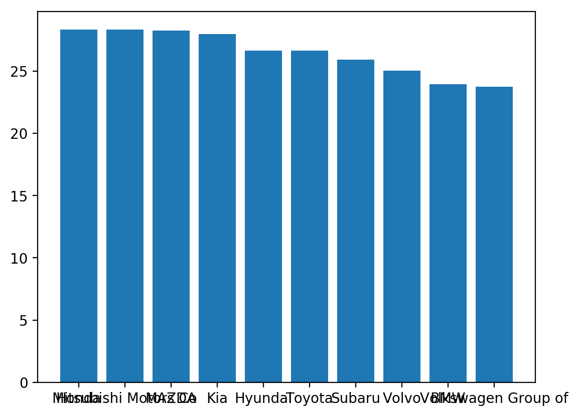
It's a mess! We need to rotate the axis labels...
Let's go through all the ways in which we can do this one by one.
Option 1: plt.xticks()
plt.xticks() is probably the easiest way to rotate your labels. The only "issue" is that it's using the "stateful" API (not the Object-Oriented API); that sometimes doesn't matter but in general, it's recommended to use OO methods where you can. We'll show an example of why it might matter a bit later.
fig, ax = plt.subplots()
ax.bar(df['Manufacturer'], df['Combined MPG'])

plt.xticks(rotation=30)

Looks better-ish but the alignment is funky. That's because, by default, Matplotlib aligns the center of the text to the tick. When you rotate the text, this no longer works so we need to change the alignment to right-aligned, like this:
# `ha` is just shorthand for horizontalalignment, which can also be used.
plt.xticks(rotation=30, ha='right')
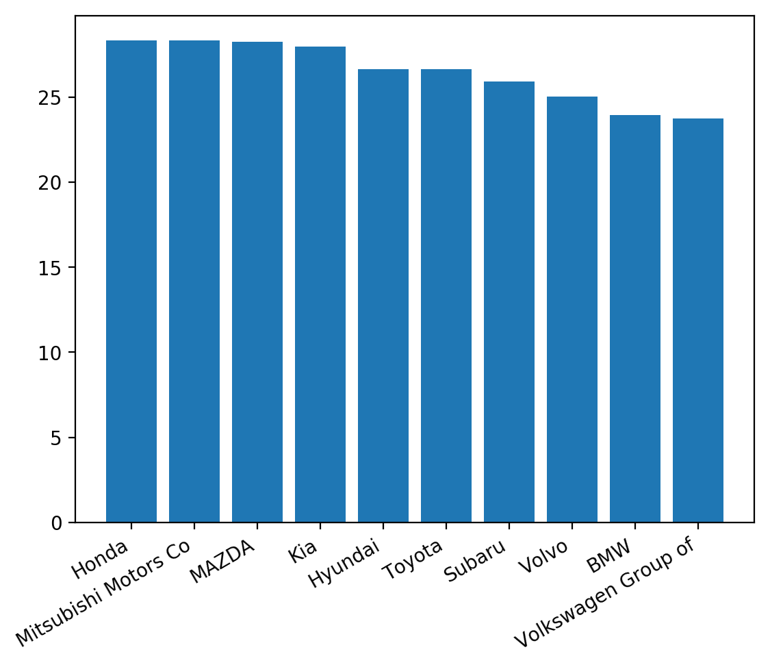
Bueno.
Note: Throughout this post we'll just focus on the x-axis but know you can do the exact same thing for the y-axis as well - just substitute x for y (e.g. plt.xticks() -> plt.yticks())
Where plt.xticks() doesn't really work
Let's say you now want to plot two bar charts in the same figure.
fig, (ax1, ax2) = plt.subplots(1, 2, figsize=(10, 5))

ax1.bar(df['Manufacturer'], df['Combined MPG'])
ax1.set_ylim(0, 30)

ax2.bar(df2['Manufacturer'], df2['Combined MPG'])
ax2.set_ylim(0, 30)

# This only works for the last chart, even if we call it
# right after we create ax1!
plt.xticks(rotation=30, ha='right')

As you can see, only the last chart gets adjusted correctly. This is because the plt method finds the current Axes object (each bar chart here is a separate Axes object) and just modifies that one.
If you're just plotting one chart and doing EDA, this method is great. Otherwise, it's probably best to get used to using an OO method below.
Option 2: ax.set_ticklabels()
Let's first try using the Axes method set_ticklabels(). This method takes the labels themselves as a required first parameter.
ax.set_xticklabels(df['Manufacturer'], rotation=30, ha='right')
But what if you want don't want to manually give the labels? Why can't we just tell Matplotlib to re-use what it already has? You can - using ax.get_xticklabels() - but with some nuance.
ax.set_xticklabels(ax.get_xticklabels(), rotation=30, ha='right')
What happened? Long story short, Matplotlib doesn't attach the labels to the chart until the very end, when the chart is drawn. So if you try to call get_xticklabels() before that, you get empty strings. A relatively hacky fix is just to draw the chart before calling the method.
# Draw the chart so labels are actually attached to the Axes object.
plt.draw()

ax.set_xticklabels(ax.get_xticklabels(), rotation=30, ha='right')
Let's try adjusting both charts using this method.
fig, (ax1, ax2) = plt.subplots(1, 2, figsize=(10, 5))

ax1.bar(df['Manufacturer'], df['Combined MPG'])
ax1.set_ylim(0, 30)

ax2.bar(df2['Manufacturer'], df2['Combined MPG'])
ax2.set_ylim(0, 30)

plt.draw()

ax1.set_xticklabels(ax1.get_xticklabels(), rotation=30, ha='right')
ax2.set_xticklabels(ax2.get_xticklabels(), rotation=30, ha='right')

Nice. This is a great method to know how to use but it's relatively verbose and comes with the caveat about needing to make sure the figure has been drawn before calling the get method.
Option 3: ax.get_xticklabels()
In this method, you get a list of the labels, loop through each one, and set rotation and alignment for each. A few nice things about this method:
- It uses the OO API
- It's pretty intuitive. Get the labels. For each, set rotation and alignment.
- It doesn't actually touch the value of the labels themselves (like the previous method), it just adjusts the formatting. This means no weird caveats.
for label in ax.get_xticklabels():
  label.set_rotation(30)
  label.set_ha('right')
Have multiple charts? Just concat the lists together and do it all in one loop.
for label in ax1.get_xticklabels() + ax2.get_xticklabels():
  label.set_rotation(30)
  label.set_ha('right')
Option 4: ax.tick_params()
This option is relatively simple but comes with a big drawback at the moment - you can't currently set alignment. However, there's an open feature request to allow it, so stay tuned!
# No horizontal alignment option!
ax.tick_params(axis='x', labelrotation=30)

# Need this as well :/
plt.xticks(ha='right')
Option 5: plt.setp()
plt.setp is a powerful method that allows you to set the properties of many (all?) Matplotlib objects. Here we use it by handing it the set of tick labels and setting the rotation and alignment properties for them.
plt.setp(ax.get_xticklabels(), rotation=30, ha='right')
While this looks like it's not OO, it actually is since you're using ax.get_xticklabels().
This works equally well when you have multiple charts:
plt.setp(ax1.get_xticklabels() + ax2.get_xticklabels(), rotation=30, ha='right')
A Summary
As you can see, there are almost too many options when deciding how to do this. I think it's good to know all the methods honestly, but in the future, when label alignment is available, it will probably be "best" to use ax.tick_params(). But really, to each their own.
# Option 1
plt.xticks(rotation=30, ha='right')

# Option 2
plt.draw()
ax.set_xticklabels(ax.get_xticklabels(), rotation=30, ha='right')

# Option 3
for label in ax.get_xticklabels():
  label.set_rotation(30)
  label.set_ha('right')

# Option 4
ax.tick_params(axis='x', labelrotation=30)
# Eventually, this shouldn't be needed and an `ha` argument should
# be available for the above.
plt.xticks(ha='right')

# Option 5
plt.setp(ax.get_xticklabels(), rotation=30, ha='right')
Have yet MORE ways to do this or have a strong recommendation of which to use? Let me know :)