
TL;DR
Pass a hex string or an RGB tuple to any color argument:
ax.bar(categories, values, color='#2A9D8F')               # hex
ax.plot(x, y,              color=(0.165, 0.616, 0.557))   # RGB (0-1 scale)
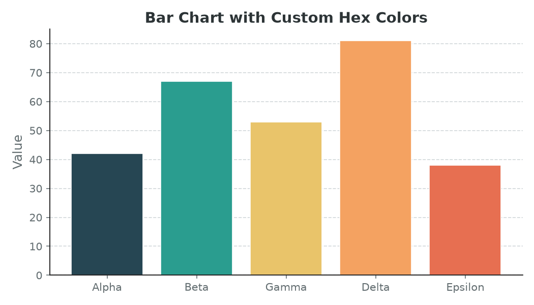
Hex colors
Any CSS-style hex code works — three-char (#2AF) or six-char (#2A9D8F), with or without an alpha channel (#2A9D8F80 for 50% opacity).
import matplotlib.pyplot as plt

categories = ['Alpha', 'Beta', 'Gamma', 'Delta', 'Epsilon']
values     = [42, 67, 53, 81, 38]
hex_colors = ['#264653', '#2A9D8F', '#E9C46A', '#F4A261', '#E76F51']

fig, ax = plt.subplots(figsize=(7, 4))
ax.bar(categories, values, color=hex_colors)
plt.tight_layout()
plt.show()
You can pass a single hex string to color every bar the same, or a list to color each one individually.
RGB tuples
Matplotlib expects normalised RGB values in the range 0.0–1.0 (not 0–255). Divide your 8-bit values by 255 to convert:
# 8-bit values (from a design tool, for example)
r, g, b = 42, 157, 143
color = (r / 255, g / 255, b / 255)   # (0.165, 0.616, 0.557)

ax.plot(x, y, color=color)
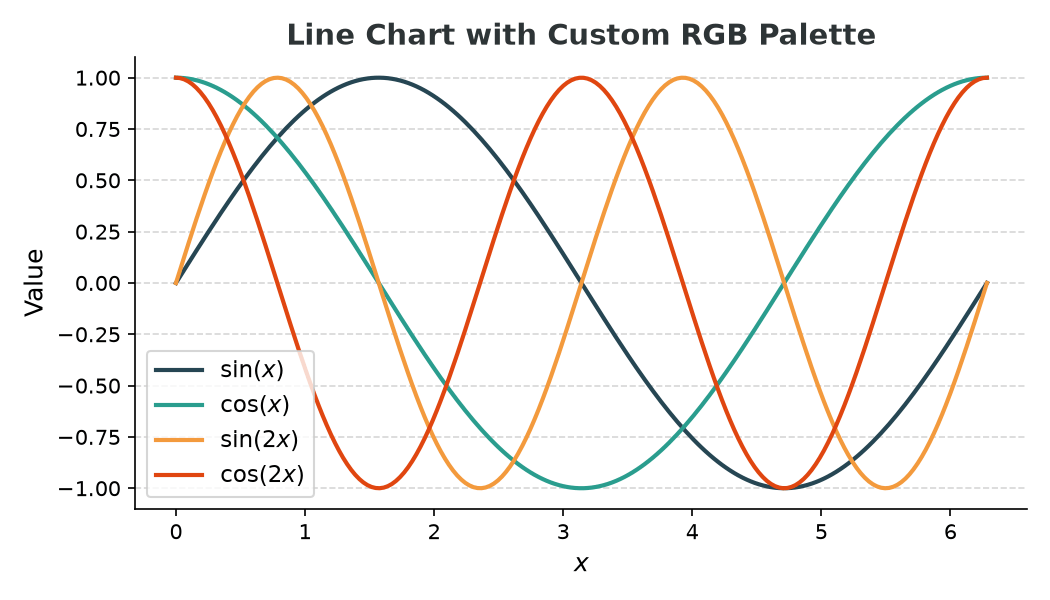
Building a palette as a list of tuples
rgb_palette = [
    (0.149, 0.274, 0.325),   # dark teal
    (0.165, 0.616, 0.557),   # mid teal
    (0.953, 0.604, 0.239),   # amber
    (0.878, 0.275, 0.063),   # orange-red
]

for func, color, label in zip(functions, rgb_palette, labels):
    ax.plot(x, func, color=color, lw=2, label=label)
Building a reusable palette dict
Keeping colors in a dict makes it easy to reference them by name across multiple charts:
palette = {
    'charcoal':      '#264653',
    'persian_green': '#2A9D8F',
    'sandy_yellow':  '#E9C46A',
    'sandy_brown':   '#F4A261',
    'burnt_sienna':  '#E76F51',
}

ax.bar(categories, values, color=[palette[k] for k in palette])
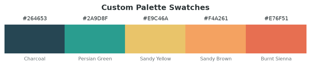
Visualising your palette as swatches
Before committing to a palette it helps to preview it. A quick strip of Rectangle patches does the job:
import matplotlib.pyplot as plt
import matplotlib.patches as mpatches

palette = {
    '#264653': 'Charcoal',
    '#2A9D8F': 'Persian Green',
    '#E9C46A': 'Sandy Yellow',
    '#F4A261': 'Sandy Brown',
    '#E76F51': 'Burnt Sienna',
}

fig, ax = plt.subplots(figsize=(7, 1.6))
ax.set_xlim(0, len(palette))
ax.set_ylim(0, 1)
ax.axis('off')

for i, (hex_val, name) in enumerate(palette.items()):
    ax.add_patch(plt.Rectangle((i, 0), 1, 0.7, color=hex_val))
    ax.text(i + 0.5, 0.78, hex_val, ha='center', va='bottom', fontsize=8.5)
    ax.text(i + 0.5, -0.08, name,    ha='center', va='top',    fontsize=7.5)

plt.tight_layout()
plt.show()
Adding transparency (alpha)
All color arguments accept an optional alpha keyword (0.0–1.0), or you can bake it into the hex code as a fourth byte:
ax.bar(categories, values, color='#2A9D8F', alpha=0.7)   # keyword
ax.bar(categories, values, color='#2A9D8FB3')             # hex with alpha byte
Where colors can be used
Any Matplotlib element that accepts a color argument works the same way — lines, bars, scatter points, patches, text, spines, and tick labels:
ax.plot(x, y, color='#E76F51')
ax.scatter(x, y, color='#2A9D8F', edgecolors='#264653')
ax.set_xlabel('x', color='#636e72')
ax.spines['bottom'].set_color('#264653')
ax.tick_params(colors='#636e72')