
Pandas
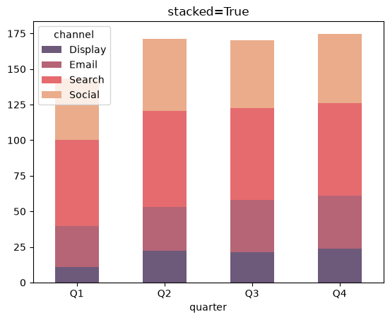
Plot Stacked vs Unstacked Bar Charts in Pandas
Plot stacked and unstacked bar charts in Pandas with df.plot and the stacked argument.
Plot stacked and unstacked bar charts in Pandas with df.plot and the stacked argument.
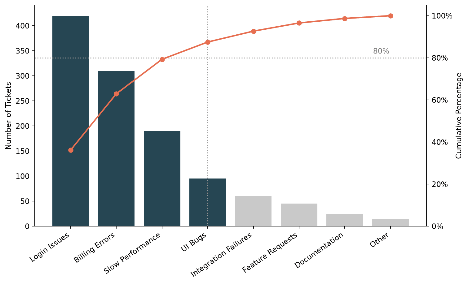
Build a Pareto chart in Matplotlib, combining a sorted bar chart with a cumulative percentage line to visualize the 80/20 rule.
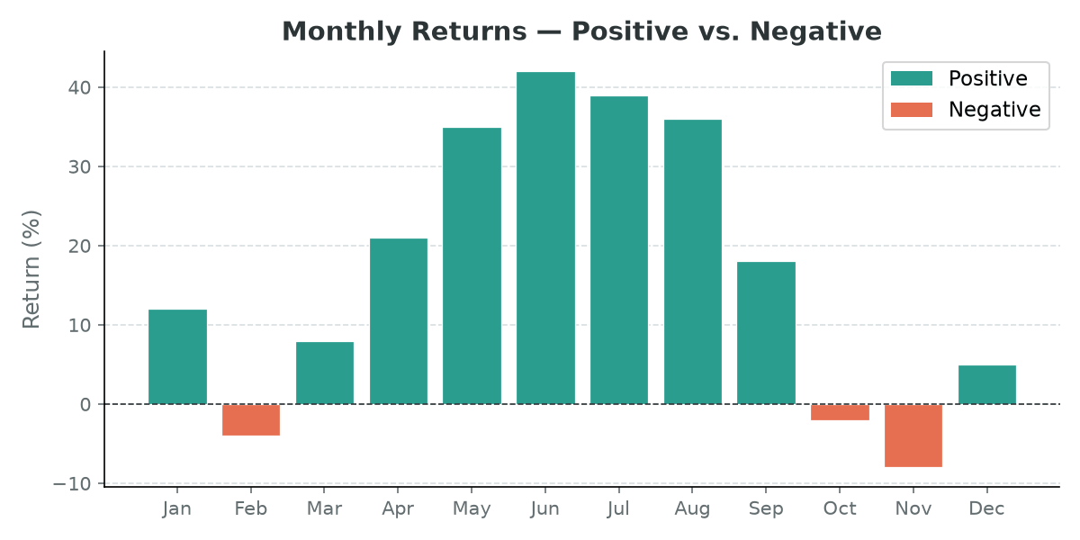
Color each bar in a Matplotlib bar chart individually — by threshold, colormap gradient, or to highlight a specific value.

Plotting stacked bar charts with labels in Matplotlib
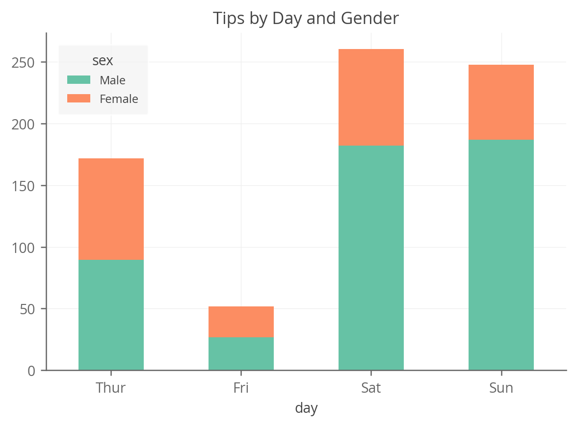
A complete guide to creating stacked bar charts in python using Pandas, Matplotlib, Seaborn, Plotnine and Altair
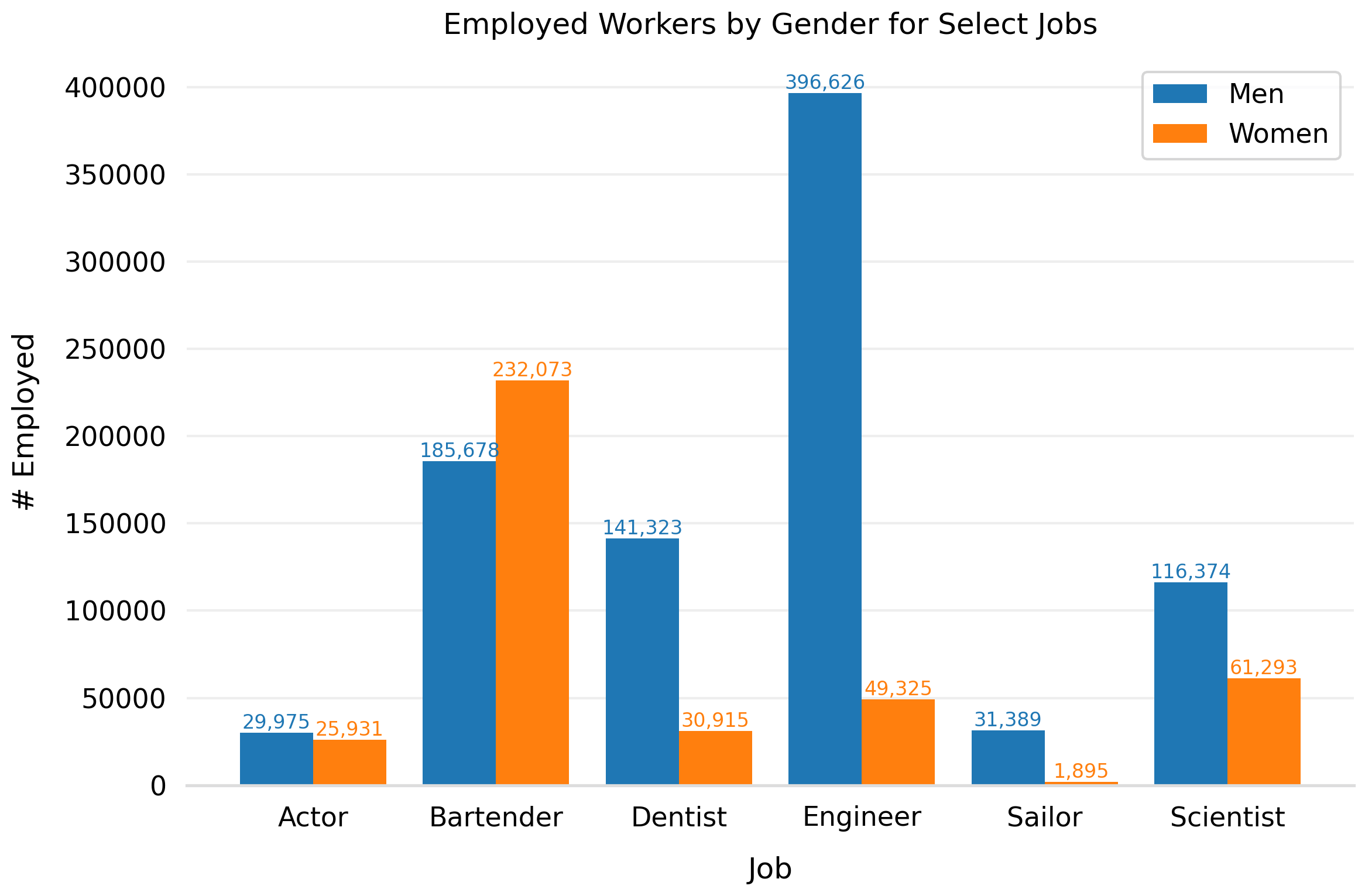
A few examples of how to create grouped bar charts (with labels) in Matplotlib
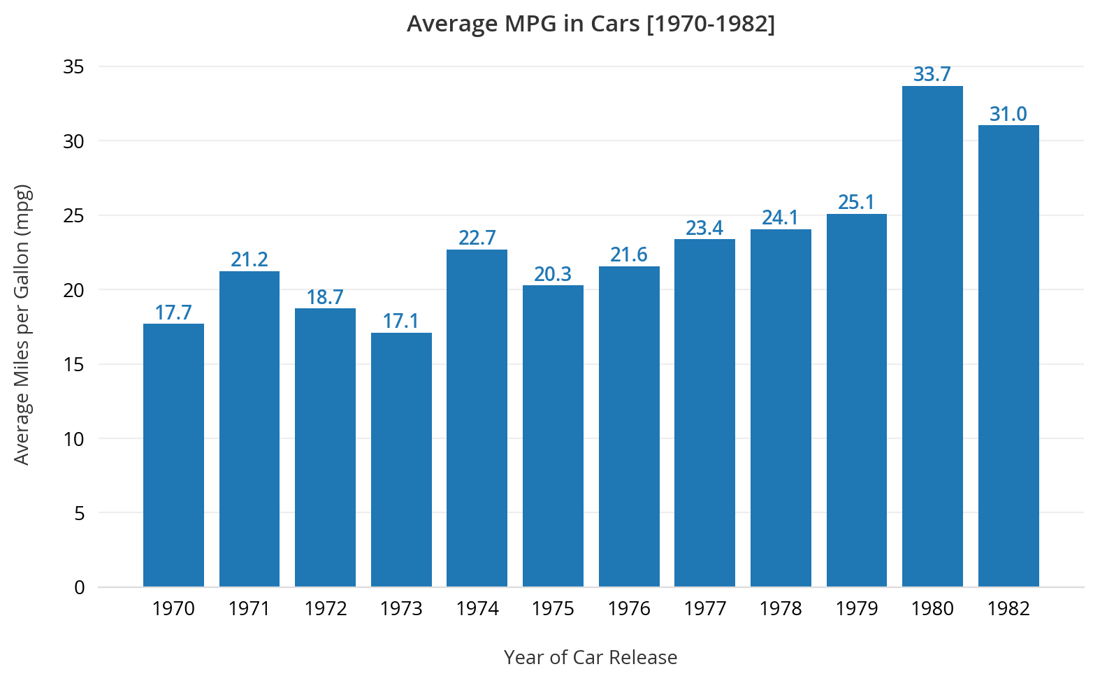
Transforming the default Matplotlib bar chart into a simple, stylish visualization