
Python
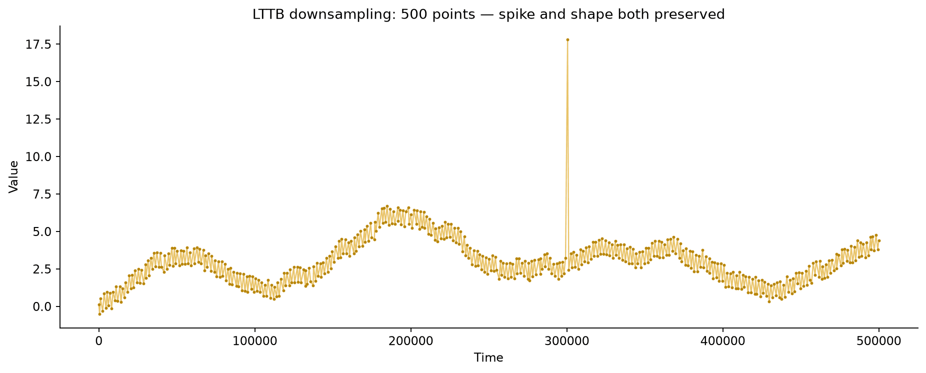
How to Downsample Large Time Series Data for Fast Visualization
Downsample large time series data in Python for fast plotting without losing spikes or overall shape, comparing naive decimation, min/max envelopes, and LTTB.
Downsample large time series data in Python for fast plotting without losing spikes or overall shape, comparing naive decimation, min/max envelopes, and LTTB.
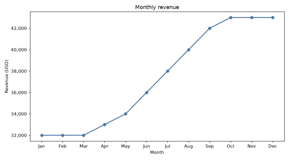
Generate PDF data reports with embedded Python charts using matplotlib's PdfPages.
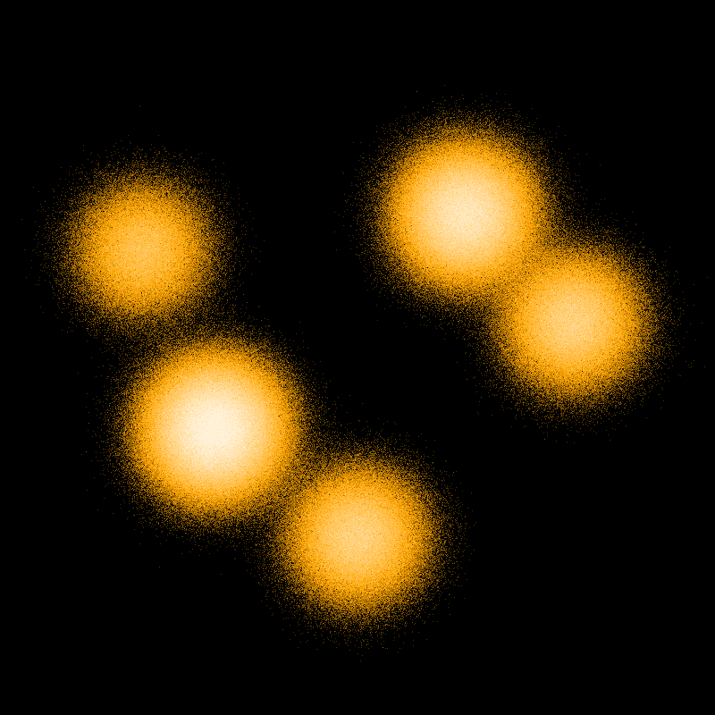
Render millions of points quickly in Python with Datashader, which rasterizes data directly instead of drawing one marker per point.
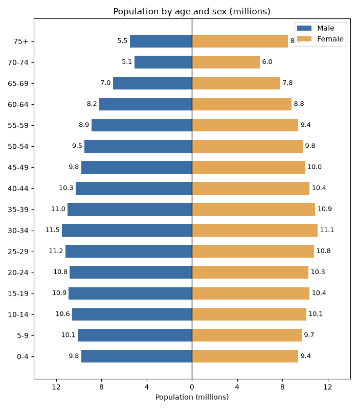
Draw a population pyramid in Python with Matplotlib using mirrored horizontal bar charts.
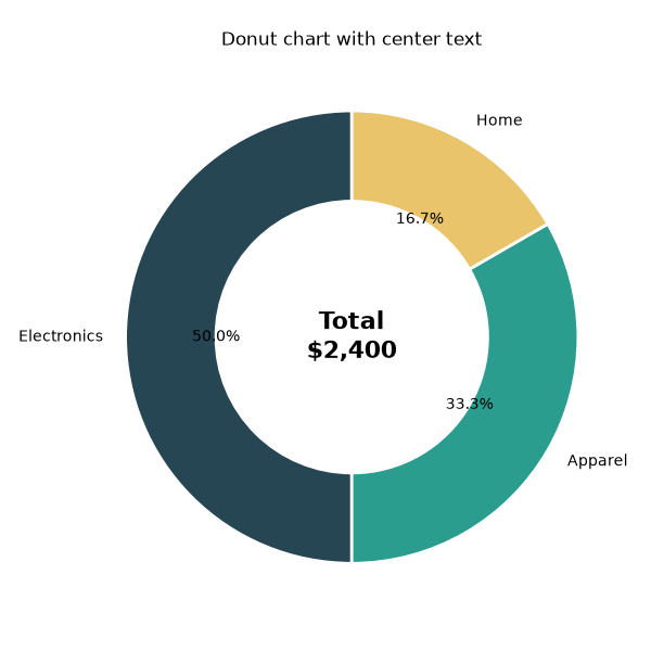
Make a donut chart in Matplotlib and add a centered label with ax.text.
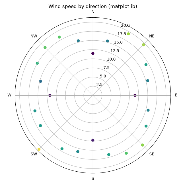
Create polar scatter plots in Matplotlib and Plotly to show points by angle and radius.
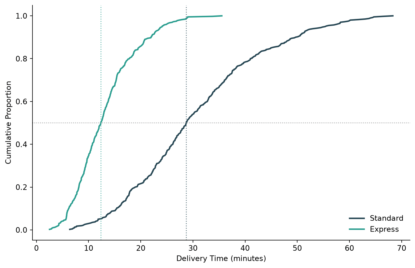
Plot an empirical cumulative distribution function (CDF) in Python, comparing a manual Matplotlib version with Seaborn's ecdfplot.
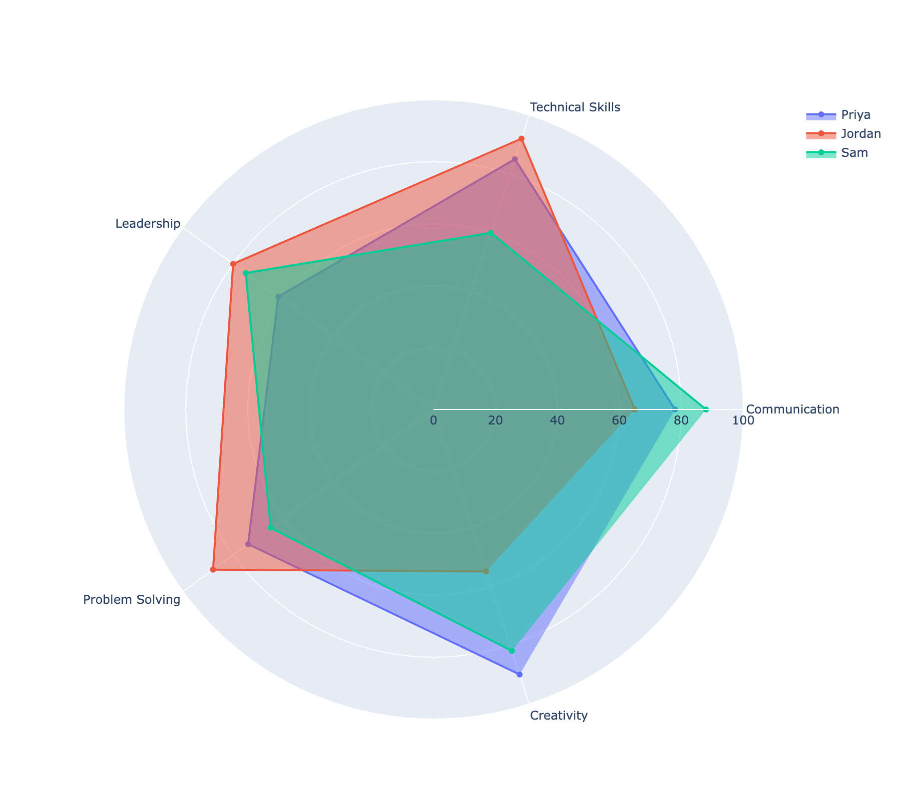
Build interactive radar (spider) charts in Plotly using go.Scatterpolar, including comparing multiple entities and customizing the radial axis.
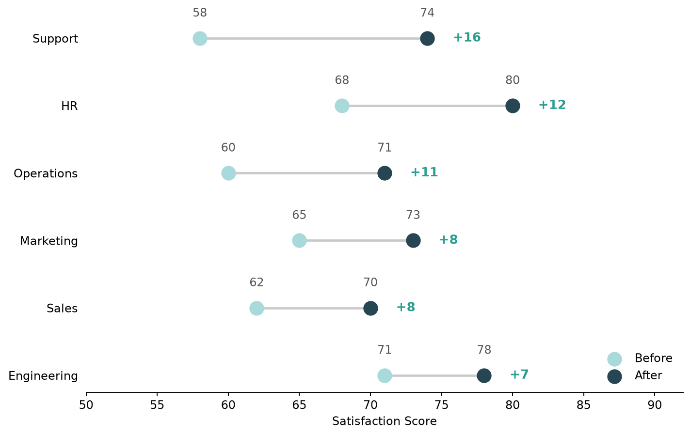
Build a dumbbell plot (dot-and-line chart) in Python with both Matplotlib and Plotly, and compare the two approaches.
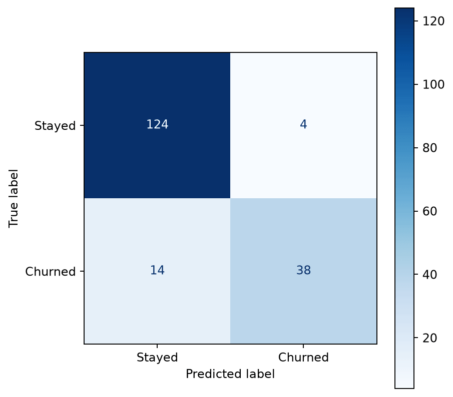
Plot a confusion matrix in Python using scikit-learn's ConfusionMatrixDisplay or a manually styled Seaborn heatmap.
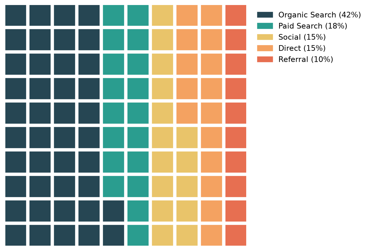
Build waffle charts (square pie charts) in Python with the PyWaffle library, including icons and custom layouts.
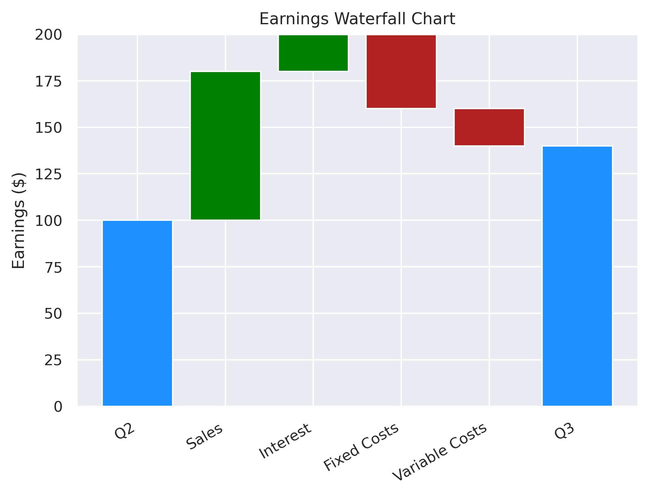
A quick tutorial of how to create waterfall charts in python, using Matplotlib and Plotly.